Screenshots
Moderators: another_commander, winston
Re: Screenshots
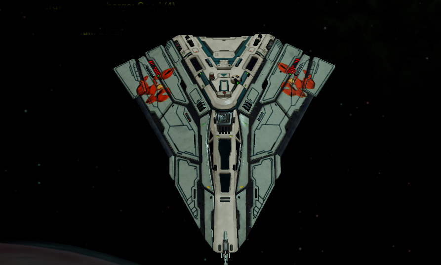
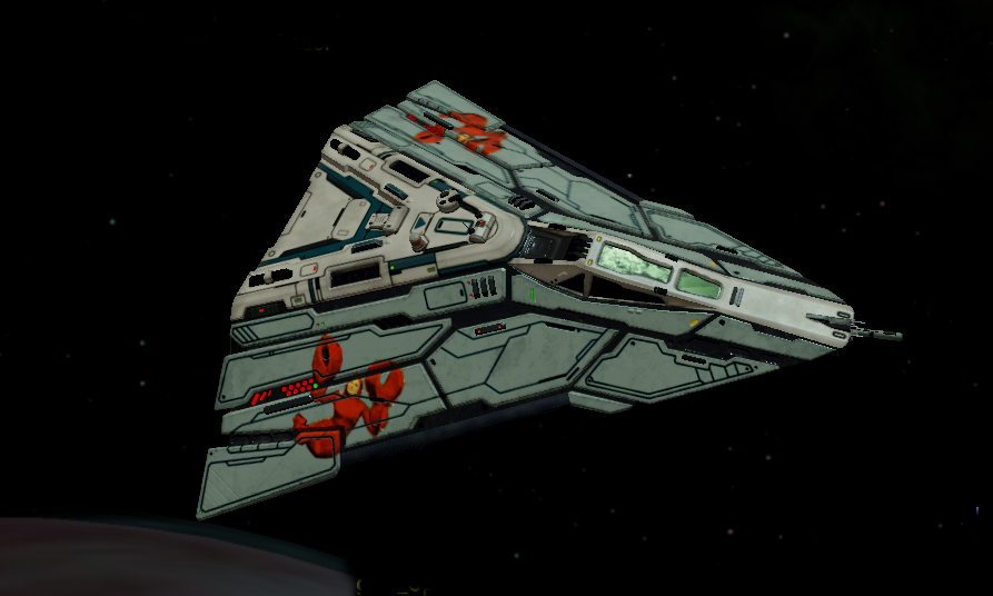
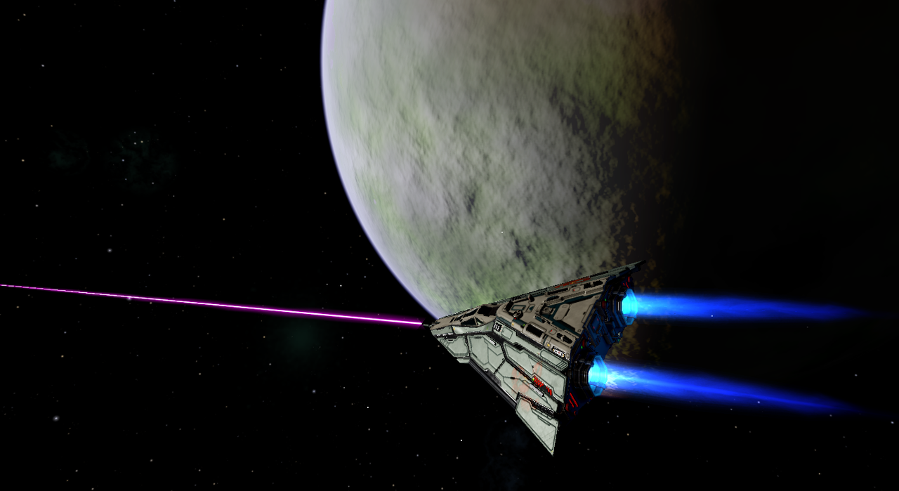
All female vipersquad called 'The Lobstergirls'
- phkb
- Impressively Grand Sub-Admiral

- Posts: 5641
- Joined: Tue Jan 21, 2014 10:37 pm
- Location: Writing more OXPs, because the world needs more OXPs.
Re: Screenshots
Re: Screenshots
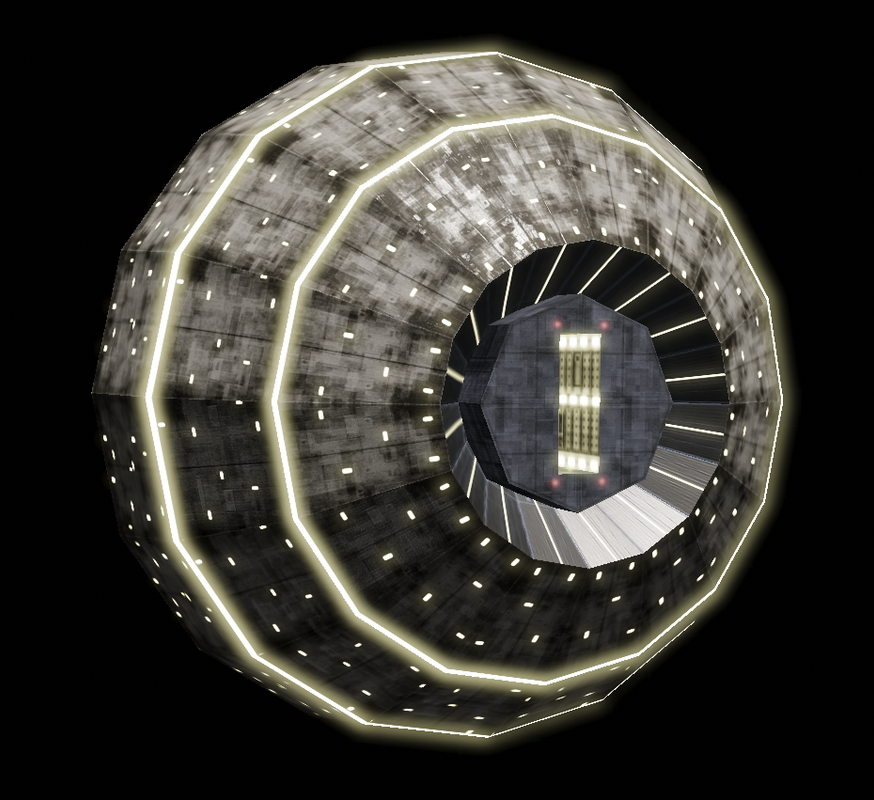
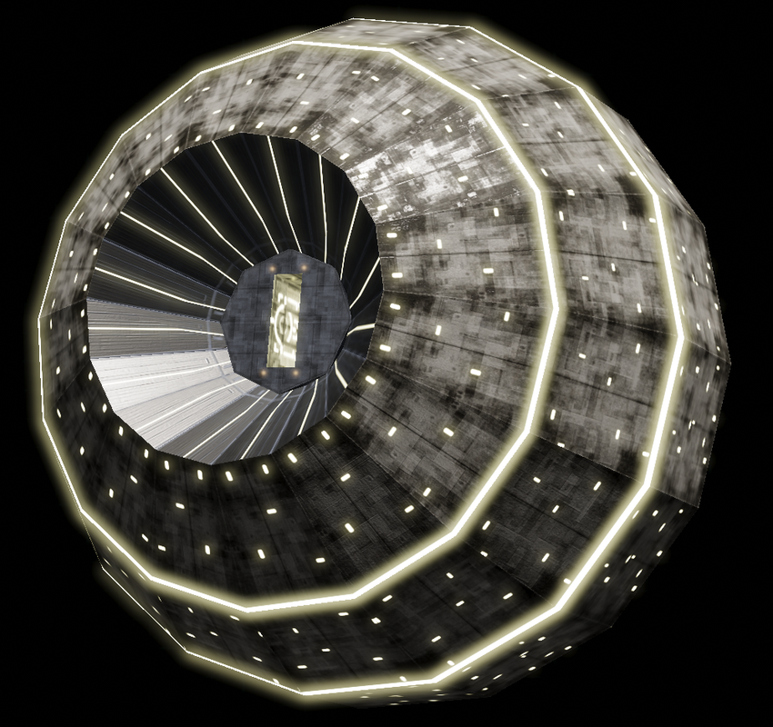
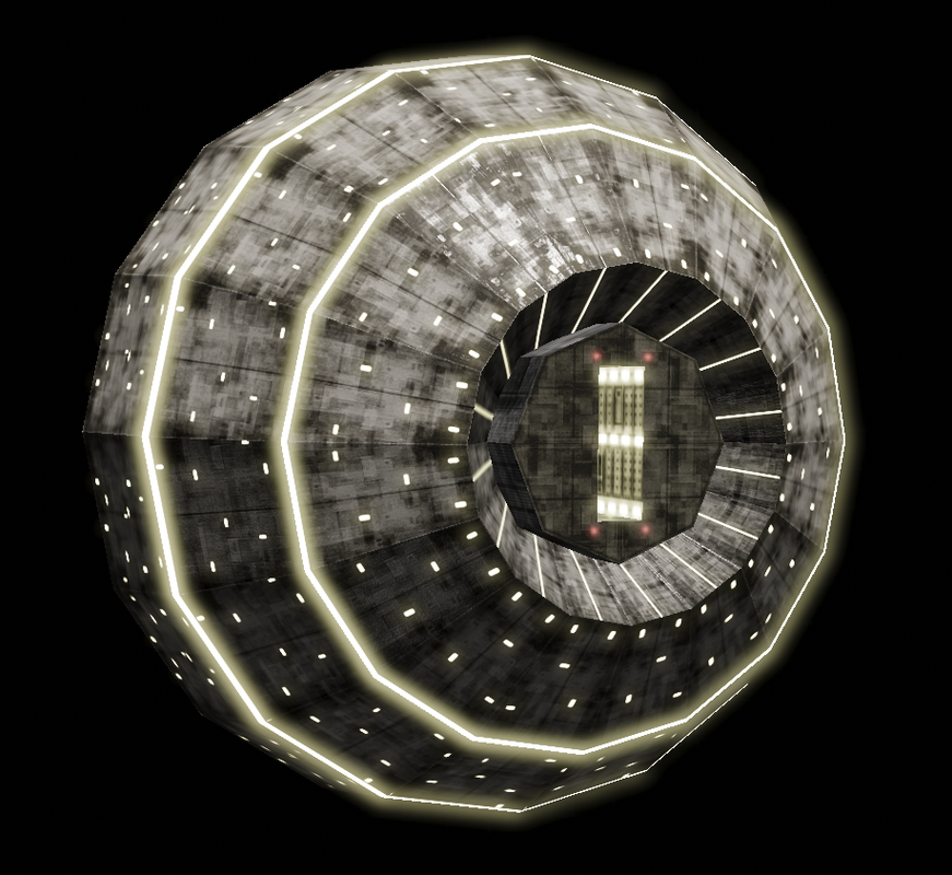
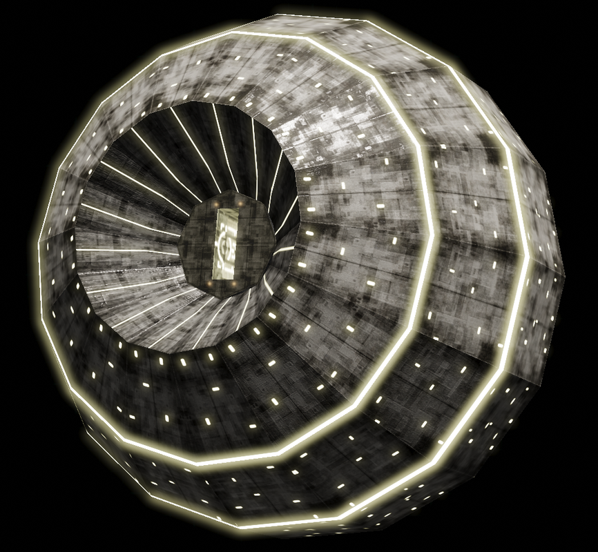
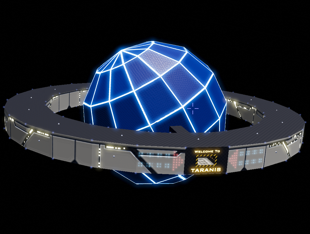
Those Globe Stations look vastly better than the ones I've got in my game!
- Redspear
- ---- E L I T E ----

- Posts: 2900
- Joined: Thu Jun 20, 2013 10:22 pm
- Location: On the moon Thought, orbiting the planet Ignorance, looking through a telescope with the lens cap on
Re: Screenshots
Outside and glows look great IMHO.
the area surrounding the docking port however looks a bit too much like a photographer's umbrella I think.
Perhaps a darker version of your texture for the outer areas could be employed there (maybe minus the 'lights')?
the area surrounding the docking port however looks a bit too much like a photographer's umbrella I think.
Perhaps a darker version of your texture for the outer areas could be employed there (maybe minus the 'lights')?
Re: Screenshots
outer skin, great!
Perhaps slighty overlaying part of the outerskin texture over the umbrella part ( 30a40 % transparancy )
Make the grey docking area more (a)like the outerskin tint/color
Enlarge the emission map >=200% and reduce the light size to give a better impression of scale/size
Re: Screenshots
While we're at it, a bigger docking bay entrance would be nice too.
Non-enhanced Boa 2's are better off docking sideways!
Yes to more places to put the semi-big ships!
Non-enhanced Boa 2's are better off docking sideways!
Yes to more places to put the semi-big ships!
- Cholmondely
- Archivist

- Posts: 6582
- Joined: Tue Jul 07, 2020 11:00 am
- Location: The Delightful Domains of His Most Britannic Majesty (industrial? agricultural? mainly anything?)
- Contact:
Re: Screenshots
I concur!
Comments wanted:
•Missing OXPs? What do you think is missing?
•Lore: The economics of ship building How many built for Aronar?
•Lore: The Space Traders Flight Training Manual: Cowell & MgRath Do you agree with Redspear?
•Missing OXPs? What do you think is missing?
•Lore: The economics of ship building How many built for Aronar?
•Lore: The Space Traders Flight Training Manual: Cowell & MgRath Do you agree with Redspear?
- phkb
- Impressively Grand Sub-Admiral

- Posts: 5641
- Joined: Tue Jan 21, 2014 10:37 pm
- Location: Writing more OXPs, because the world needs more OXPs.
Re: Screenshots
Cholmondely wrote: ↑Mon Oct 30, 2023 5:28 pmWhile we're at it, a bigger docking bay entrance would be nice too.
Alas, my skills don't come to changing the model. Messing about with textures is about all I can do!
- phkb
- Impressively Grand Sub-Admiral

- Posts: 5641
- Joined: Tue Jan 21, 2014 10:37 pm
- Location: Writing more OXPs, because the world needs more OXPs.
Re: Screenshots
Re: Screenshots
very nice !
Re: Screenshots
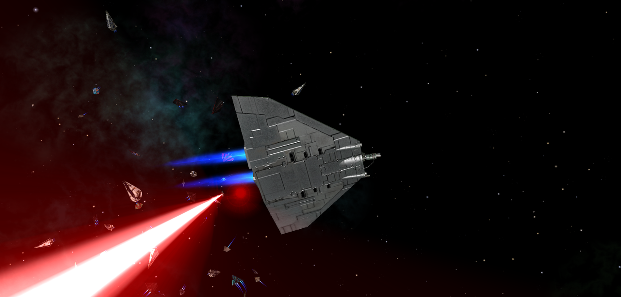
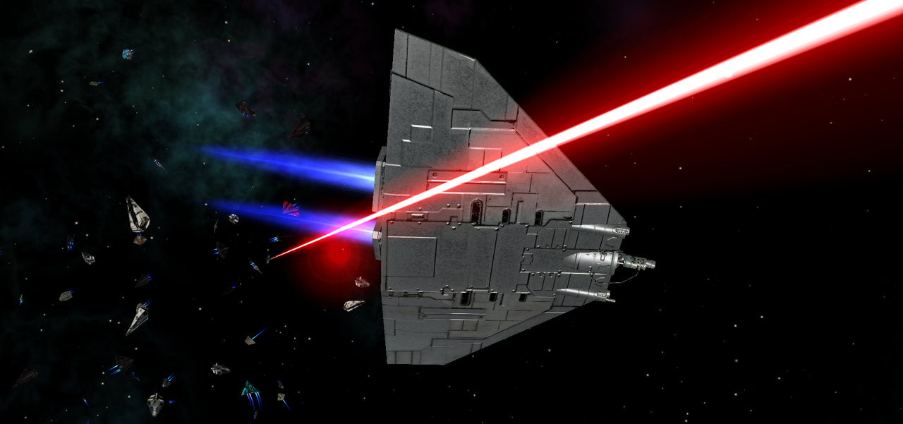
And the conclusion, press space...
