Page 437 of 474
Re: Screenshots
Posted: Sun Aug 27, 2023 7:32 pm
by another_commander
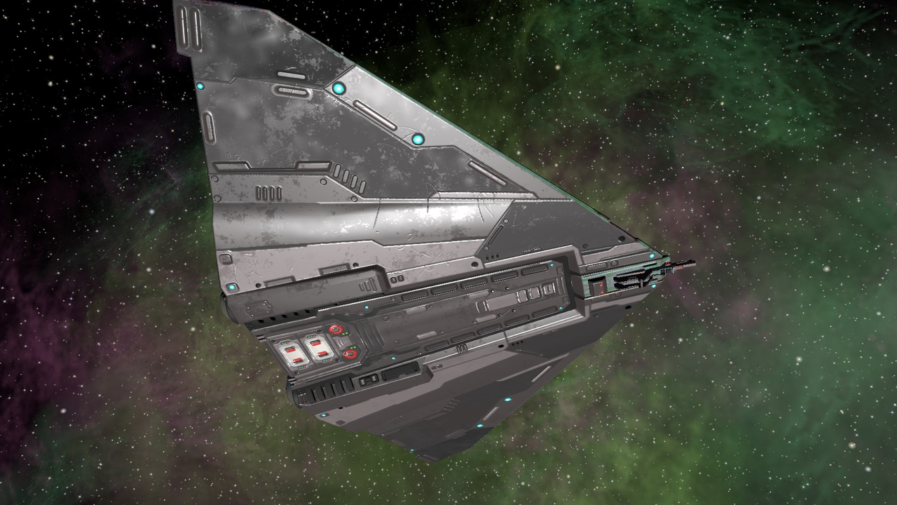
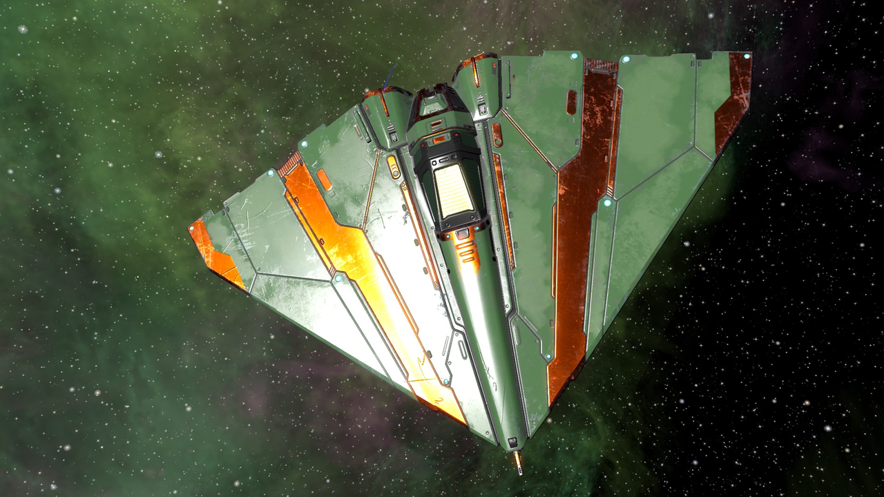
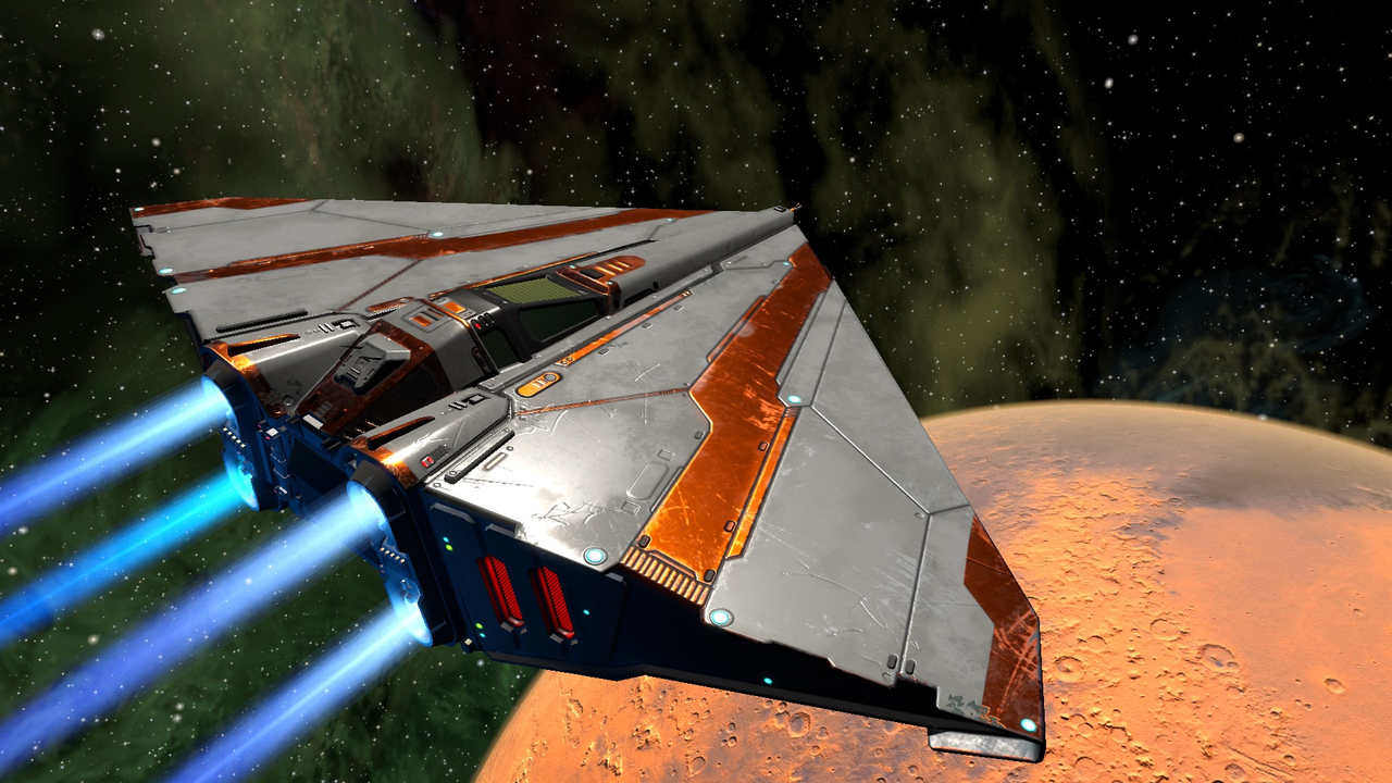
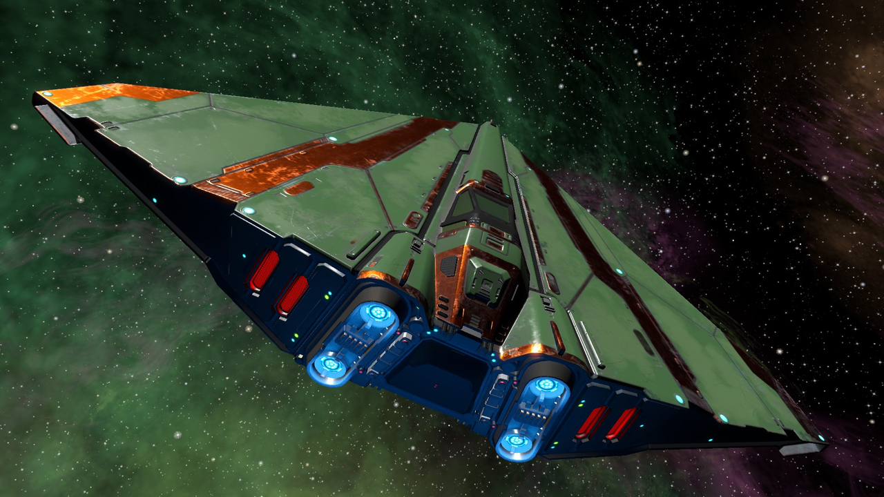
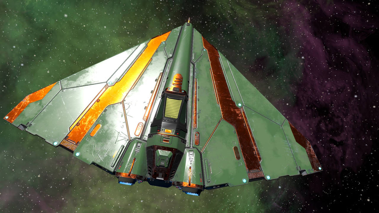
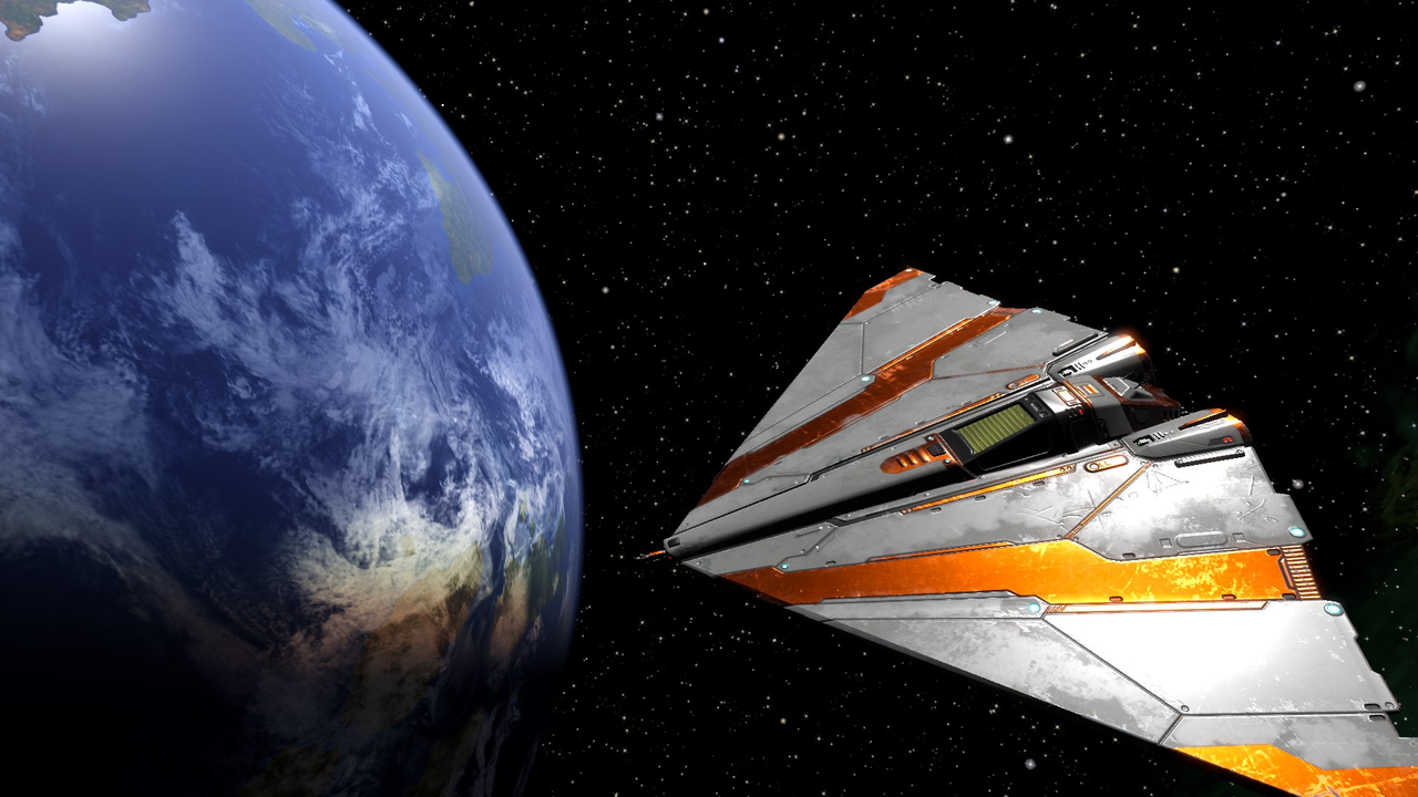
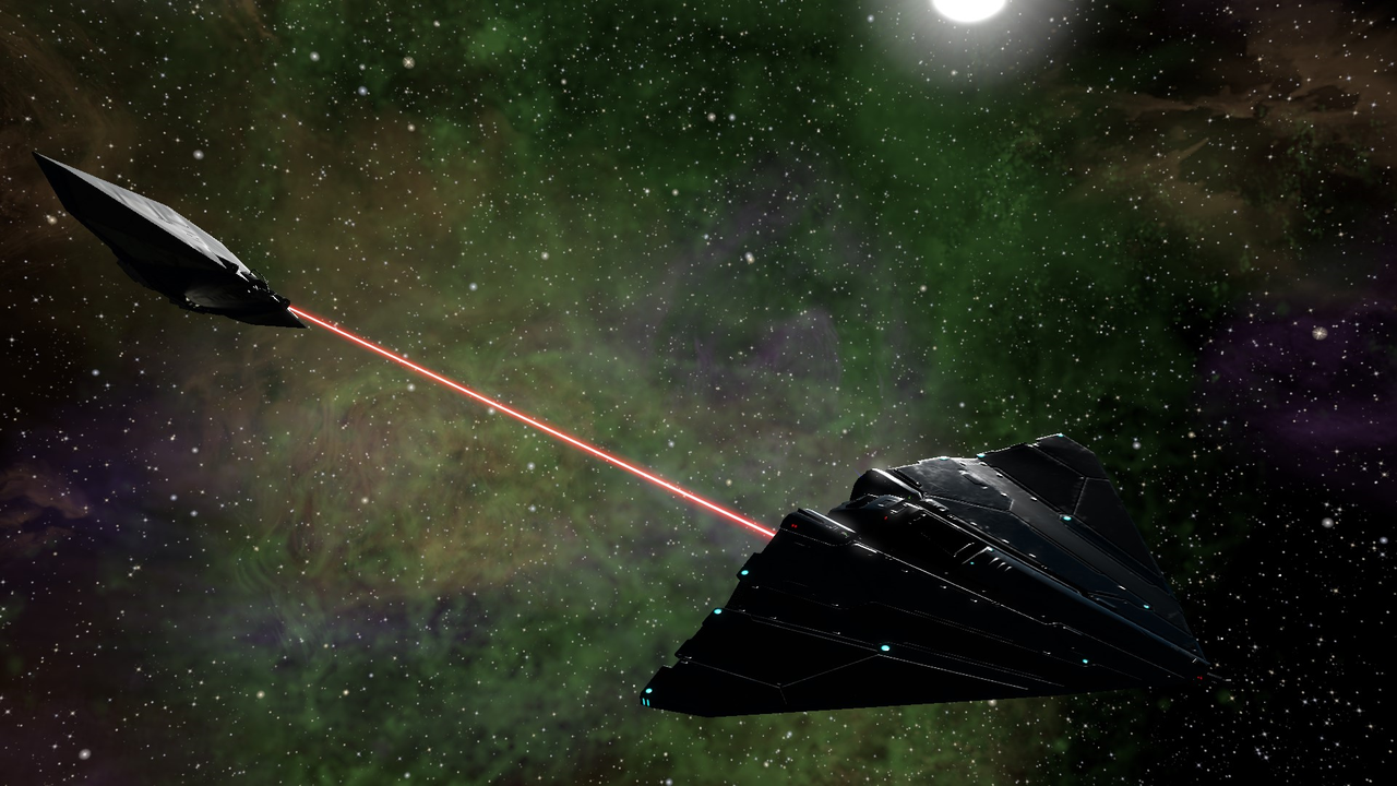
Heads up! Phenomenal new ship from Griff incoming. This is the Gecko and words can't describe it. Pics can so here you go:
And for those with HDR screen output capailities, the source hdr format files can be downloaded from
https://drive.google.com/file/d/1ln9C-- ... sp=sharing so that you can view it in its full glory.
Re: Screenshots
Posted: Sun Aug 27, 2023 7:42 pm
by another_commander
Re: Screenshots
Posted: Sun Aug 27, 2023 7:56 pm
by hiran
Looks great!
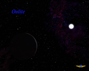
Could someone check the Oolite logo? Somehow when placing this together with one of the current screenshots it seems so outdated...

Re: Screenshots
Posted: Sun Aug 27, 2023 8:55 pm
by Cody
That logo was the reason I changed my splashscreen.
Re: Screenshots
Posted: Sun Aug 27, 2023 10:04 pm
by Redspear
hiran wrote: ↑Sun Aug 27, 2023 7:56 pm
Could someone check the Oolite logo? Somehow when placing this together with one of the current screenshots it seems so outdated...
I think the colours very much matched the aesthetic of the original shipset , much less now of course.
I quite like the icon itself but maybe repainted and/or made to appear 3D?
Re: Screenshots
Posted: Sun Aug 27, 2023 10:29 pm
by hiran
Redspear wrote: ↑Sun Aug 27, 2023 10:04 pm
hiran wrote: ↑Sun Aug 27, 2023 7:56 pm
Could someone check the Oolite logo? Somehow when placing this together with one of the current screenshots it seems so outdated...
I think the colours very much matched the aesthetic of the original shipset , much less now of course.
I quite like the icon itself but maybe repainted and/or made to appear 3D?
Yes, that might be sufficient. Although I am far from being an expert in that area.
Re: Screenshots
Posted: Mon Aug 28, 2023 8:26 am
by Redspear
hiran wrote: ↑Sun Aug 27, 2023 10:29 pm
Although I am far from being an expert in that area.
Likewise sadly...
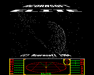
The original elite logo was 3D and also silver/gold (depending upon which version/document). Thinking some more, the 3D aspect probably suited the artwork better than it does an icon.
I do think it's easy to overdo it however. There's a lot to be said for a simple, easily recognisable logo over an elaborate one.
FWIW, I'm quite happy with the current logo but...
There was a BBC loading screen that was essentially Saturn with it's rings tilted to a diagonal and 'Elite' emblazoned above it. That's an iconic shape we could colour/shade however and it would likely remain so. Stick the word 'oolite' above or below (perhaps below the top half of Saturn, no need to display all of it) and we wouldn't even have the issue of colours competing with the text.
That would still be a nod to the game's inspiration and a distinctive but still readable logo.
Re: Screenshots
Posted: Mon Aug 28, 2023 9:25 am
by Cody
Redspear wrote: ↑Mon Aug 28, 2023 8:26 amThere was a BBC loading screen that was essentially Saturn with it's rings tilted to a diagonal and 'Elite' emblazoned above it.
Not this one, was it?
Re: Screenshots
Posted: Mon Aug 28, 2023 9:56 am
by Redspear
Cody wrote: ↑Mon Aug 28, 2023 9:25 am
That's the one.
I'm thinking of the idea, not the dots.
Putting 'oolite' below rather than above would be a good excuse to just show the top half of the planet, as if it were emerging above a horizon... Oh, the poetry

Re: Screenshots
Posted: Mon Aug 28, 2023 11:09 am
by hiran
Cody wrote: ↑Sun Aug 27, 2023 8:55 pm
That logo was the reason I changed my splashscreen.
What did you change to?
Re: Screenshots
Posted: Mon Aug 28, 2023 11:14 am
by hiran
Redspear wrote: ↑Mon Aug 28, 2023 8:26 am
The original elite logo was 3D and also silver/gold (depending upon which version/document). Thinking some more, the 3D aspect probably suited the artwork better than it does an icon.
I do think it's easy to overdo it however. There's a lot to be said for a simple, easily recognisable logo over an elaborate one.
There is a common trend to simple recognizable icons that can be scaled and used on different screen resolutions/platforms.
Overall it is called "Material Design".
Somehow I feel like we could slightly modify such an icon and use it repeatedly to identify Oolite. It would stand for a very simple wireframe model of a Cobra:
https://fonts.google.com/icons?selected ... ry=near_me
it could look similar to this:
What do you think?
Re: Screenshots
Posted: Mon Aug 28, 2023 11:17 am
by Cody
hiran wrote: ↑Mon Aug 28, 2023 11:09 am
This (click to enlarge):
I was going to add a Cobra, but never got around to it.
Re: Screenshots
Posted: Mon Aug 28, 2023 12:25 pm
by Redspear
hiran wrote: ↑Mon Aug 28, 2023 11:14 am
If it's on an angle then I don't think it would scale well.
One way to consider that might be to ask, would it work as an emoji?
Those things have to work at very small size and avoid, by necessity, complexity. The icon we currently have, I think, would just pass that test.
If it were a cobra from above, nose 'up' then it might work but I don't think that hints at very much. I mean that it's both very specific and yet loses clarity in miniature.
Cody's splash screen for example makes a good poster but not such a good icon (which is fine and dandy because it's a splash screen).
The icon we currently have might be quite hard to beat. Throw in the idea of consensus, even with the current size of the community, and it might be sticking around for quite some time.
Re: Screenshots
Posted: Mon Aug 28, 2023 12:32 pm
by hiran
Redspear wrote: ↑Mon Aug 28, 2023 12:25 pm
If it's on an angle then I don't think it would scale well.
One way to consider that might be to ask, would it work as an emoji?
Those things have to work at very small size and avoid, by necessity, complexity. The icon we currently have, I think, would just pass that test.
If it were a cobra from above, nose 'up' then it might work but I don't think that hints at very much. I mean that it's both very specific and yet loses clarity in miniature.
I agree.
Redspear wrote: ↑Mon Aug 28, 2023 12:25 pm
Cody's splash screen for example makes a good poster but not such a good icon (which is fine and dandy because it's a splash screen).
The icon we currently have might be quite hard to beat. Throw in the idea of consensus, even with the current size of the community, and it might be sticking around for quite some time.
The current icon would still have to be reduced. It consumes too many colors that do not add information - and the letters Oolite will be unreadable at the size of an icon/emoji. So it would have to become a simpler black/white shape, which may end up as 'Y'. Would be fine for me.

Re: Screenshots
Posted: Mon Aug 28, 2023 1:22 pm
by Cody
For reference, the Oolite Icon "competition" is
here.