Re: Her Imperial Majesty's Space Navy
Posted: Mon Feb 17, 2014 6:03 pm
I think it's an Oolite function - see cim's post above.Pleb wrote:What OXPs are you running? I don't recognise thethis.__ltcache.oolite_nearestStationfunction...
For information and discussion about Oolite.
https://bb.oolite.space/
I think it's an Oolite function - see cim's post above.Pleb wrote:What OXPs are you running? I don't recognise thethis.__ltcache.oolite_nearestStationfunction...
this.__ltcache is a long-term cache used by priority AIs. It gets cleared every minute or so. Feel free to stick your own bits in there if you prefix them properly. this.__cache is a short-term cache which only lasts the duration of the priority calculation, but that is sometimes useful for values that are somewhat expensive to calculate but might be requested multiple times (e.g. the odds calculation, or whether the ship is currently "in combat")this.__ltcache.oolite_nearestStation contains the identity of the nearest station to the ship, on the assumption that it won't change in an important fashion very often. In a recent nightly build I had used it without first checking that it contained a station (the usual "forget that interstellar space exists"), hence the exception message. That will be fixed in tonight's nightly.








Wow, spoilt for choice!Gimi wrote:Honest opinions please.
I agree that it might get confusing so this sounds like the best idea. Definitely use the Omega symbol for intelligence.Smivs wrote:Wow, spoilt for choice!
It might get confusing if too many are used, and the subtlety may not even be noticed by many, so I'd suggest keeping it simple. I do prefer the planet to the star, so how about the white planet and blue star for the HQ and flagships. The same in black on everything else except black ops which get the black omega.
The bits I want are as follows (that is assuming that it looks good in the end.):Keeper wrote:Like Thargoid said, having each side look different would require a complete re-model. The same bit of texture is applied on both sides, I'm pretty sure.Gimi wrote:Are you familiar with how the Kiota stations are put together? Is this something you could do and give to pleb for incorporation in the OXP?
Painting the things white instead of letting it be metallic is no problem; that's the same as what I've been doing to ships as seen in the HIMSN thread. I'd just need to know which bits you're going to put together so I don't spend time on bits that won't be used. The stations are modular; most of the bits are subentities which you add to the dock.
Still undecided on the logos. There seems to be a split on the planet/sun preference, and also on the background colour. Need to think. (Possibly see a demo on the blue and black background in use).Keeper wrote:I'm partial to the blue background and white planet. I think that would look best on a white ship with blue trim. (The "star" looks almost like a Mandelbrot set image... that might be a cool logo to stick in there, actually.)
Since you mentioned the Constrictor should be black (or near enough to it), I'm thinking the logo would be colourless, like the logos on modern-day stealth aircraft -- black logo on a nearly-black matte finish.
Speaking of the ships, what do you think about having the bottoms of them being painted blue (or at least most of the bottom panels), instead of left as bare metal like most civilian versions are? Also, which Sidewinder do we want? The Scout Ship or the Escort Ship? I want to make sure I create a white version of the correct one... Let me know when you decide on a cruiser model so I can paint it too.
Once we decide on a logo, I can finish these off. I will be updating the Asp to make it whiter and less shiny, in line with the Anaconda picture above. If you want an off-white, i.e. slightly yellow, let me know also so we can come up with a target shade. Right now I'm just eyeballing the blue colours, and the white is completely neutral (other than variances from dirt or effects from the metal on which it is being applied).
I see the omega on the Constrictor and I think "Psi Cop!" The Corps is Mother; The Corps is Father.
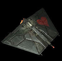
Yes, why is that? You see the bottoms of the ships as much as the tops, so I'd favour white with blue detailing top and bottom.Keeper wrote:Speaking of the ships, what do you think about having the bottoms of them being painted blue (or at least most of the bottom panels), instead of left as bare metal like most civilian versions are?
The stations are designed to be modular, so quite easy to mix and match. Your requirements above look OK, I have had similar running in my ooniverse before. I would recommend to keep them symmetric like that (with the same sub-ents on opposite struts) or else that does look somewhat odd. The only one that won't work is the main HQ with 6 communications sub-ents, as the design is only for 4 (which will work, although again may look a little odd).Gimi wrote:The bits I want are as follows (that is assuming that it looks good in the end.):Keeper wrote:Like Thargoid said, having each side look different would require a complete re-model. The same bit of texture is applied on both sides, I'm pretty sure.Gimi wrote:Are you familiar with how the Kiota stations are put together? Is this something you could do and give to pleb for incorporation in the OXP?
Painting the things white instead of letting it be metallic is no problem; that's the same as what I've been doing to ships as seen in the HIMSN thread. I'd just need to know which bits you're going to put together so I don't spend time on bits that won't be used. The stations are modular; most of the bits are subentities which you add to the dock.
Main HQ: Small habitat station with a communications strut outside that on four or even six sides assuming there is room. Communications is a big thing with the Navy.
System stations: Core + research modules on two struts and communication modules on two struts.
Inter stellar stations: Manufacturing on two struts and communication on two struts.
As for the painting, as long as the main theme is white/whiteish I'll leave it to you to make it look good. If you have to make adjustments to make bump maps, normals and what have you work, that is fine.
+1 from me. The star with the omega sign should be used for something special, but non-secret: having a Black Ops division with its own logo seems a little self-defeating ...Keeper wrote:I'm partial to the blue background and white planet. I think that would look best on a white ship with blue trim.
While I agree, using black on black logos or it's like is common in RL. Also, it's a game, so I have no problems using it if it looks good.Disembodied wrote:Keeper wrote:The star with the omega sign should be used for something special, but non-secret: having a Black Ops division with its own logo seems a little self-defeating ...