But I will take opinions expressed here into account. Especially if you say why you like or dislike a particular entry.Commander McLane wrote:Nope.Commander Ragugaki wrote:Can we cast a vote?aegidian wrote:Post your entries to this topic, and I'll judge a winner on the first of May.
BB Logo competition for v1.75
Moderators: another_commander, winston
-
aegidian

- Master and Commander

- Posts: 1163
- Joined: Thu May 20, 2004 10:46 pm
- Location: London UK
- Contact:
Re: BB Logo competition for v1.75

Re: BB Logo competition for v1.75
OK here's mine then, and apologies to the existing designs so far this is a positive critique.
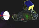
I like the galaxy and Lave local map in the background that is pure Elite, but I'd like to see something more "Oolite" in the picture like a small GriffKrait flying towards a new style Dodo or something. The version with the Cobra is on the right lines, but it's not a very good view of the Cobbie it's too big, it dominates the picture and you can't really see it's a ship unless you already know.
As I said before I think the BB logo should show that the game is based on Elite, but that now it is Oolite and has moved on with better graphics, just having the new Oolite logo and name doesn't give that message. We know there's a whole lot more than just graphics, but you can't get it all into a small banner it's the visuals that are important.
The Grey Haired Commander has spoken!
OK so I'm a PC user - "you know whats scary? Out of billions of sperm I was the fastest"
OK so I'm a PC user - "you know whats scary? Out of billions of sperm I was the fastest"
-
Disembodied

- Jedi Spam Assassin

- Posts: 6885
- Joined: Thu Jul 12, 2007 10:54 pm
- Location: Carter's Snort
Re: BB Logo competition for v1.75
A version with just the logo, the chart and the stars (and hopefully on the right, i.e. correct, side of Riedquat!):

-
CheeseRedux
- ---- E L I T E ----

- Posts: 827
- Joined: Fri Oct 02, 2009 6:50 pm
Re: BB Logo competition for v1.75
Me like.
The inclusion of Zaonce & Tionisla amongst the visible systems is a Good Thing in my book.
The inclusion of Zaonce & Tionisla amongst the visible systems is a Good Thing in my book.
"Actually this is a common misconception... I do *not* in fact have a lot of time on my hands at all! I just have a very very very very bad sense of priorities."
--Dean C Engelhardt
--Dean C Engelhardt
Re: BB Logo competition for v1.75
My favourite so far. The systems are, as has been mentioned earlier in this thread, very recognisable. The Oolite logo has a dominant place as it should, the background is picturesque, yet the whole thing maintains a certain simplicity. Well done Disembodied. If possible, and if you have the time, a wallpaper along the same line would be really nice.Disembodied wrote:A version with just the logo, the chart and the stars (and hopefully on the right, i.e. correct, side of Riedquat!):
Anybody know the name of the font used in Oolite, or the nearest thing.
"A brilliant game of blasting and trading... Truly a mega-game... The game of a lifetime."
(Gold Medal Award, Zzap!64 May 1985).
(Gold Medal Award, Zzap!64 May 1985).


Re: BB Logo competition for v1.75
One other idea - could the game logo be semi-transparent and actually behind the map, as a backdrop?
My thinking is that as the BB logo banner is on top-left of the screen, having the game logo on the right (so inboard on the page) may look a little weird. Having it centralised may help there, and also allow for more info text or whatever to be on both left and right sides.
My thinking is that as the BB logo banner is on top-left of the screen, having the game logo on the right (so inboard on the page) may look a little weird. Having it centralised may help there, and also allow for more info text or whatever to be on both left and right sides.
My OXPs via Boxspace or from my Wiki pages  .
.
Thargoid TV
Dropbox Referral Link
Thargoid TV
Dropbox Referral Link
-
Selezen

- ---- E L I T E ----
- Posts: 2530
- Joined: Tue Mar 29, 2005 9:14 am
- Location: Tionisla
- Contact:
Re: BB Logo competition for v1.75
Ditto.Gimi wrote:My favourite so far.
I agree with Thargoid too. Maybe a semi-transparent logo would be an idea, letting the background show through.
Fantastic design though.
-
Smivs

- Retired Assassin

- Posts: 8408
- Joined: Tue Feb 09, 2010 11:31 am
- Location: Lost in space
- Contact:
Re: BB Logo competition for v1.75
Even as a 'rival bidder' I have to say that is very nice.
Commander Smivs, the friendliest Gourd this side of Riedquat.
-
Disembodied
- Jedi Spam Assassin
- Posts: 6885
- Joined: Thu Jul 12, 2007 10:54 pm
- Location: Carter's Snort
Re: BB Logo competition for v1.75
Semitransparent versions:


I think the logo centred and behind the chart looks a bit lost. As for the other two, it depends, of course, on where you think "this" side of Riedquat is! It might be a shame though if the logo disappears into the background too much.
@Gimi: sadly no wallpapers possible – I'm working on 640 x 192 originals, and can't scale up to wallpaper sizes.
I think the logo centred and behind the chart looks a bit lost. As for the other two, it depends, of course, on where you think "this" side of Riedquat is!
@Gimi: sadly no wallpapers possible – I'm working on 640 x 192 originals, and can't scale up to wallpaper sizes.
-
Cody

- Sharp Shooter Spam Assassin

- Posts: 16081
- Joined: Sat Jul 04, 2009 9:31 pm
- Location: The Lizard's Claw
- Contact:
Re: BB Logo competition for v1.75
Semi-transparent doesn't work for me.
I would advise stilts for the quagmires, and camels for the snowy hills
And any survivors, their debts I will certainly pay. There's always a way!
And any survivors, their debts I will certainly pay. There's always a way!
Re: BB Logo competition for v1.75
Well, I see them fine.
-
CheeseRedux
- ---- E L I T E ----
- Posts: 827
- Joined: Fri Oct 02, 2009 6:50 pm
Re: BB Logo competition for v1.75
I think it looks good, but loses too much visibility, if that made any sense at all.El Viejo wrote:Semi-transparent doesn't work for me.
"Actually this is a common misconception... I do *not* in fact have a lot of time on my hands at all! I just have a very very very very bad sense of priorities."
--Dean C Engelhardt
--Dean C Engelhardt
-
Cody
- Sharp Shooter Spam Assassin
- Posts: 16081
- Joined: Sat Jul 04, 2009 9:31 pm
- Location: The Lizard's Claw
- Contact:
Re: BB Logo competition for v1.75
Give the man a coconut... it makes perfect sense.
I would advise stilts for the quagmires, and camels for the snowy hills
And any survivors, their debts I will certainly pay. There's always a way!
And any survivors, their debts I will certainly pay. There's always a way!
Re: BB Logo competition for v1.75
But giving him a coconut doesn't! 
The Grey Haired Commander has spoken!
OK so I'm a PC user - "you know whats scary? Out of billions of sperm I was the fastest"
OK so I'm a PC user - "you know whats scary? Out of billions of sperm I was the fastest"
-
Cody
- Sharp Shooter Spam Assassin
- Posts: 16081
- Joined: Sat Jul 04, 2009 9:31 pm
- Location: The Lizard's Claw
- Contact:
Re: BB Logo competition for v1.75
Alright... give him a jellybaby.TGHC wrote:But giving him a coconut doesn't!

I would advise stilts for the quagmires, and camels for the snowy hills
And any survivors, their debts I will certainly pay. There's always a way!
And any survivors, their debts I will certainly pay. There's always a way!