Page 5 of 12
Re: [RELEASE] HUD Selector v1.9
Posted: Sat Jan 10, 2015 1:47 pm
by phkb
Thanks for the suggestions everyone! Just going to grab another cookie and go under the hood again!
Re: [Release] HUD Selector v1.9
Posted: Mon Apr 27, 2015 8:36 pm
by Day
Hi Norby,
it's a very fine oxp I use since beginning Oolite. I couldn't do without it!
I've had a bug for a long time: if I dock, save and then relaunch, some mfd, and often all of them are not visible anymore.
If I dock, save, enter the Hud selector in F4, and then relaunch, i've got all of them.
Oolite 1.80 with last Hud selector from the oxz manager.
I've looked a little bit into the code, and come with a lead.
I've changed this:
Code: Select all
this.shipWillLaunchFromStation = function() {
//	log(this.name, "MFDSetup: "+this.$MFDsetup);//debug
//	log(this.name, "DefaultMFDs: "+this.$HUDSelectorDefaultMFDs);//debug
	if(this.$MFDsetup) { //must setup MFDs here and not eralier in startup()
		this.$MFDsetup = false; //do only once after load game or MFD interface
		this.$HUDSelectorSetMFDs(this);
	}
}
to this:
Code: Select all
this.shipWillLaunchFromStation = function() {
//	log(this.name, "MFDSetup: "+this.$MFDsetup);//debug
//	log(this.name, "DefaultMFDs: "+this.$HUDSelectorDefaultMFDs);//debug
	if(this.$MFDsetup) { //must setup MFDs here and not eralier in startup()
		this.$MFDsetup = false; //do only once after load game or MFD interface
	}
	this.$HUDSelectorSetMFDs(this);
}
and now it seems to work.
What do you think?
Re: [Release] HUD Selector v1.10
Posted: Mon Apr 27, 2015 9:54 pm
by Norby
Thank you Day, I put your change into the new v1.10. In addition interfaces use background from BGS if installed.
The goal of the quoted code was exactly the avoid of unneccessary setup if nothing is changed and save a few ms at launch, but if a HUD remove MFDs in the dock (maybe a custom docked plist has too few MFDs) then really need setup again at launch.
Which HUD do you use?
Re: [Release] HUD Selector v1.10
Posted: Tue Apr 28, 2015 5:25 am
by Day
Glad to have been of help

I used Coluber and now Nova.
I had the problem on both.
maybe a custom docked plist has too few MFDs
I don't set all the MFD emplacements, two of them are set on "undefined". Is that what you mean ?
Re: [Release] HUD Selector v1.10
Posted: Tue Apr 28, 2015 11:24 am
by Norby
Day wrote:I don't set all the MFD emplacements, two of them are set on "undefined". Is that what you mean ?
No, should work regardless of your settings with the mentioned HUDs. Your report is well-founded, thank you!
Re: [Release] HUD Selector v1.10
Posted: Tue Apr 28, 2015 12:02 pm
by Day
You're welcome ^^
Re: [Release] HUD Selector v1.11
Posted: Sun May 17, 2015 10:52 pm
by Norby
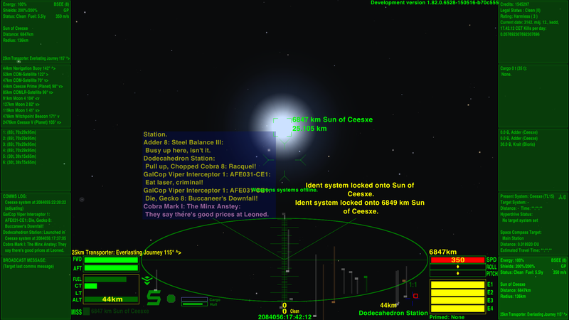
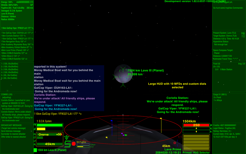
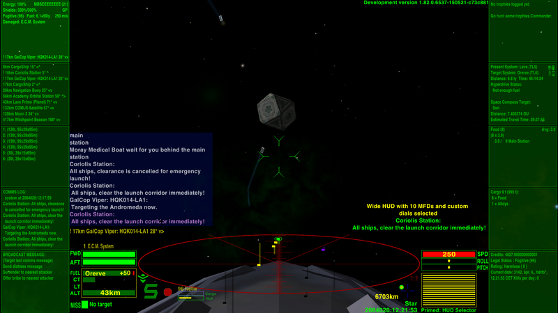
HUD Selector v1.11 introduce
Large HUD with 10 MFDs, custom dials like speed value if [wiki]CombatMFD[/wiki] is installed and a very large, alert sensitive scanner:


Both 4:3 and 16:9 displays are supported, but in 4:3 "only" 8 MFDs are usable:

Re: [Release] HUD Selector v1.11
Posted: Thu May 21, 2015 6:26 pm
by Anonymissimus
I followed your suggestion of trying LargeHUD and decided that it has enough pros over my previous HUD for using it for now.
But the "needed fuel indicator" seems to miss, even if a target system is set. That line in the fuel meter indicating the fuel needed for the next jump step, turning red if the fuel is insufficient.
Re: [Release] HUD Selector v1.12
Posted: Thu May 21, 2015 10:49 pm
by Norby
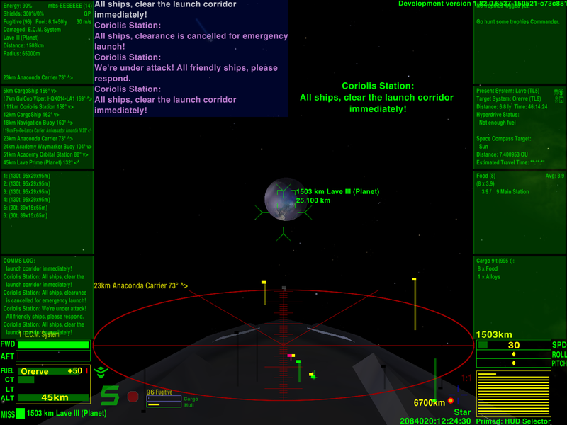
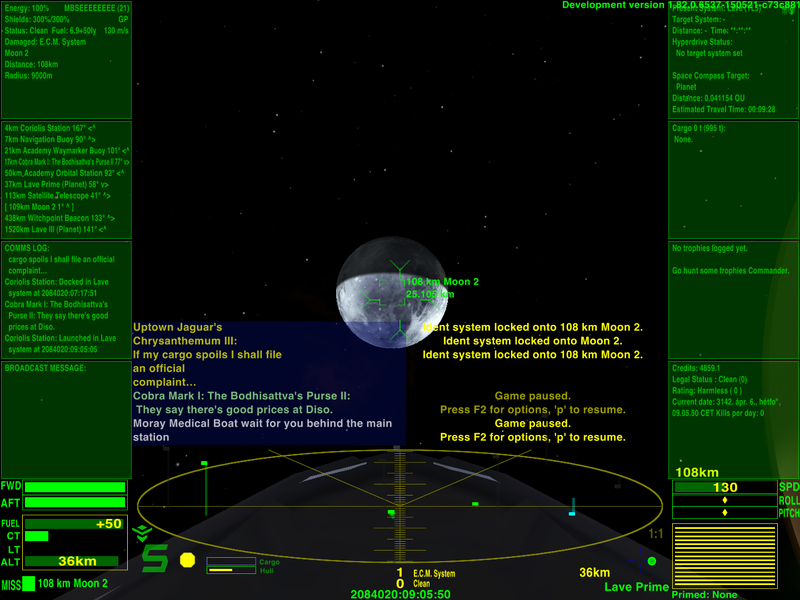
Thank you, I fixed the fuel indicator in v1.12 and polished further:
-messages and comms boxes are wider and aligned to the sides in 16:9,
-reduced scanner height for better aspect ratio and more room above.
Just before a successful landing at full injector speed.

Re: [Release] HUD Selector v1.12
Posted: Thu May 21, 2015 11:59 pm
by Anonymissimus
I wonder whether the probably most characteristical aspect of the HUD - the large scanner - can be made more useful by repositioning the elements below ?
There's unused space to both sides of the clock, and damaged equiment doesn't need to be on top of the clock. The legal status and bounty may be sacrificial elements, as they are displayed in the combat MFD as well. The scanner could be a centimeter larger vertically in my current view.
Re: [Release] HUD Selector v1.12
Posted: Fri May 22, 2015 12:34 am
by Norby
Imho the space below the scanner is a good thing, the lollipops need it to extend. In
NumericHUD the scanner is positioned to the bottom but I often missed the marks of ships behind and below me. I felt as if I have a blind spot when almost the whole lollipop was out of screen what I would like to avoid here. The additional elements just utilize this space second time and make it less empty in general.
Re: [Release] HUD Selector v1.12
Posted: Fri May 22, 2015 4:00 pm
by Anonymissimus
I didn't consider the lollipops moving out of the winow range, so, yes, you are probably right.
EDIT
What is useful_MFD_general_info or what addon does it come with ?
Re: [Release] HUD Selector v1.13
Posted: Sat May 23, 2015 3:03 am
by Norby
Anonymissimus wrote:What is useful_MFD_general_info or what addon does it come with ?
Check the
Useful MFD topic.
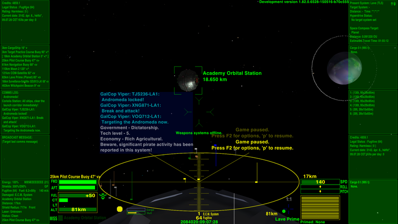
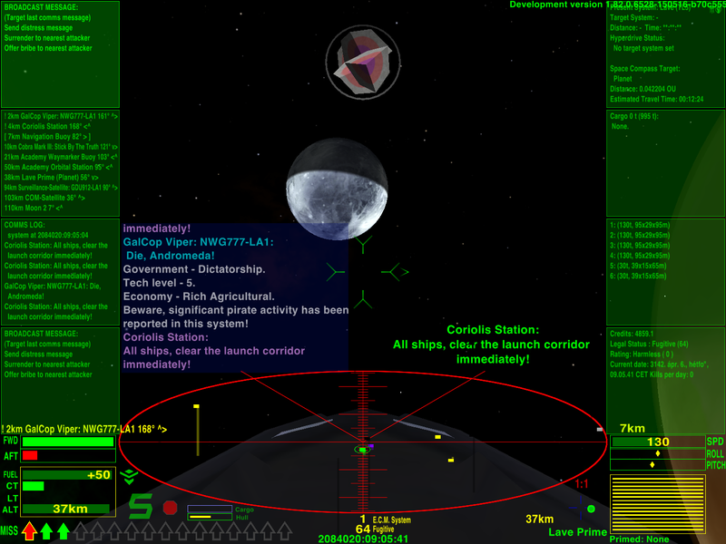
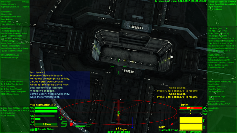
In v1.13 the previous versions of Large HUD are available again as Wide HUD and XL HUD.
-Large HUD is optimized for 16:10 screens, scanner is narrower to fit 10 MFDs.
-Wide HUD is a polished variant of the previous Large HUD for 16:9 screens.
-XL HUD is a polished variant of the Large HUD from v1.11 with very large scanner.
-Clock and custom dials are repositioned from bottom center to leave the room to lollipops.
Large HUD on 16:10 screen:
 Wide HUD
 on 16:9 screen (4:3 is usable also with 8 MFDs):
 XL HUD
 on 4:3 screen with 8 MFDs (16:9 provide 10 MFDs):

Re: [Release] HUD Selector v1.13
Posted: Sat May 23, 2015 5:02 pm
by Anonymissimus
The fuel indicator is missing again in XL HUD, in 16:10 at least.
There shouldn't be so many versions, if anything, give them names that are more descriptive. So many versions are too complicated for you to maintain, see the indicator bug. I was using LargeHUD on 16:10 anyway; the cargo MFG can be placed into the bottom left corner, some overlapping is no problem then.
Re: [Release] HUD Selector v1.14
Posted: Sun May 24, 2015 1:33 pm
by Norby
Thank you for the feedback, now in v1.14:
-ExtraLarge HUD is the new name of XL HUD.
-Removed Original HUD and Wide HUD in favor of Large HUD and ExtraLarge HUD.
-Fixed fuel indicator in ExtraLarge HUD.
-Small HUD got alert sensitive scanner.
