Screenshots
Moderators: another_commander, winston
-
Getafix

- Quite Grand Sub-Admiral

- Posts: 979
- Joined: Tue Apr 01, 2008 12:55 pm
- Location: A small ice asteroid, orbiting Oresrati in Galaxy 8 (a.k.a. northwest Armorica).
- Contact:
Re: Screenshots
"Any sufficiently advanced information is indistinguishable from noise." [Newman, Lachmann, Moore]

Re: Screenshots
How cool is that  You could have ads in front of the docking bay

-
Paladin Tux

- Competent

- Posts: 57
- Joined: Sat Jan 03, 2015 2:32 am
- Location: Middle of Nowhere, Nowhere
Re: Screenshots
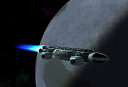
Being an “unflagging patron” of Her Majesty’s Space Navy I thought I’d haul over to the local Seccom at Rigebi in Chart 2. Ready to grab as much free fuel and cheap repairs as I could fit, when I arrived, I was greeted by...some of the Rigebians more...’non-standard’ construction practises...
https://drive.google.com/open?id=1c8vrx ... SfKWkdbvwz_

https://drive.google.com/open?id=1c8vrx ... SfKWkdbvwz_
Now with 100% less Wonderworm!
-
spud42
- ---- E L I T E ----

- Posts: 1600
- Joined: Wed Mar 26, 2014 10:11 am
- Location: Brisbane,Australia
Re: Screenshots
link is not valid Tux..
Arthur: OK. Leave this to me. I'm British. I know how to queue.
OR i could go with
Arthur Dent: I always said there was something fundamentally wrong with the universe.
or simply
42
OR i could go with
Arthur Dent: I always said there was something fundamentally wrong with the universe.
or simply
42
-
Disembodied

- Jedi Spam Assassin

- Posts: 6885
- Joined: Thu Jul 12, 2007 10:54 pm
- Location: Carter's Snort
-
another_commander
- Quite Grand Sub-Admiral
- Posts: 7188
- Joined: Wed Feb 28, 2007 7:54 am
-
Getafix
- Quite Grand Sub-Admiral
- Posts: 979
- Joined: Tue Apr 01, 2008 12:55 pm
- Location: A small ice asteroid, orbiting Oresrati in Galaxy 8 (a.k.a. northwest Armorica).
- Contact:
Re: Screenshots
You've just had a "Cody" moment. 
"Any sufficiently advanced information is indistinguishable from noise." [Newman, Lachmann, Moore]
-
Cody

- Sharp Shooter Spam Assassin

- Posts: 16081
- Joined: Sat Jul 04, 2009 9:31 pm
- Location: The Lizard's Claw
- Contact:
Re: Screenshots
Oi! Come back here with my moment!
I would advise stilts for the quagmires, and camels for the snowy hills
And any survivors, their debts I will certainly pay. There's always a way!
And any survivors, their debts I will certainly pay. There's always a way!
-
Redspear
- ---- E L I T E ----
- Posts: 2900
- Joined: Thu Jun 20, 2013 10:22 pm
- Location: On the moon Thought, orbiting the planet Ignorance, looking through a telescope with the lens cap on
Re: Screenshots
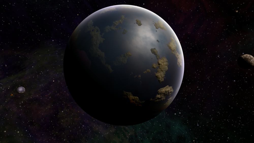
Is it the lighting or are some continents (e.g. on the left of the image) a little less rocky than others?
If not the lighting then I very much approve - otherwise it's oceans and high mountain ranges only...
If that's a default planet texture then I think it's the best one I've seen (kudos to the dev team).
Very much looking forward to trying out 1.88, thanks for all your hard work!
If not the lighting then I very much approve - otherwise it's oceans and high mountain ranges only...
If that's a default planet texture then I think it's the best one I've seen (kudos to the dev team).
Very much looking forward to trying out 1.88, thanks for all your hard work!
-
another_commander
- Quite Grand Sub-Admiral
- Posts: 7188
- Joined: Wed Feb 28, 2007 7:54 am
Re: Screenshots
Some continents are less rocky than others. Here is the comparison. One part of the planet looks like this up close:
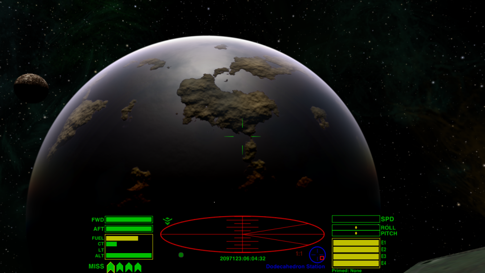
A bit further down, it looks like this:
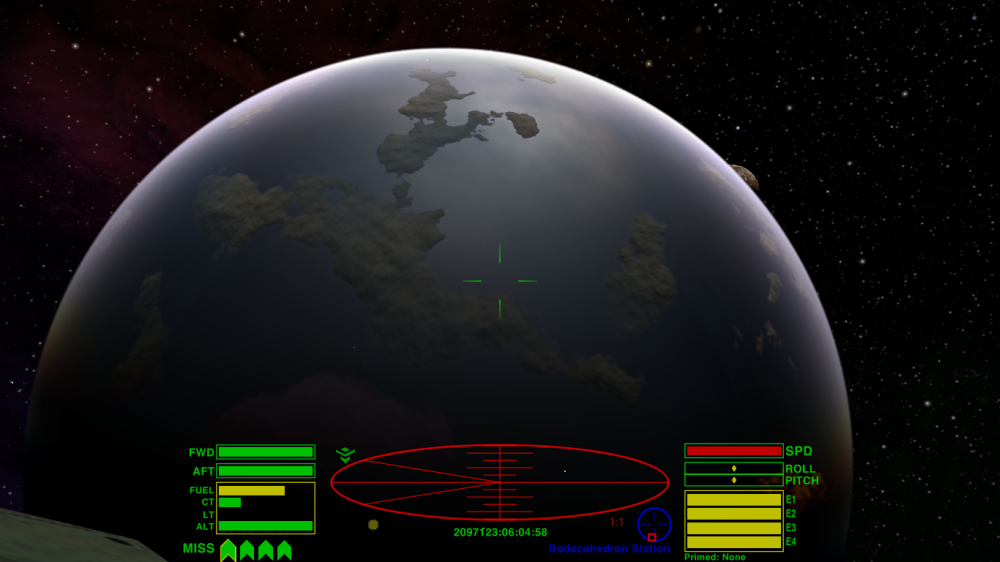
Thanks and yes, it is the default planet texture of Maraus, G7, in case you would want to check it out.If that's a default planet texture then I think it's the best one I've seen (kudos to the dev team).
Very much looking forward to trying out 1.88, thanks for all your hard work!
-
Cody
- Sharp Shooter Spam Assassin
- Posts: 16081
- Joined: Sat Jul 04, 2009 9:31 pm
- Location: The Lizard's Claw
- Contact:
Re: Screenshots
Are those the default cloud settings, A_C?
I would advise stilts for the quagmires, and camels for the snowy hills
And any survivors, their debts I will certainly pay. There's always a way!
And any survivors, their debts I will certainly pay. There's always a way!
-
another_commander
- Quite Grand Sub-Admiral
- Posts: 7188
- Joined: Wed Feb 28, 2007 7:54 am
-
Redspear
- ---- E L I T E ----
- Posts: 2900
- Joined: Thu Jun 20, 2013 10:22 pm
- Location: On the moon Thought, orbiting the planet Ignorance, looking through a telescope with the lens cap on
Re: Screenshots
That looks better to my eyes, still rocky but much less jarring
-
another_commander
- Quite Grand Sub-Admiral
- Posts: 7188
- Joined: Wed Feb 28, 2007 7:54 am
Re: Screenshots
New lighting isn't just for shinies… Here is an Asp that has seen a LOT of combat in its days...
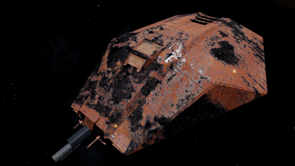
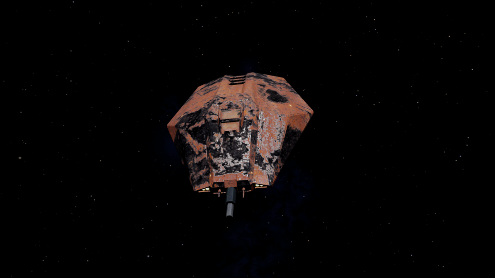
Scarred and rusty, with bare metal showing under the destroyed paintjob. Done using diffuse, specular+gloss and normal maps.
Edit: I just realized that the spec/gloss map used in the pics above was 512x512, while all other textures were 2048x2048. Apologies for the low quality spec, here are some new pics with the correct size spec/gloss map:
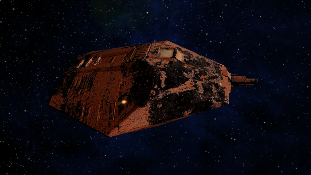
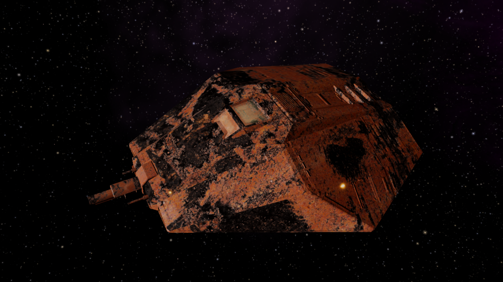
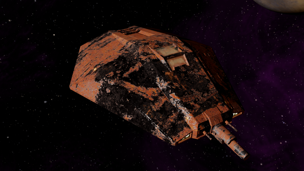
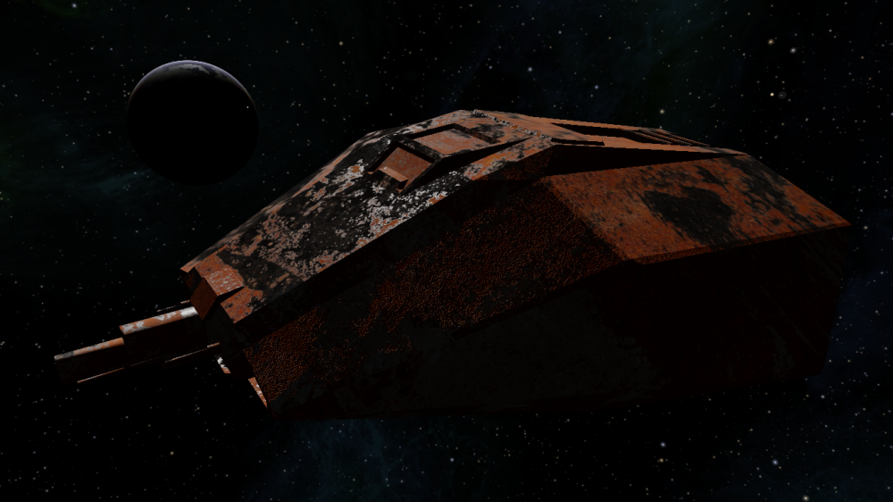
D/L link for anyone wishing to play with these textures: https://drive.google.com/open?id=1w9tAE ... IsUqU1zVgf (modified from this original material).
Scarred and rusty, with bare metal showing under the destroyed paintjob. Done using diffuse, specular+gloss and normal maps.
Edit: I just realized that the spec/gloss map used in the pics above was 512x512, while all other textures were 2048x2048. Apologies for the low quality spec, here are some new pics with the correct size spec/gloss map:
D/L link for anyone wishing to play with these textures: https://drive.google.com/open?id=1w9tAE ... IsUqU1zVgf (modified from this original material).