RFC: Fancy classics
Moderators: another_commander, winston
- DaddyHoggy
- Intergalactic Spam Assassin

- Posts: 8515
- Joined: Tue Dec 05, 2006 9:43 pm
- Location: Newbury, UK
- Contact:
In the UK its even more subtle - "Highways Agency" vehicles are painted up in almost exactly the same colours are Police Cars - but they're not the police - but they do make people slow down until they get close enough to read "Highways Agency" on the back instead of "Police" 


Oolite Life is now revealed hereSelezen wrote:Apparently I was having a DaddyHoggy moment.
- Selezen
- ---- E L I T E ----

- Posts: 2530
- Joined: Tue Mar 29, 2005 9:14 am
- Location: Tionisla
- Contact:
Paramedics are even more sneaky...they have the same cars as police highway patrol cars and a similar scheme!
it's called the Battenburg scheme, if anyone's interested. Here's a wikipedia article on it!
http://en.wikipedia.org/wiki/Battenburg_markings
it's called the Battenburg scheme, if anyone's interested. Here's a wikipedia article on it!
http://en.wikipedia.org/wiki/Battenburg_markings
You think you're joking! Why do you think I'm messing about with Oolite?Wolfwood wrote:Do Nossex next!CaptKev wrote:Here's the Sussex version of the GalCop viper
Sorry, bad one... Had a long day at work...
If you want a laugh here it is

Download Fighter HUD, Stingray and System Redux from the EliteWiki
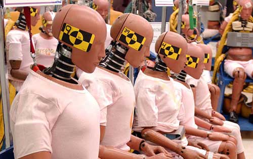
not sure why you would pick that color scheme for a car
since it looks like a crash test vehicle to me...

since it looks like a crash test vehicle to me...

Bounty Scanner
Number 935
Number 935
just a random google picture...
mayhaps chess like this.. although i like the pack better than the wrapping...

I think it is little kittys, perfect for a certain trumble sales person... , allthough i think that very persons logo should be...

mayhaps chess like this.. although i like the pack better than the wrapping...

I think it is little kittys, perfect for a certain trumble sales person... , allthough i think that very persons logo should be...
Bounty Scanner
Number 935
Number 935
- wackyman465
- ---- E L I T E ----

- Posts: 831
- Joined: Thu Nov 06, 2008 10:15 pm
- Location: Currently hunting you down in an Imperial Courier
Boston mayhaps, or are you throwing in rogue filenames?
My OXPs via Boxspace or from my Wiki pages  .
.
Thargoid TV
Dropbox Referral Link
Thargoid TV
Dropbox Referral Link
- Cmd. Cheyd
- ---- E L I T E ----

- Posts: 934
- Joined: Tue Dec 16, 2008 2:52 pm
- Location: Deep Horizon Industries Manufacturing & Research Site somewhere in G8...
- Simon B
- ---- E L I T E ----

- Posts: 836
- Joined: Thu Oct 23, 2008 5:54 am
- Location: Red Beach NZ
- Contact:
@Frame: the livery is actual police livery and there is a link to an article about why one would choose this.
The whole police livery stuff started because certain persons felt that police vehicles should be serious and formal and boring :P
@Everyone
I notice that there is a mismatch across the top. If you look at the UVmap, you can see why - I can stitch the tops together if people want - though that may annoy people who have already worked hard on alternate skins.
If I fix up the uv-map, I'll need the blue-square livery pattern that kicked all this off.
... on the textures:
Almost all the textures use flat-panel uv-maps which have unstiched boundaries. This will create mismatches and seems in some places, but avoids distortion elsewhere.
1-2 pixel mismatches are easy to fix. So I need to know about them.
The question is - do you want more sophisticated mappings? eg - I can make things seamless across panels and put more work into large contiguous areas. This will make large detailed liveries easier to paint.
I need to know now: before too many alternate skins come available.
There is another issue - which will come to a head at the 1.0 release (when shaders are done - soon, my pets... soon :> ... it's slow going, largely through being very boring.)
The issue is this: I could produce low-res textures for shaded editions ... this will conserve RAM. However, detail - such as hull markings - become terribly distorted.
Griff solves this using a seperate layer for decals, and making the decals large and simple. It may be possible to apply hi-res decals for small areas - not looked into it - perhaps using an offset against the diffuse map. But this is extra work.
Right now - policy is to use the same texture for shaded and non-shaded versions, but coding to allow a change if it becomes desirable.
On the cop textures:
I can do my own yellow and blue ones, and it would be cool to do a galactic empire, or commonwealth, sometime ... later.
I'd like to get hold of the original liveries, as separate layers, which kicked the whole thing off.
Labourers wanted: It occurs to me that I can farm out some of the donkeywork.
If you want to try your hand at helping with normal maps, I need a greyscale png image ... white=highest, black=lowest, as a height-map. Just draw over the textures you have and send to me.
I'm doing them alphabetically - so if you start at he other end...
It needn't be great or complex - I can tidy it up or fix the relative heights or whatever.
Simon Bridge
[re2dux] [neolite]
"Everything is perfect down to every last flaw..."
HBT: The Book of Verse - Principia Discordia
[re2dux] [neolite]
"Everything is perfect down to every last flaw..."
HBT: The Book of Verse - Principia Discordia
- Simon B
- ---- E L I T E ----

- Posts: 836
- Joined: Thu Oct 23, 2008 5:54 am
- Location: Red Beach NZ
- Contact:
Shader help wanted:
I have a problem with the lighting - look:

... what causes this?
The top of the skiff has the same angle as the top of the main hull, so it should have the same lighting. I have the same problem with the Boa, but other multi-model ships don't seem to be affected. But that may not show up on the smaller models. Something to do with the skins?
I need a closer look.
... I cannot see any particular difference apart from the skiff having a much higher resolution skin than the body: tho skins are all 512x512, but the body skin has to cover a greater area in square meters.
Simon Bridge
[re2dux] [neolite]
"Everything is perfect down to every last flaw..."
HBT: The Book of Verse - Principia Discordia
[re2dux] [neolite]
"Everything is perfect down to every last flaw..."
HBT: The Book of Verse - Principia Discordia
- Simon B
- ---- E L I T E ----

- Posts: 836
- Joined: Thu Oct 23, 2008 5:54 am
- Location: Red Beach NZ
- Contact:
Well .. meantime - here's another update on normalmap progress:

The top face still looks a bit too plasticy.
Probably need to adjust the specular exponent. But I already have values way way off what griff has been experiencing.
This one uses a spec-exponent of 5 and the intensity value for the colored area is 25-40% of that for the grey areas. The specular color is a kind of orangy-red.
technical:
spec intensity is 2 x (1-green-value)
so if I put a solid green line (0 0 1) on the fxMap, that give an intensity = 0 for a totally matt look.
The light-grey and white metal bits are the shinyest at 2.0
Paint areas are 25-40% (0 0 0.75) for intensity 0.5-0.8
Engine grey is 10% (0.2)
The dirt and blacklines are almost matt at 3%, intensity = 0.06
Simon Bridge
[re2dux] [neolite]
"Everything is perfect down to every last flaw..."
HBT: The Book of Verse - Principia Discordia
[re2dux] [neolite]
"Everything is perfect down to every last flaw..."
HBT: The Book of Verse - Principia Discordia
Re: Shader help wanted:
ATI has some magic that can cause a Hydra to be drawn normally and it's pods entirely black. Same applies for winged spacecraft....and sometimes it's just the other way around.Simon B wrote:... what causes this?
However, what you have looks new, as the remaining ship is only darker...would be nice, though, if the explanation would be that easy in this case. Then you probably would only have to sit back and wait for new drivers
Screet who just got "red" markings at a german tech magazine board for commenting that ATI does neither have OpenGL 3 support ready nor working drivers at all. Strange people, us germans. Punish me for telling the truth - and that's not the first time!


