Page 4 of 5
Re: Yet another contribution to the collection of HUD´s
Posted: Wed Jun 15, 2011 8:24 pm
by Captain Beatnik
@Zireael: The green box indicates that the scanner targeting enhancement is installed.
@Killer Wolf: Unfortunately I also do not know how to define the colours and the justification of the text in the com- and message-gui.
Does anyone know how to accomplish that?
Re: Yet another contribution to the collection of HUD´s
Posted: Thu Jun 16, 2011 12:03 am
by CommonSenseOTB
I believe the comms gui and message gui have preset colors and justification. Placement(x,y) size of the window(height,width) text line height and perhaps alpha is all we can adjust. If this is incorrect I would like to know as well.
Re: Yet another contribution to the collection of HUD´s
Posted: Sun Jun 19, 2011 4:43 pm
by CommonSenseOTB
Hey Killer Wolf! Check this out!
 http://wiki.alioth.net/index.php/Hud.plist
Eric just added this and it will give you the answers you are looking for!

Re: Yet another contribution to the collection of HUD´s
Posted: Wed Jun 22, 2011 10:57 pm
by Captain Beatnik
Hi folks,
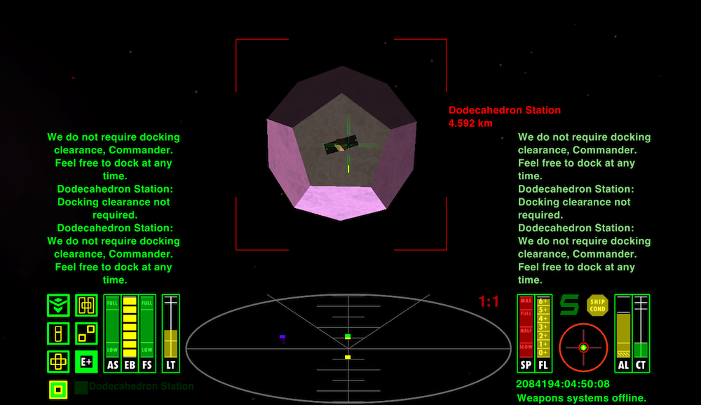
here comes the latest version of CB-hud:

If you want to try it, you may dowload it here:
http://www.box.net/shared/5svulop0ma58uh8t5c4f
If you find any bugs please report.
Now what´s new?
- All gauges are now vertical;
- the displayed text in the message- und commlog-gui are now bigger (size 12). (Thanks to Zireael for the suggestion);
- the gauges now have a scale.
Imho a scale is more than just eye candy and comes in handy especially with the fuel-gauge. And of course with the cabin-temperature-gauge. It´s now easier than ever to find the optimal roasting temperature for certain dish.

Unfortunately I have found no way to get the scales to be drawn in the foreground. This is because the dials are drawn in order before the legends. Does anyone know a method to get some of the legends to be drawn before the dials?
BTW: I would like to ad a short article about CB-hud and it´s features to the wiki. As described on the wiki I wrote a PM to winston and asked for access to the wiki. That was on may 29 but till now I got no response. Maybe something went wrong the PM? The PM has the status "sent". What can I do?
Best regards
CB
Re: Yet another contribution to the collection of HUD´s
Posted: Wed Jun 22, 2011 11:00 pm
by DaddyHoggy
Very nice - very stylish. Between yourself and COTB the HUD seems to have come alive recently
Re: Yet another contribution to the collection of HUD´s
Posted: Thu Jun 23, 2011 2:07 am
by CommonSenseOTB
Captain Beatnik, nicely done. Everyone should try it as it is excellent for a classic style hud with equipment activated icons. I like!

I gave it a test so here are the results:
1)-I really like what you have done with the images of scales behind the bar gauges. They are accurate and quite excellent. Well done!
2)-The combined space compass/rpy gauge is top notch-no wasted space.
3)-The message centers are well done, I like the proportions, color, etc.
4)-The equipment activated icons are excellent and I like that you have improved the selection prioritising shields,energy,etc. I like how the icons upgrade in look as you add related equipment. When you have used them a little it should be easy to see at a glance if the shield boosters for example are either online or damaged/destroyed by their absence. It IS difficult to design an icon only using draw surrounds but you have, and quite nicely!
Overall, Well done! A nice Classic Style Hud that has to be seen and used to be appreciated. Try this one!

Captain Beatnik wrote "Unfortunately I have found no way to get the scales to be drawn in the foreground. This is because the dials are drawn in order before the legends. Does anyone know a method to get some of the legends to be drawn before the dials?"
AFAIK it is hardcoded. If overlays worked on the forward view you could do it that way but it doesn't.

Oh, and Captain Beatnik, I prefer my trumble gumbo well-done with extra sauce!

Re: Yet another contribution to the collection of HUD´s
Posted: Thu Jun 23, 2011 4:08 am
by Capt. Murphy
Captain Beatnik wrote:
BTW: I would like to ad a short article about CB-hud and it´s features to the wiki. As described on the wiki I wrote a PM to winston and asked for access to the wiki. That was on may 29 but till now I got no response. Maybe something went wrong the PM? The PM has the status "sent". What can I do?
You could try dropping Ahruman an PM - he sorted my access very quickly.
Re: Yet another contribution to the collection of HUD´s
Posted: Thu Jun 23, 2011 6:51 am
by Killer Wolf
i saw the Hud.plist, still doesn't address what i was asking about, there's no attributes for justification.
Odd how the text colour is different on that HUD, the attribute mentions background colour ~ i thought it would give a coloured box as a backdrop.
the other thing is still a "problem" that i think spoils the effect - we've got a mesage specific gui and a comms specific gui, yet the messages are duped in both - i don't see the point of that at all. My Phantom HUD has the two guis, a big one for messages and a small one for comms, on the assumption you were more likely to get messages in the average trip than comms. if there's nothing to differentiate where the comms/messages goes tho, what's the point in the two guis?
edit - sorry that was rude of me : that's a great looking HUD. i like the text behind the scales, it colours the text and makes it blend better, IMO.
[UPDATED RELEASE] CB HUD Mark II
Posted: Sun Sep 25, 2011 8:45 pm
by Captain Beatnik
Hi folks,
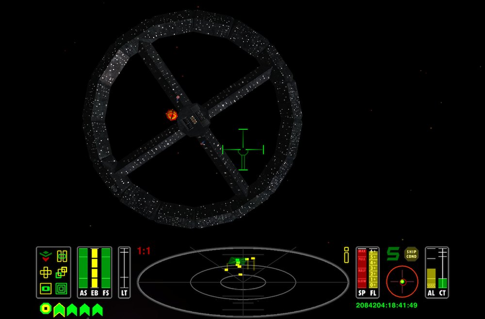
here comes the latest version of CB-HUD and this is how it looks like:

You can download the latest version here:
http://www.box.net/shared/y1q8yegurud6lr5v9bd7
I made only minor changes to the previous version, most of it is just eye-candy. The only new functionality are the two gray rings within the scanner. The mid-size ring marks the 2:1 magnification zone. If you switch the scanner magnification from 1:1 to 2:1, all blips inside the mid-size ring stay visible. The small ring marks the close-up range (in 1:1 magnification) when using a military laser. If you are aiming at a ship that is within close-up range, you should set your aim a little bit above the point you want to hit. The nearer the target, the more above.
I´ve designed also some new crosshairs.
Enjoy!
Unfortunately I still have no access to the wiki, so i can not introduce CB-HUD there. As advised I wrote a PM to Ahruman several days ago, but the PM is still in my outbox, so I guess he has not received the PM. Is there more I have to do to send a PM when it´s already in the outbox?
A request to our wiki wizard, maik, in case he reads this post: Could you please change the link in the OXP-List to the latest version of CB-HUD? Thank you in advance.
Best regards
C.B.
Re: Yet another contribution to the collection of HUD´s
Posted: Mon Sep 26, 2011 3:50 am
by CommonSenseOTB
Very nicely done Captain Beatnik. I am liking very much how this hud is evolving. The new grey surrounds are an improvement and easier on the eyes. The grey scanner makes it easier to interpret the situation and the distance marks work well. I really like your new crosshairs with integrated laser temperature guage. I found it easy to use while in close dogfights so as not to take my eyes off the action.
Once again you've raised the bar for classic type hud design and a lot of people will enjoy this hud. Don't miss out on this one folks!

Re: Yet another contribution to the collection of HUD´s
Posted: Sat Oct 22, 2011 11:58 am
by maik
Captain Beatnik wrote:BTW: I would like to ad a short article about CB-hud and it´s features to the wiki. As described on the wiki I wrote a PM to winston and asked for access to the wiki. That was on may 29 but till now I got no response. Maybe something went wrong the PM? The PM has the status "sent". What can I do?
Send me the text/pictures you want to add and I can do it for you.
Re: Yet another contribution to the collection of HUD´s
Posted: Sun Jun 17, 2012 9:39 pm
by reclusivemonkey
Hi,
Can anyone tell me how to switch to one of the other crosshairs? Specifically I would like to use the third one along. Thanks.
Re: Yet another contribution to the collection of HUD´s
Posted: Sun Jun 17, 2012 11:01 pm
by Commander McLane
Hi, reclusivemonkey! Wow, long lurker here.

Unfortunately I can't answer your question, but I'm sure someone more knowledgeable will be around soon.
Re: Yet another contribution to the collection of HUD´s
Posted: Mon Jun 18, 2012 12:27 am
by marcusrg
Very nice hud! I'll try it soon!

Re: Yet another contribution to the collection of HUD´s
Posted: Mon Jun 18, 2012 12:31 am
by Captain Beatnik
reclusivemonkey wrote:Hi,
Can anyone tell me how to switch to one of the other crosshairs? Specifically I would like to use the third one along. Thanks.
Hi reclusivemonkey!
Buy a military laser. The third crosshair is the military laser crosshair and will show up automatically as soon as you buy the proper laser.
If you wish to use the third crosshair with other lasers, you can do this by editing the crosshairs.plist config file in the config folder of the .OXP. Just replace the entries in the config section of that laser(s) with the entries you find in the military laser config section via copy and paste.
Best regards
C.B.

