Page 4 of 15
Posted: Fri Jan 08, 2010 1:30 am
by Corny
Since the divider-bar isn't infinite anymore, I don't want to let it look like that would be accidental.
I'll care about the gallery later... at the earliest, after my sleep.
Got the basic structure coded, so I can show you how the font would really look like (mac, WebKit r52751)
Posted: Fri Jan 08, 2010 1:32 am
by JazHaz
Ahruman wrote:
…as it related to web design over a decade ago. This is no longer true.
I didn't spot that, but it is still true if the latest standards compliant coding is not used.
Posted: Fri Jan 08, 2010 2:18 am
by Lucidor
I think it would look better without the glow.
And why not use the Oolite logo?
Posted: Fri Jan 08, 2010 9:14 am
by Corny
Lucidor wrote:
I think it would look better without the glow.
Which one?
Lucidor wrote:
And why not use the Oolite logo?
Because there is a new one in the making. The current one is max. 128x128 while the new one should be .max 512x512.
Since I don't know which one will be taken as the Oolite-Logo and what color-scheme it will use, I didn't put one at the draft.
Posted: Fri Jan 08, 2010 11:03 am
by Greyman
Corny wrote:Greyman wrote:Just had an idea for a banner tonight and kept fighting with the GIMP until I got this:
Well it's just a draft of what it could look like. I guess a wizard like Corny could get more out of the idea, like fancy glow effects or other stuff.

I would rather put myself just a bit over "lame"... maybe "below average", speaking in Elite-ranks
Guess a combat-ranking is adequate since I'm fighting with GIMP as well sometimes

I achieve fancy glowing effects with duplicating the layer and applying gaussian diffuser to it, by the way - not that hard.

Edit: One more thing: May I assume that people visiting Oolite.org use browsers that support png transparency correctly?
Like... good browsers?
Didn't know it's that bad

I actually was kind of proud of this ... for a first try at least

Just kidding, I know I'm a bad graphics designer/painter/whatever ...
Posted: Fri Jan 08, 2010 11:29 am
by Corny
Greyman wrote:
Didn't know it's that bad
I actually was kind of proud of this ... for a first try at least
Just kidding, I know I'm a bad graphics designer/painter/whatever ...
Huh? You must've misread (or misunderstand) me. I wanted to express that I don't consider _myself_ a very good graphics designer with GIMP.
Besides, I didn't mess about with your icon yet. Mainly because I didn't really have great ideas for improving it.
Posted: Fri Jan 08, 2010 11:31 am
by Greyman
Sorry then. I misunderstood you ... forget everything.
BTW, I can live with criticism anyways.

Posted: Fri Jan 08, 2010 11:54 am
by ClymAngus
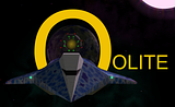
Well it needs a touch of work. round out the O so it's central to the planet, glass effect the lettering with a 60-75% transparency. bring up the background stars, widen the image and put the sun on the other side to balance out the lettering (yes you'll have to flip the other elements so it doesn't look "odd"). Maybe add a cheaky lense flare. Maybe review your ship choice and go with a griff "special"
I would also separate layer; the planet, fuel station, ship and sun (making sure you check your shadows! That way you can easily do some element compesition.
As for my credentials, well I have my moments....

Still for my money I see potential banner or forum tag material here. Good work.
Greyman wrote:Corny wrote:Greyman wrote:Just had an idea for a banner tonight and kept fighting with the GIMP until I got this:
Well it's just a draft of what it could look like. I guess a wizard like Corny could get more out of the idea, like fancy glow effects or other stuff.
I would rather put myself just a bit over "lame"... maybe "below average", speaking in Elite-ranks
Guess a combat-ranking is adequate since I'm fighting with GIMP as well sometimes
I achieve fancy glowing effects with duplicating the layer and applying gaussian diffuser to it, by the way - not that hard.
Edit: One more thing: May I assume that people visiting Oolite.org use browsers that support png transparency correctly?
Like... good browsers?
Didn't know it's that bad
I actually was kind of proud of this ... for a first try at least
Just kidding, I know I'm a bad graphics designer/painter/whatever ...
Posted: Fri Jan 08, 2010 12:14 pm
by ovvldc
Very nice. I would do the yellow navigation bit without the glow effect (see draft 2), but otherwise is looks lovely. Well done!
Another possible option is to have a small set of graphics for the top-right bit (where the planet is now), and choose randomly when the site is loaded. The set could include the planet, a station, a Cobra MkIII, a Thargoid and possibly another ship. All in nice shaderified Griff/SimonB versions.
Best wishes,
Oscar
Posted: Fri Jan 08, 2010 12:14 pm
by Disembodied
One thing to perhaps consider is not running the text all the way across the screen. It can be hard for the eye to follow a long line and then to reliably jump to the next one down on reaching the end. It could improve readability if the text block was a little bit narrower.
Posted: Fri Jan 08, 2010 1:18 pm
by Lucidor
Corny wrote:Lucidor wrote:
I think it would look better without the glow.
Which one?
Every one.
Lucidor wrote:
And why not use the Oolite logo?
Because there is a new one in the making. The current one is max. 128x128 while the new one should be .max 512x512.
Since I don't know which one will be taken as the Oolite-Logo and what color-scheme it will use, I didn't put one at the draft.
Probably the same as the current one? It should be fairly simple to trace it in Inkscape and have a scalable logo.
Posted: Fri Jan 08, 2010 2:06 pm
by Corny
Lucidor wrote:
And why not use the Oolite logo?
Corny wrote:
Because there is a new one in the making. The current one is max. 128x128 while the new one should be .max 512x512.
Since I don't know which one will be taken as the Oolite-Logo and what color-scheme it will use, I didn't put one at the draft.
Lucidor wrote:
Probably the same as the current one? It should be fairly simple to trace it in Inkscape and have a scalable logo.
Seriously, I guess I have better things to do than transferring the logo in Inkscape crappily just to discover that the new logo (which could to be finished, but just not choosen) is approved...
Also, if it's so easy, why don't you help a bit and do it yourself?
(
Ahruman wrote:Oolite requires a new icon. Current systems use icons up to 512 × 512 pixels, while the current Oolite icon only exists as a bitmap up to 128 × 128 pixels, and doesn’t really have enough detail to be enlarged anyway.
)
Edit:
Example with less glow (I wasn't satisfied with the background-glow in the navigation that much) and an example logo made by McSpider
Posted: Fri Jan 08, 2010 3:05 pm
by ovvldc
Looks very nice
.
I was also wondering if it were possible to put the YAH! banners as fake ads on the web page somewhere. A lot of them are hilarious and it could be nice to cycle three random ads or something if the load times would not be impacted too badly

.
Best wishes,
Oscar
Posted: Fri Jan 08, 2010 3:24 pm
by Lucidor
The new one looks much better.
Corny wrote:
Also, if it's so easy, why don't you help a bit and do it yourself?
No need, KZ9999 has done it already.
https://bb.oolite.space/viewtopic.php?t= ... c&start=45
I like Seventh's BW proposal too.
https://bb.oolite.space/viewtopic.ph ... c&start=30
Posted: Fri Jan 08, 2010 3:32 pm
by Corny
Lucidor wrote:The new one looks much better.
So you're not completey allergic against "glow"-stuff, as long as it looks nice


