Wonderful!
I take my hat off to you, Sir! A veritable tour-de-force.
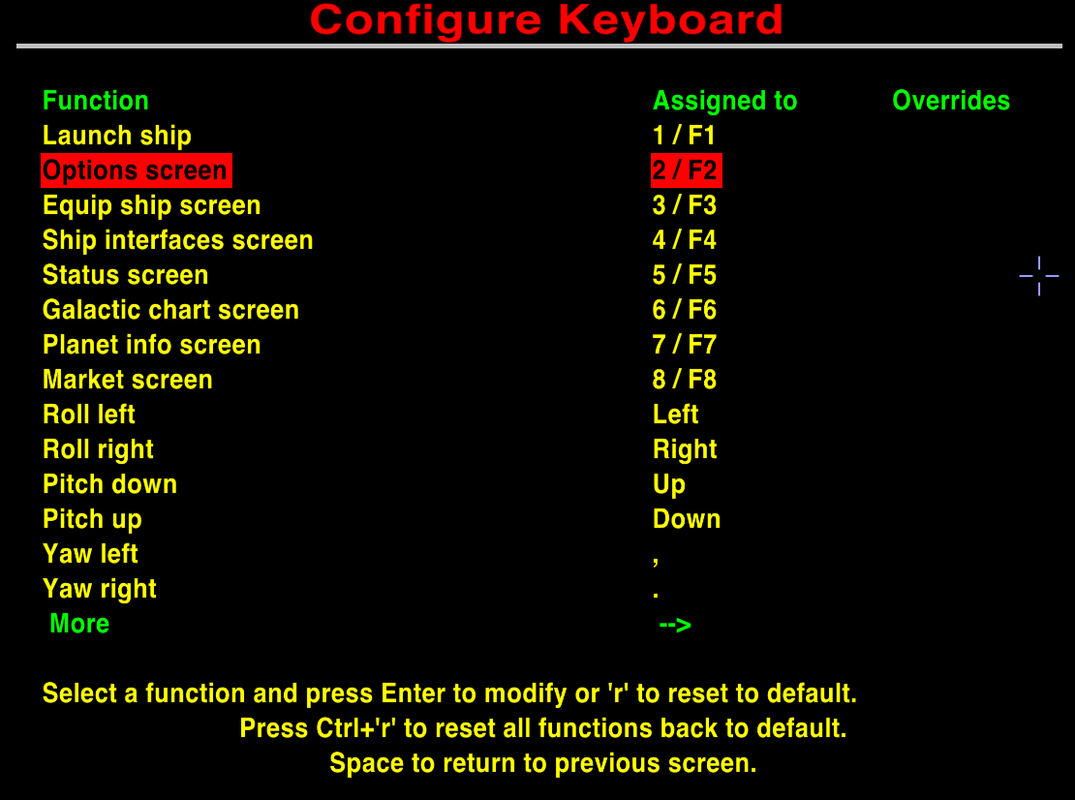
Minor issue: Too many key-commands
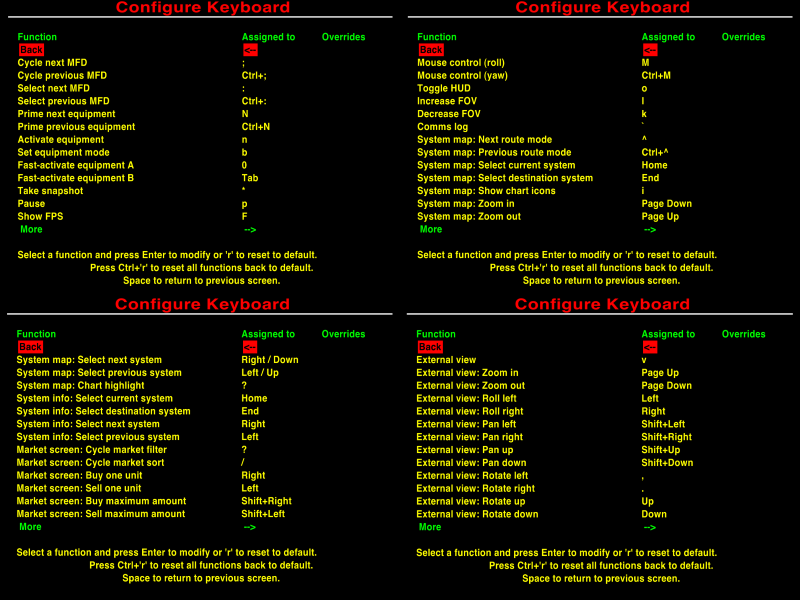
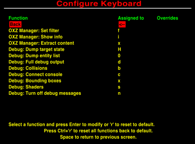
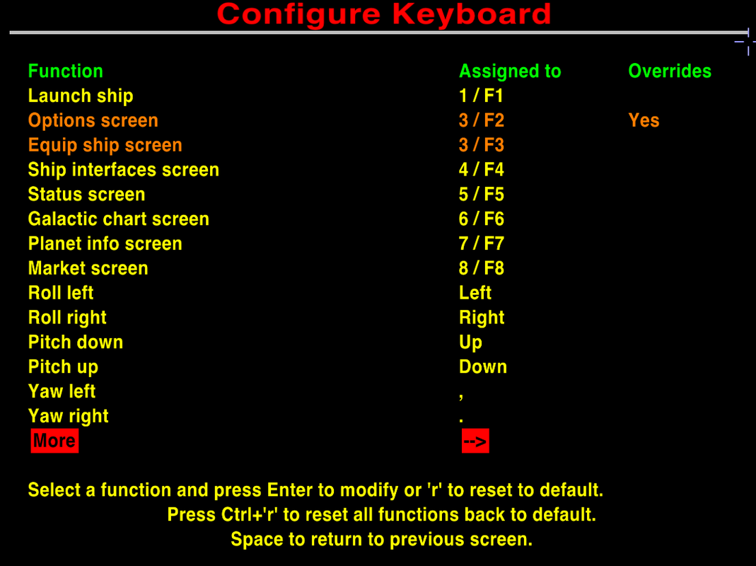
I had a discussion with a_c_ quite some time ago now about introducing more key-commands into Oolite for Fast Activation of oxps. He was against new key-commands. The principal reason from what I could make out was that there are already too many such in Oolite. So, yes, I've been posting about the greater number of key-commands for driving cars & flying planes.
But a_c_
does have an important point. We want other people to join us. If we make the skill barrier too high, it won't happen. How many different things do people have to learn before they can start enjoying Oolite? How much time will they need to spend doing so?
My wish to rewrite the OoliteRS (defeated by the difficulties of manipulating OpenOffice) came from a_c_'s comments - to split up the key commands between
(1) the vanilla game,
(2) the extra equipment (ECM's, Fuel Injectors, Docking Computers, ASC
etc)
and (3) the extra extra (OXP) equipment (Priming buttons, fast activation buttons & MFD buttons).
Unlike a_c_ I feel that more new buttons in the
third category is fine - by this stage our newcomers have already worked out that they like the game, and will want to manage what is now an added complexity. Especially more Fast Activation buttons - one only defines as many as one wants/needs.
a_c_ did make the point to me that if more buttons are defined, then more buttons
will be used ( a bit like building more roads, which encourages more people to drive more of the time...). Personally, I feel that if stays that way for oxp's only, then fine. We each choose which oxp's we incorporate, nobody forces any of us. I avoided Ship Configuration for an entire year because of its complexity. I will avoid OoCheat because I don't want to. Etc. etc. etc. In the real world we often find that we have two sets of controls together - a basic crude easy to manage set, and a more complex more refined set (think of a radio with preset buttons, or windscreen wipers with one automatic setting and several more manually determined).
So, yes, I fully support your idea of splitting the views between all the various key-commands. BUT our older version was
much easier to learn, even if it was less precise.
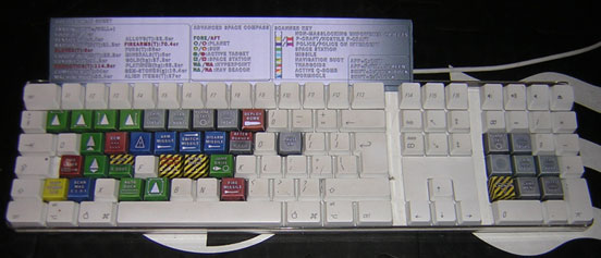
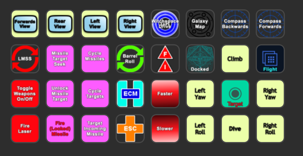
I know, myself, that I get the half-dozen missile buttons mixed up. If I plug in my Elgato button box, it's fine - each button is clearly labelled, and in a combat I can clearly see what each one does. (Ditto with Clym Angus's overlays). But without, I won't remember.
Similarly (for example) for the new views, I suspect.
Would it be an idea to consider keeping the lengthy but simple toggle for the views too? Then people can start off with that, and if they then use the views enough and learn the 8 new key commands, fine. but if not, they can still access the external views easily.
Of course, if this is eventually added to the Joystick Configuration, an 8-way "hat" will solve the issue very simply indeed...
References:
Keyboard Issues (wiki)
My rant about cars and airplanes
6
pink missile buttons on buttonbox's Combat setting:

Clym's overlays:
