Page 290 of 474
Re: Screenshots
Posted: Sun Jun 28, 2015 2:32 am
by Cody
CaptSolo wrote:Sobite main has resorted to huge billboard adverts to fund restorations.
That's a
very dark station, amigo - what display/gamma settings are you using? Or have you turned the ambient lighting right down?
Re: Screenshots
Posted: Sun Jun 28, 2015 1:39 pm
by CaptSolo
Ambient level = 0.05 as set by ZygoUgo for his excellent Cinematic Skies and Nebulae OXP. I like it.
Re: Screenshots
Posted: Sun Jun 28, 2015 1:46 pm
by Cody
I removed that OXP as its nebulae are too much for me - I did tinker with it once, but couldn't get it right.
I have ambient_level = 0.2; set in my game - dark, but not too dark. Ain't choice a wonderful thing!
Re: Screenshots
Posted: Sun Jun 28, 2015 2:30 pm
by CaptSolo
Cody wrote:Ain't choice a wonderful thing!
Indeed! For me, there is something atmospheric seeing the passing silhouette of a ship against a nebular cloud.
Re: Screenshots
Posted: Mon Jun 29, 2015 10:16 pm
by another_commander
Re: Screenshots
Posted: Thu Jul 02, 2015 8:58 pm
by another_commander
Re: Screenshots
Posted: Thu Jul 02, 2015 11:27 pm
by Redspear
Superb shots a_c

The top one from your last post could be cover art...
Re: Screenshots
Posted: Fri Jul 03, 2015 10:14 am
by Day
I concur.
Re: Screenshots
Posted: Sat Jul 04, 2015 10:54 pm
by Cody
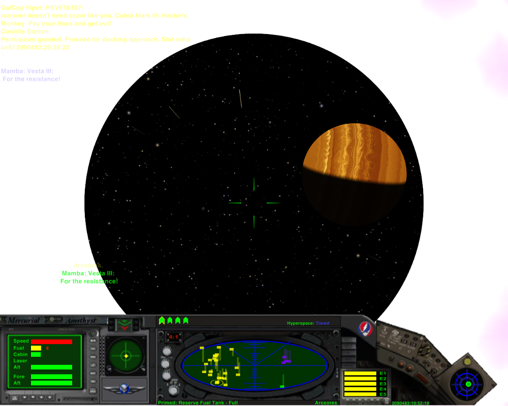
For a courier, jumping straight into a bandit/Viper firefight is usually a bonus - one can slip quietly by...

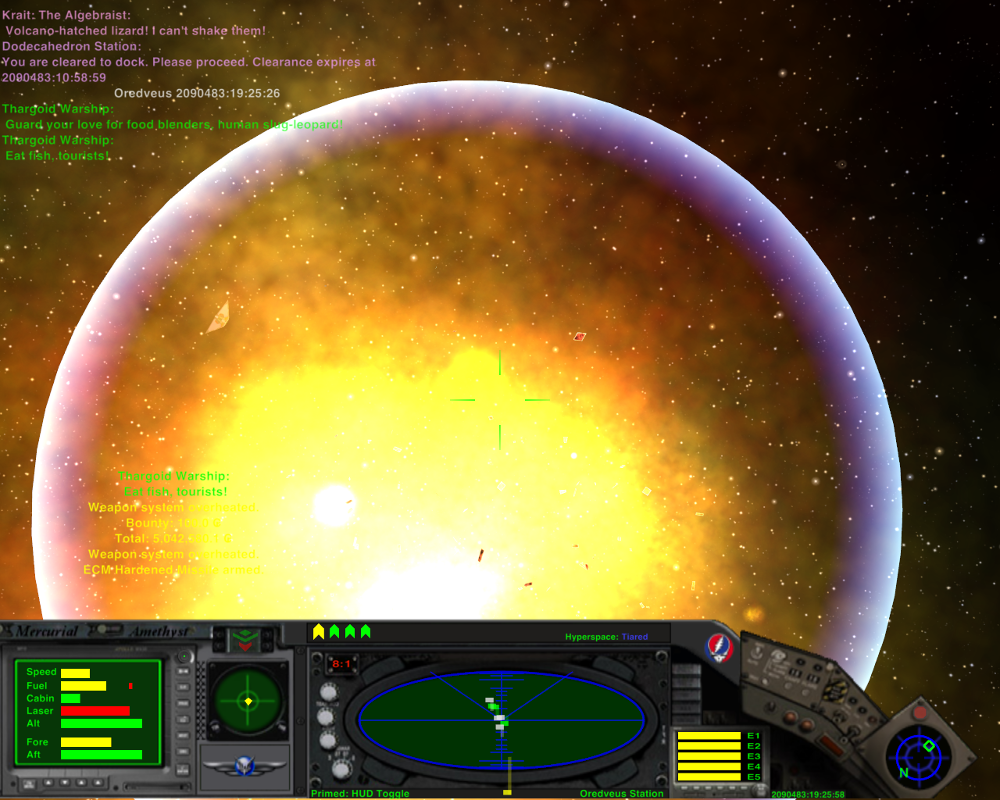
... but in that lot at least three assassins were lurking, and just when I thought I'd slipped past, they latched onto my six.
Explosions! I love big explosions!

Re: Screenshots
Posted: Mon Jul 06, 2015 12:13 am
by Commander_X
The second screenshot made me almost loose my breath, thinking you're using a sort of shady planets branch. Took me a while to figure out it's not a planet but the outer part of the big explosion shaded (almost) like an atmosphere.
BTW, congrats for your 6 year anniversary post!

Re: Screenshots
Posted: Mon Jul 06, 2015 5:53 am
by another_commander
Commander_X wrote:The second screenshot made me almost loose my breath, thinking you're using a sort of shady planets branch. Took me a while to figure out it's not a planet but the outer part of the big explosion shaded (almost) like an atmosphere.
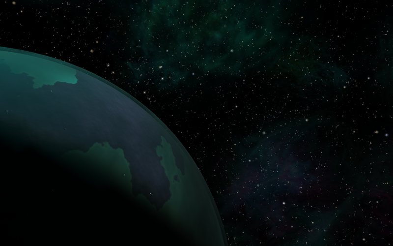
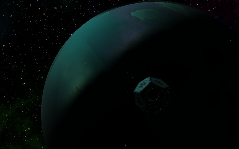
Shady planets branch, eh? Here are a few teaser shots from that branch (note: the branch is very old, there seemed to be cases where atmosphere rendering had issues on certain cards and plenty of the rendering code has been changed since it was created. It may need a bit of work to make it compatible with the latest versions).


Re: Screenshots
Posted: Mon Jul 06, 2015 11:20 am
by Cody
another_commander wrote:... the branch is very old...
No further progress, eh? I presume that submersible has gone walkabout - pity!
Re: Screenshots
Posted: Tue Jul 07, 2015 1:13 am
by Redspear
Cody wrote:another_commander wrote:... the branch is very old...
No further progress, eh? I presume that submersible has gone walkabout - pity!
That would be a shame...
I am enjoying the default planets in 1.82 however.
Previously, some planets would just look bad to my eyes and spoil the others.
Now the 'bad' ones look ok and the 'ok' ones are looking pretty good


(I must have made these images too low-res as they looked better as raw screenshots

)
Re: Screenshots
Posted: Fri Jul 10, 2015 1:36 pm
by Selezen
Damn, that is a FINE screenshot. Do you have a high res version of that by any chance?
Oolite = Elite Dangerous in terms of graphic loveliness these days...
Re: Screenshots
Posted: Fri Jul 10, 2015 1:57 pm
by another_commander
Selezen wrote:Damn, that is a FINE screenshot. Do you have a high res version of that by any chance?
Not sure which one you are referring to, although I imagine it would be the reddish one in the asteroid field. If my guess is correct, then here you go:
https://drive.google.com/file/d/0BwG6R5 ... sp=sharing
The original was taken in a 1080x600 window, so it's not terribly high res, but at least it's in png format.


