Page 264 of 469
Re:
Posted: Sat Dec 28, 2013 10:29 pm
by Zieman
Redspear wrote:Any advice on how others could achieve such feats of 'tweakery' please?

You need a text editor (such as NotePad++) & a graphics editor (such as Gimp), and of course the DeepspaceShip.oxp + some time...

On a more serious note, you have PM Redspear.
The DeepspaceShip OXP doesn't come with any licence, and IIRC the author has dropped off the radar, so I won't be releasing the modded OXP to the public yet (I'd like to get JBlythe's permission first).
Re: Screenshots
Posted: Sat Dec 28, 2013 10:43 pm
by Redspear
Zieman wrote:The DeepspaceShip OXP doesn't come with any licence, and IIRC the author has dropped off the radar, so I won't be releasing the modded OXP to the public yet (I'd like to get JBlythe's permission first).
Understandable.
Shame, that guy was quite the artist...
Re: Screenshots
Posted: Sun Dec 29, 2013 8:26 am
by Diziet Sma
Redspear wrote:Shame, that guy was quite the artist...
Yup.. I still have the Oolite wallpapers he made.


Re: Screenshots
Posted: Mon Dec 30, 2013 8:38 am
by Tichy
Zireael wrote:
This is epic. What planet is this?
Eh... I can't remeber
Somewhere in G3 using System Demux planets.
Re: Screenshots
Posted: Sat Jan 11, 2014 4:01 pm
by Smivs
Just a little update on the 'Accessories' overhaul.
The
docking thingy is working nicely now, although I still haven't started on the hermits.

There has been talk of buoys recently. With the new graphics coming in the old buoy has been taking a bit of flack and Chey'd excellent buoy has been mooted as a possible replacement if it can be made to work well in non-shadery form. Whatever, I decided to take another look at the current default buoy to see what could be done with it as I'm sort of updating Accessories anyway. I've tried a few things and so far this is my preferred attempt.

It comes in at around 650KB for the diffuse and emission maps (and thats with big 2048x2048 textures!), so it's a good lightweight option. There is a short video of it
here if you want to watch it spin for a few seconds.
Re: Screenshots
Posted: Sat Jan 11, 2014 4:47 pm
by Redspear
Smivs wrote:I decided to take another look at the current default buoy to see what could be done with it as I'm sort of updating Accessories anyway. I've tried a few things and so far this is my preferred attempt.
I like it
If I may, I think it might look even better if some of those pointy edges on the default model were 'shaved' a bit, to better match your texture.
In any case, if you released that one then I'd find a place for it in my game
Re: Screenshots
Posted: Sat Jan 11, 2014 5:46 pm
by Smivs
Thanks Redspear
Yes, those pointy corners are a bit iffy aren't they?! It's just occured to me that making the outer circumference black rather than the steel blue might mask them a bit. Perhaps I'll try that.
Re: Screenshots
Posted: Sat Jan 11, 2014 6:24 pm
by JensAyton
For reference, I believe the current design is supposed to look like a [wp]corner reflector[/wp], although it wouldn’t actually work as one since the faces are slightly convex.
Re: Screenshots
Posted: Sat Jan 11, 2014 6:28 pm
by Smivs
Thanks. I'd often wondered why it was such an odd shape but that sort of makes sense.
Edited to add:-
I've tried making the circumference black now and yes, I think the black border is better.

Also just tried re-scaling to 512x512 textures. Just over 67KB now but really doesn't notice
Re: Screenshots
Posted: Sun Jan 12, 2014 5:11 am
by Diziet Sma
Smivs wrote:Thanks. I'd often wondered why it was such an odd shape but that sort of makes sense.
Heh.. it's instantly recognisable to any blue-water yacht sailor.. tho' I can see how it would confuse all you landlubbers!


JensAyton wrote:I believe the current design is supposed to look like a [wp]corner reflector[/wp]
I noted with interest, that in the picture of the reflector on the yacht mast in that article, the owner has it mounted incorrectly (which is rather typical for power-boaters, I might add

).. in the (essentially) 2D world of ocean sailing, it needs to be in the "rain-catcher" position in order to function as intended. In space, of course, that's not such an issue.
Smivs wrote:I've tried making the circumference black now and yes, I think the black border is better.
That's looking very good, Smivs.. I wouldn't mind seeing a mixture of this and Cheyd's buoys in the core game, perhaps according to TL or economy level..
Re: Screenshots
Posted: Mon Jan 13, 2014 7:11 pm
by spara
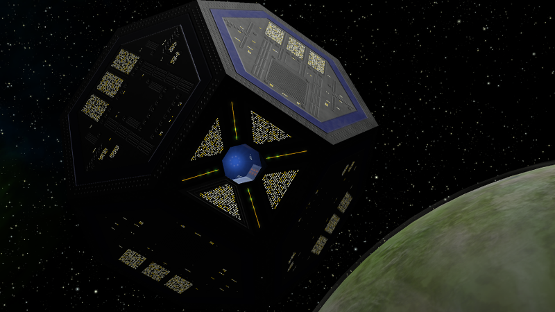
Captain Beatnik's brand new Sodalite station (without corporate logos and enhanced with a normal map) captured from the dark side. Those lights look absolutely fantastic.
Re: Screenshots
Posted: Tue Jan 14, 2014 3:10 am
by CaptSolo
Diziet Sma wrote:Redspear wrote:Shame, that guy was quite the artist...
Yup.. I still have the Oolite wallpapers he made.
Hi Diz,
Could you upload some of them somewhere?
Re: Screenshots
Posted: Tue Jan 14, 2014 3:48 am
by Diziet Sma
Sure.. interestingly enough, they are all still available at his website, though the only way to access them is by clicking on the thumbnails of them in
his wallpaper thread.
I've bundled all three in a single zip here:
https://app.box.com/s/l9p2j520d7ivzknfbp8j
Re: Screenshots
Posted: Tue Jan 14, 2014 6:32 pm
by Redspear
Smivs wrote:I've tried making the circumference black now and yes, I think the black border is better.
Ooh yes, I'd say so
spara wrote:Captain Beatnik's brand new Sodalite station (without corporate logos and enhanced with a normal map) captured from the dark side. Those lights look absolutely fantastic.
Nice work spara (again!) and Capt Beatnik too!
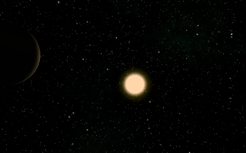
Meanwhile...
Does this remind you of any particular sci-fi film or is it just me?
Re: Screenshots
Posted: Wed Jan 15, 2014 6:01 pm
by pagroove
Redspear wrote:Smivs wrote:I've tried making the circumference black now and yes, I think the black border is better.
Ooh yes, I'd say so
spara wrote:Captain Beatnik's brand new Sodalite station (without corporate logos and enhanced with a normal map) captured from the dark side. Those lights look absolutely fantastic.
Nice work spara (again!) and Capt Beatnik too!
Meanwhile...
Does this remind you of any particular sci-fi film or is it just me?
Redspear: It reminds me of many sic-fi settings. But Mostly this looks a bit like Star Trek. I was watching the intro from Voyager and we are now almost on that CGI-level in game. If only we had lights on he night side of planets (with random patterns) then it could be perfect.