Page 258 of 466
Re: Screenshots
Posted: Tue Aug 20, 2013 6:17 am
by spara
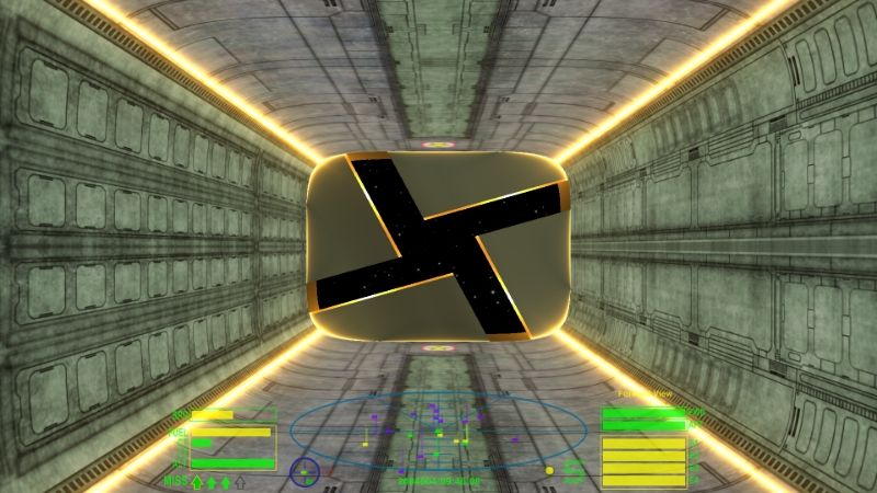
BGS launch tunnel for GalNavy dockables. Tinkered from Griff's Dodo dock texture.

Re: Screenshots
Posted: Wed Aug 21, 2013 9:16 am
by Griff
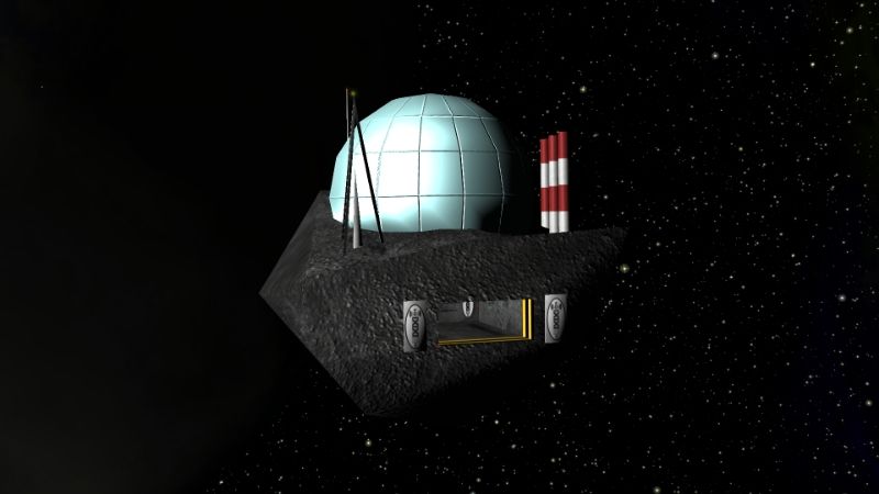
spara wrote:A Griffified Hacker Outpost.

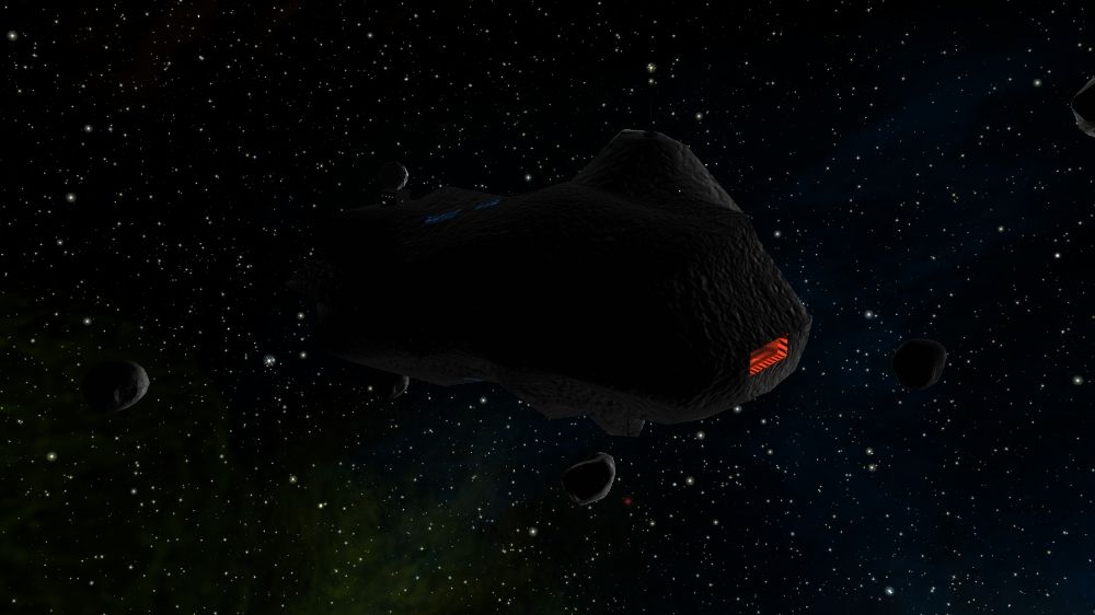
cool screenshot, really nice and moody looking. Great work with the models & textures!
Re: Screenshots
Posted: Sat Aug 31, 2013 5:44 pm
by spara
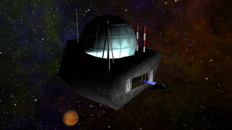
A Griffified Imperial AstroFactory.

Re: Screenshots
Posted: Sat Aug 31, 2013 6:11 pm
by Tichy
Nice! So, Dictators and Commies are the next?

Re: Screenshots
Posted: Sun Sep 01, 2013 8:29 am
by spara
Tichy wrote:Nice! So, Dictators and Commies are the next?

Dictators maybe. I was experimenting with normal maps and Griff's custom shaders and that dome came out quite nice. It's done with a plain one color texture and a normal map.
For Commies Amaranth has done a nice re-texture, that's really worth installing. Find it
here.
Re: Screenshots
Posted: Sun Sep 01, 2013 9:18 am
by Tichy
spara wrote:Tichy wrote:Nice! So, Dictators and Commies are the next?

Dictators maybe. I was experimenting with normal maps and Griff's custom shaders and that dome came out quite nice. It's done with a plain one color texture and a normal map.
For Commies Amaranth has done a nice re-texture, that's really worth installing. Find it
here.
I didn't know about the commies retexture.

Re: Screenshots
Posted: Sun Sep 01, 2013 11:47 am
by ZygoUgo
Re: Screenshots
Posted: Sun Sep 01, 2013 8:38 pm
by spara
After seeing ZygoUgo's pics, I just had to put this one up.

Re: Screenshots
Posted: Sun Sep 01, 2013 10:27 pm
by ZygoUgo
Re: Screenshots
Posted: Mon Sep 02, 2013 7:31 am
by spara
Thanks ZygoUgo, those tanker skins look really promising. I'll test them out, add suitable normal maps along with some emissions and we'll see how it turns out. I'll open a new thread to the Expansion sub-forum, when I've got something to show/share.
The original dictators ships are not too shabby IMO, so instead of retexturing, I'll probably just turn the lights up, maybe add a grill or two for detail and add a suitable normal map. Then again, if someone has done any retexturing of ships in dictators, I'll be happy to check them out and put them in

.
Re: Screenshots
Posted: Sat Sep 07, 2013 6:11 am
by spara
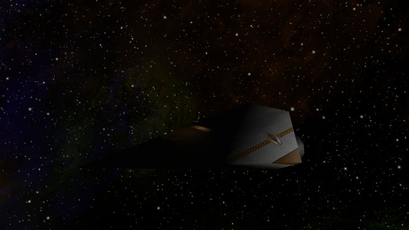
Here's a moody shot of an Imperial Enforcer. I've gently retouched the texture and added some emission. There's also some subtle normal mapping in work there. And once again ZygoCinematicSky&Nebula's creates a stunning background.

Re: Screenshots
Posted: Sat Sep 07, 2013 6:16 pm
by JazHaz
Here's a look at one of Spara's new space bars, dark and threatening. Especially like the neon of a missile orbitting a wormhole...
 Oolite space bar
 by
JazHaz, on Flickr
Re: Screenshots
Posted: Tue Sep 10, 2013 4:43 pm
by spara
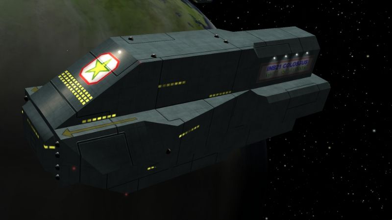
Here's an image of Behemoth Type 2 with enhanced texture and some added spotlights.

Re: Screenshots
Posted: Tue Sep 10, 2013 7:26 pm
by Griff
nice job, looks fantastic!

Re: Screenshots
Posted: Tue Sep 10, 2013 7:54 pm
by JazHaz
spara wrote:Here's an image of Behemoth Type 2 with enhanced texture and some added spotlights.
Nom nom nom! <drool>
Just wish those Behemoths weren't a pig to fly.
