Page 3 of 4
Re: (WIP)Pie Chart HUD(seriously) Require hud ideas/requests
Posted: Fri May 13, 2011 3:27 am
by CommonSenseOTB
Gnudoll, I'm glad you liked the pics. The triangle hud is polished and ready and the first pie/circle hud is under construction. I may have to build some custom arrays from scratch for a top/bottom full circle guage for the shields in the 4th hud(it will probably sweep in a wave from bottom to top,hope that will look alright) but the rest should be straight forward.
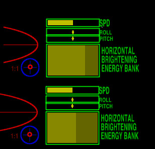
Because it will be awhile for v2 I have a couple new concept hud demos illustrating the energy guage arrays. Particularily interesting is the horizontal array with sweeps that brighten or dim each energy bank in sequence. A cool effect and may have some uses. Check out the pics.
 horizontal energy guage
 by
CommonSenseOTB, on Flickr
Also the vertical energy guage array is kind of misleading. It looks like the standard guage but when the energy level drops, if you didn't know ahead of time you would probably be surprised that it behaves as it does.
Here's the link for PCS HUDv1b.oxp and PCS HUDv1c.oxp
Edit: Due to faulty arrays in version 1 the download link will bring you the latest version.
http://wiki.alioth.net/index.php/Pie_Chart_Style_HUDs
It sure helps to have a constant supply of feedback and encouragement. I will try to keep you all updated as I go into the harder stuff(circles/pies).
Later!

Re: (WIP)Pie Chart HUD(seriously) Require hud ideas/requests
Posted: Sat May 14, 2011 9:02 am
by Zireael
I hope this gets added to the OXP list...
Re: (WIP)Pie Chart HUD(seriously) Require hud ideas/requests
Posted: Sat May 14, 2011 2:18 pm
by CommonSenseOTB
All my stuff is linked to the oxp list now. when I find time I will make appropriate wiki pages.
Re: (WIP)Pie Chart HUD==>Version 2 under construction
Posted: Sat May 14, 2011 6:55 pm
by pagroove
Certainly some very cool hud goodies! The future is bright!
Re: (WIP)Pie Chart HUD==>Version 2 under construction
Posted: Sun May 15, 2011 4:37 am
by CommonSenseOTB

It sure is P.A. Groove. At this point it looks as if I could do about 80% of the things I would like to with pie arrays. It's like finding treasure buried in the backyard.
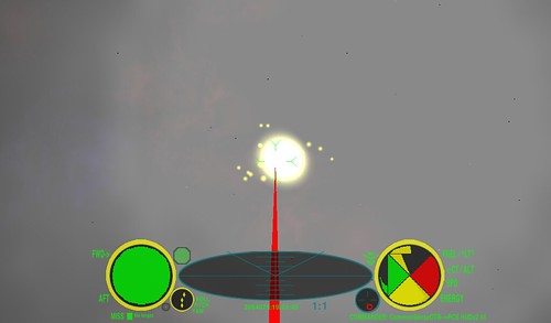
Well, I'm still tweaking the first real pie hud so I'll post some more triangle pics. Presenting Triangle HUD #2 with a full front/aft shield guage and a similar profile to Triangle HUD #1.
 triangle hud #2
 by
CommonSenseOTB, on Flickr
And here we have an illustration of the motion of the new full shield guage cluster. Orientation is front shield/top right and aft shield/bottom left.
 triangle hud #2 full shield guage motion
 by
CommonSenseOTB, on Flickr
This is a cool guage. It reminds me of the layers of an onion being pulled to the side and peeled back as your front shield drops. And it's like the energy is being squeezed out from the sides of the aft shield until there is just a thread of energy trailing straight back. A very organic and fluid motion.

The pie's almost ready so fire up the oven!

Re: (WIP)Pie Chart HUD==>Version 2 under construction
Posted: Sun May 15, 2011 12:01 pm
by DaddyHoggy
Very, very clever! I'm impressed!

Re: (WIP)Pie Chart HUD==>Version 2 under construction
Posted: Tue May 17, 2011 3:11 pm
by CommonSenseOTB
Just updating my progress. Have a small snag related to the transition between the triangle array and the rounding array for the pie huds. This is related to the difference in resolution causing alpha problems when positioning the arrays making them tempermental to make a hud without lines appearing at that transition. If I'm having a problem then you most certainly would get very frustrated with this when you construct your own huds. Therefore there will be an extra days delay in my work as I convert the triangle arrays to hires as well. This does fix the problem however and makes the arrays much easier to position so on with the work and please excuse the delay. It will be worth it.

Re: (WIP)Pie Chart HUD==>Version 2 under construction
Posted: Wed May 18, 2011 8:22 pm
by Gnudoll
OTB, you work is already more than well worth it. Please take the time you need to make whatever improvements you deem beneficial. It can really do nothing but make things even better. Many thanks for all the hard work you have already done on this. Even the "unfinished" product looks really great and would be a fine addition to the OXP list.
Re: (WIP)Pie Chart HUD==>Version 2 under construction
Posted: Fri May 20, 2011 3:43 am
by CommonSenseOTB
Well it was a looong 2 weeks but the wait is over!

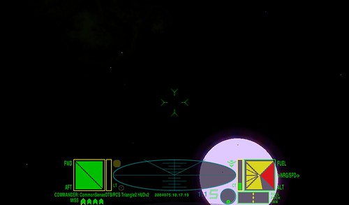
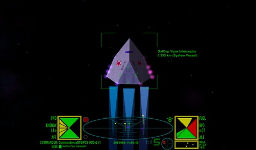
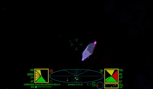
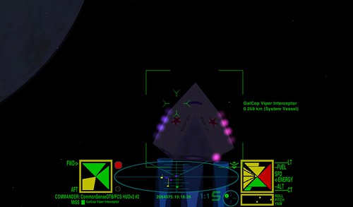
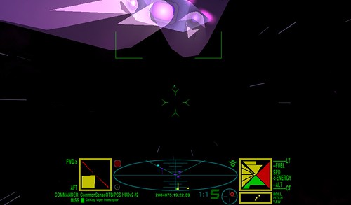
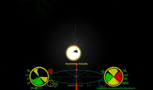
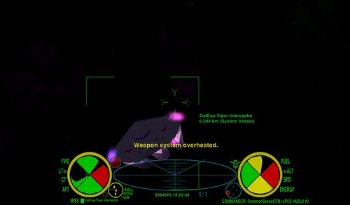
I bring you PCS HUDv2 .....but first some pics.

 PCS HUDv2#1(1)
 by
CommonSenseOTB, on Flickr
 PCS HUDv2#1(2)
 by
CommonSenseOTB, on Flickr
 PCS HUDv2#2(1)
 by
CommonSenseOTB, on Flickr
 PCS HUDv2#2(2)
 by
CommonSenseOTB, on Flickr
 PCS HUDv2#3(1)
 by
CommonSenseOTB, on Flickr
 PCS HUDv2#3(2)
 by
CommonSenseOTB, on Flickr
 PCS HUDv2#4(1)
 by
CommonSenseOTB, on Flickr
 PCS HUDv2#4(2)
 by
CommonSenseOTB, on Flickr
Brief summary of what's in here:
4 HUDS(2 triangle and 2 pie)
Updated high resolution arrays
Screenshots
Developers' note(I expect some cool new huds from the oolite community! You're free to use these arrays with attribution! Any questions, concerns or feedback please post here so that all may benefit.

)
Here's the download link:
http://wiki.alioth.net/index.php/Pie_Chart_Style_HUDs
Now the fun begins with the playtesting and feedback, don't be shy now!


CommonSenseOTB(thinking Outside-the-Box for a better oolite!)
Re: (NEW RELEASE)Pie Chart Style HUDS==>PCS HUDv2
Posted: Fri May 20, 2011 9:13 pm
by DaddyHoggy
I thought I'd prefer the pie charts but seeing them altogether I prefer the triangular one (with the exception that I think the borders are slightly too thick)
Well done - amazing work!
Re: (NEW RELEASE)Pie Chart Style HUDS==>PCS HUDv2
Posted: Sat May 21, 2011 6:07 pm
by CommonSenseOTB
Thanx for the first feedback DH I appreciate it. Now that you say you prefer the triangle huds I'm kinda glad I took the effort to improve the resolution of those arrays as well(prevents the jaggies). It's probably that distortion on the edge of the pie gauges that turns you off but not much I can do 'bout that. Only thing one can do to have perfect pie guages is to mask off a larger triangle gauge and the pie gauges are plenty big already. Masking off part of a triangle gauge will leave small gauges with lots of dead space around the sides of them. I'm guessing one would use an overlay for that. My primary concern was/is to try to develop nice looking gauges with a classic look to them without making a dash-type of HUD. I kinda have the idea that HUDs(Heads-Up Displays) should be just graphics projected/overlaid on the ship's viewscreen. In any event I know there will be lots of cool huds made from these arrays.

And DH did you mean the borders between the gauges or the guage cluster surround?
Also to those previously inquiring I now have finished the wiki-page and hud-images for this oxp. Thanx for all your help.

Keep the feedback coming. I am eager to hear how you like or even dislike the huds and all your comments about them.
CommonSenseOTB

Re: (NEW RELEASE)Pie Chart Style HUDS==>PCS HUDv2
Posted: Sun May 22, 2011 12:19 am
by DaddyHoggy
CommonSenseOTB wrote:Thanx for the first feedback DH I appreciate it. Now that you say you prefer the triangle huds I'm kinda glad I took the effort to improve the resolution of those arrays as well(prevents the jaggies). It's probably that distortion on the edge of the pie gauges that turns you off but not much I can do 'bout that. Only thing one can do to have perfect pie guages is to mask off a larger triangle gauge and the pie gauges are plenty big already. Masking off part of a triangle gauge will leave small gauges with lots of dead space around the sides of them. I'm guessing one would use an overlay for that. My primary concern was/is to try to develop nice looking gauges with a classic look to them without making a dash-type of HUD. I kinda have the idea that HUDs(Heads-Up Displays) should be just graphics projected/overlaid on the ship's viewscreen. In any event I know there will be lots of cool huds made from these arrays.

And DH did you mean the borders between the gauges or the guage cluster surround?
Also to those previously inquiring I now have finished the wiki-page and hud-images for this oxp. Thanx for all your help.

Keep the feedback coming. I am eager to hear how you like or even dislike the huds and all your comments about them.
CommonSenseOTB

I was referring to the surrounds of the gauges in terms of being overly thick. I think I prefer the triangular gauges because they're somehow neater - filling the space better, as you say, and subconsciously more exact (perhaps?)
I think you've done a sterling job - bravo!
Re: (NEW RELEASE)Pie Chart Style HUDS==>PCS HUDv2
Posted: Sun May 22, 2011 2:02 am
by Gnudoll
DH calls it Sterling, and I think it is a gem, so in either case it is a thing of beauty to be coveted. Well done indeed!!
Re: (NEW RELEASE)Pie Chart Style HUDS==>PCS HUDv2
Posted: Sun May 22, 2011 2:14 am
by CommonSenseOTB
Thanx Gnudoll, but a little criticism can't hurt. Nothing's perfect. Be honest. Best feature and worst feature. I can't improve design without the facts.

In your case specifically I think you were looking for full circle top/bottom shield gauges. Did the ones created meet your expectations? In less than a month I'll be revisiting this oxp for a version 3 and I will be experimenting with a few other ideas for arrays that I thought of. Your input will help greatly in design/determination of these arrays. Please and thankyou!

Re: (NEW RELEASE)Pie Chart Style HUDS==>PCS HUDv2
Posted: Mon May 23, 2011 4:09 pm
by DaddyHoggy
Can I suggest that the dial surrounds for either circular or triangular arrays either use a colour not represented by Green, Yellow or Red, or have it change to match the alert status indicator - since they take up visually more real estate than the actual alert status it would be nice if they performed/enforced this status as a secondary element to their design.
