Page 3 of 34
Re: Planetfall 2.0 (maybe)
Posted: Tue Mar 19, 2024 11:51 pm
by phkb
Cholmondely wrote: ↑Tue Mar 19, 2024 11:50 pm
The dramatic date of the dialogue is set around 3150 CE
So, 32nd century, then!
Re: Planetfall 2.0 (maybe)
Posted: Wed Mar 20, 2024 12:27 am
by Cholmondely
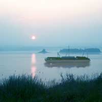
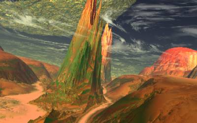
We could also have a stab at creating some landing sites.
DGill used this:
https://deepai.org/ for Digebiti, Aronar & Tibecea (and also for generic industrials & agriculturals)
You select your style of image and then bung in some carefully chosen descriptive words for it to work with
Maybe we could come up with some half-ways decent ones for some of the better-described planets from the Rough Guide/Wiki:
Isinor
Qutiri
Laenin
Xexedi
Ceesxe -
not Rough Guide
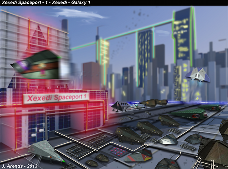
We already have a few (might need improving) which include:
Bandy Bay (Isinor)

Makandal's Reorte (one of several planetscapes by him)

Xexedi Spaceport

Re: Planetfall 2.0 (maybe)
Posted: Wed Mar 20, 2024 6:51 am
by phkb
Well, that took longer than expected! But, I now have (almost) proper station dock clearance requests working for the ground-based locations. The “almost” is the fact that it is completely automated. You drive up to nearby the dock point, you wait a few seconds, and if your “request” is accepted, you can dock without issue. If not, you can still dock, but normal fines will apply.
Why is that important? Well, I have it on good authority that, when using the Diplomacy OXP with the current version of PlanetFall, if you’ve been knocked back from docking at the main station because you forgot your visa, you can just beetle off down to the planet and dock there, no questions asked. That message you get about checking your clearance? Yeah, that’s a lie. They’re not checking anything. They’re just *saying* they’re checking.
But change is afoot. Legislative changes are forcing all traffic controllers to do things the right way, and if visas are required for the system, they need to actually check them.
(That was a roundabout way of saying the next version will work better with Diplomacy).
Re: Planetfall 2.0 (maybe)
Posted: Wed Mar 20, 2024 11:01 pm
by cbr
Cholmondely wrote: ↑Wed Mar 20, 2024 12:27 am
We could also have a stab at creating some landing sites.
Xexedi Spaceport

If an oxp can handle overlaying/rescale pngs with transparancy, an universal spaceport with random overlayed ships ed could be a possibility too...
Re: Planetfall 2.0 (maybe)
Posted: Fri Mar 22, 2024 4:21 am
by phkb
I'm in two minds about this. I will admit I was never really a fan of the docking animation in the original PlanetFall. There was nothing wrong technically - it's more of an artistic difference of opinion. Anyway, I thought the images could use a refresh, at the very least.
So I went looking for suitable images, thinking I could update them to freshen them up. And while I found plenty of public domain images, none of them ever felt just right. (I haven't done a lot of exploration into the AI image path yet. That may come soon).
Which left me in a bit of a quandary. I needed *something* in the landing animation, something that wasn't a BGS animation and would give you the impression you're docking somewhere different.
Here's a short video to showcase what I've come up with.
VouTube: PlanetFall2 docking and launching
I'm open to opinions here. Let me know what you think of the whole experience, not just the docking animation. Is this an improvement on the previous version, or have I ruined it completely?
Re: Planetfall 2.0 (maybe)
Posted: Fri Mar 22, 2024 4:33 am
by phkb
In other news: You can now land at a planetary location even if your planetary landing capability is damaged. But doing so carries a high chance that something else will get damaged during re-entry. Also, if you try landing at a military base without authorisation, you'll be booted back to orbit (presumably with a rather mortified look on your face).
Re: Planetfall 2.0 (maybe)
Posted: Fri Mar 22, 2024 8:09 am
by cbr
phkb wrote: ↑Fri Mar 22, 2024 4:21 am
I'm in two minds about this. I will admit I was never really a fan of the docking animation in the original PlanetFall. There was nothing wrong technically - it's more of an artistic difference of opinion. Anyway, I thought the images could use a refresh, at the very least.
So I went looking for suitable images, thinking I could update them to freshen them up. And while I found plenty of public domain images, none of them ever felt just right. (I haven't done a lot of exploration into the AI image path yet. That may come soon).
Which left me in a bit of a quandary. I needed *something* in the landing animation, something that wasn't a BGS animation and would give you the impression you're docking somewhere different.
Here's a short video to showcase what I've come up with.
VouTube: PlanetFall2 docking and launching
I'm open to opinions here. Let me know what you think of the whole experience, not just the docking animation. Is this an improvement on the previous version, or have I ruined it completely?
observations
Landing animation looks ori9inal
The dot had me confused at first as the landing point, but works as the trajectory point ( planet moving under it )
I did not see a launching animation
Re: Planetfall 2.0 (maybe)
Posted: Fri Mar 22, 2024 12:35 pm
by phkb
Here's another concept rather hastily thrown together.
YouTube - PlanetFall2 Alternate landing animation
Yes, I know it's not lined up perfectly. It's a concept, more than a finished product.
I'm trying to find something that
(a) will work in the 2.5 seconds of time the animation has to play
(b) is not immersion breaking (ie it doesn't take you out of the game world, or make you really notice rough edges)
(c) has the possibility of multiple ways of doing it (using the video I just posted as an example, I can drop in a different cloud formation as the backdrop, 8 frames of animation total about 7mb in file size, so I could easily create a dozen different sets of animations) so that landing on a planet feels special in some way, and more importantly, it should feel like you *are* landing on a planet.
(d) I can actually create, not being an graphic artist or anything even resembling one.
Anyway, more thoughts. Let me know yours.
Re: Planetfall 2.0 (maybe)
Posted: Fri Mar 22, 2024 4:13 pm
by Nite Owl
Either one looks good. Perhaps use both, or even more of them, for different Landing Site types. Really like the Landing Beacon with the planet moving underneath it concept. In the original Planetfall a likely looking Landing Site was chosen, approached, and then the "Please Wait" message would pop up. While waiting the Planet's rotation would take your chosen Landing Site out of vector unless you learned how to compensate. Noting the Landing Site, reading the rotation, and aiming towards a point that would take the rotation into consideration. Granted that in the original the Landing Site was random so this was not really necessary but immersion is key.
Re: Planetfall 2.0 (maybe)
Posted: Fri Mar 22, 2024 4:39 pm
by Redspear
phkb wrote: ↑Fri Mar 22, 2024 12:35 pm
(a) will work in the 2.5 seconds of time the animation has to play
It's so little time but yeah, for an oxp that's what you've got to work with barring mission screen involvement I suppose.
Also (again, not your fault), the speedy planet rotation really doesn't help.
As an aside nice to see what you did with the altimeter for Vimana HUD

phkb wrote: ↑Fri Mar 22, 2024 12:35 pm
(c) has the possibility of multiple ways of doing it (using the video I just posted as an example, I can drop in a different cloud formation as the backdrop, 8 frames of animation total about 7mb in file size, so I could easily create a dozen different sets of animations) so that landing on a planet feels special in some way, and more importantly, it should feel like you *are* landing on a planet.
Even recolouring the clouds or changing the concentration of them (simulating different weather) would help.
Speaking of clouds...
Nite Owl wrote: ↑Fri Mar 22, 2024 4:13 pm
Either one looks good. Perhaps use both
I'd be tempted to use the first landing animation for landing... and then the second landing animation for
launching.
Looking at the sky through the clouds makes more sense for launching than landing, right?
Re: Planetfall 2.0 (maybe)
Posted: Fri Mar 22, 2024 5:13 pm
by Cholmondely
Redspear wrote: ↑Fri Mar 22, 2024 4:39 pm
phkb wrote: ↑Fri Mar 22, 2024 12:35 pm
(a) will work in the 2.5 seconds of time the animation has to play
It's so little time but yeah, for an oxp that's what you've got to work with barring mission screen involvement I suppose.
Also (again, not your fault), the speedy planet rotation really doesn't help.
Might it make sense to slow down the planet rotation as part of Planetfall 2.0?
Re: Planetfall 2.0 (maybe)
Posted: Fri Mar 22, 2024 5:28 pm
by hiran
I watched both videos. And got also confused why the marker would move over the planet surface. In the beginning it is not aligned with the ship's nose, so it cannot be the trajectory. Later it behaves like a trajectory. But when does the behaviour change? And why?
The second video is much more to my taste, since it shows clearly that we are not in a station. But the rectangles don't make sense any more.
Switching to an outside camera is equivalent as showing from inside, but I'd like to see the spaceship actually approach and land. Where landing means the ship does not balance on it's nose. But for the time being that may be asking for too much, or?
Would it be possible to design a 'station' that looks like a spaceport almost completely submerged under the planet's surface, and the player ship approaches and docks? In that case the animation for docking outside might be improved as we had discussed before.
Re: Planetfall 2.0 (maybe)
Posted: Fri Mar 22, 2024 6:38 pm
by Redspear
Cholmondely wrote: ↑Fri Mar 22, 2024 5:13 pm
Might it make sense to slow down the planet rotation as part of Planetfall 2.0?
There's
rotation_speed_factor in planetinfo.plist.
If used as a universal setting then it could be done easily enough but then how much is too much likely depends on the player.
Re: Planetfall 2.0 (maybe)
Posted: Fri Mar 22, 2024 6:41 pm
by Redspear
hiran wrote: ↑Fri Mar 22, 2024 5:28 pm
I watched both videos. And got also confused why the marker would move over the planet surface. In the beginning it is not aligned with the ship's nose, so it cannot be the trajectory. Later it behaves like a trajectory. But when does the behaviour change? And why?
Could it be because the texture is rotating around the planet rather than the planet itself is rotating?
hiran wrote: ↑Fri Mar 22, 2024 5:28 pm
Would it be possible to design a 'station' that looks like a spaceport almost completely submerged under the planet's surface, and the player ship approaches and docks? In that case the animation for docking outside might be improved as we had discussed before.
Collision detection off?
Re: Planetfall 2.0 (maybe)
Posted: Fri Mar 22, 2024 11:27 pm
by phkb
hiran wrote: ↑Fri Mar 22, 2024 5:28 pm
And got also confused why the marker would move over the planet surface.
I refer you to what I said earlier:
I'm not planning to go down the "let's give the docking point a geostationary orbit", at least not in the first version of this rework. My handwavium is "The flasher represents the entry point to the automated planetary docking control, which is kept in a fixed position to ease traffic complexity in the upper atmosphere. When engaged, you are guided through the lower atmosphere and into your docking berth."
Part of the issue you're seeing in the videos is that I'm pointing my ship vertically at the planet, because that's the fast way to the dock point. Here's a video but doing the approach from a more "natural" angle.
YouTube - PlanetFall2 landing animation 2
hiran wrote: ↑Fri Mar 22, 2024 5:28 pm
Switching to an outside camera is equivalent as showing from inside, but I'd like to see the spaceship actually approach and land. Where landing means the ship does not balance on it's nose. But for the time being that may be asking for too much, or?
Would it be possible to design a 'station' that looks like a spaceport almost completely submerged under the planet's surface, and the player ship approaches and docks? In that case the animation for docking outside might be improved as we had discussed before.
These are great ideas, but beyond my ability. I'm limited to flat images with some simple "docking control" lines drawn on them.
I think it's probably time to have this discussion. *Anything* we do this close to the surface of the planet is going to look wrong on a number of levels. First, unless we switch over to 8k textures for every planet, the "ground" starts to look very grainy and unrealistic. If we put some sort of "star port" on the surface of the planet, to make it even slightly believable (ie large enough to accommodate a Cobra MkIII) will make the base the size of a small country. Oolite planets were *never* intended to be interacted with, and so anything we do with them (like PlanetFall) is forcing them into a role they weren't designed for. Everything we do has an element of "unrealism" to it. I'm just trying to find the best "least jarring" way to communicate to the player they are landing on a planet. And if we feel that having a flasher to indicate the docking point is too jarring, I could potentially use a visual effect that looks like a standard station buoy. But it would be pretty hard to see on the dark side of the planet.
Redspear wrote: ↑Fri Mar 22, 2024 4:39 pm
Even recolouring the clouds or changing the concentration of them (simulating different weather) would help.
The clouds are just a free image I found on the web, so purely for demonstration purposes. It would certainly be possible to have a number of different cloud colours ready to go, and select the best one based on cloud details of the planet object.
