Page 135 of 475
Posted: Fri Aug 06, 2010 3:36 pm
by Cmdr Wyvern
Getafix wrote:It indeed gives me the same feeling as some scenes from Odyssey 2001.
And the advertisement resembles to the monolith! 
Weeeeeeeell....Almost.
"By Giles, its full of spam!"

Posted: Sat Aug 07, 2010 9:53 pm
by Cody
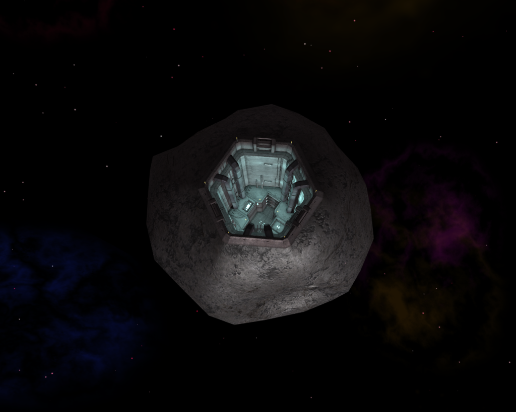
Griff rocks... er, I mean Griff's rock.

Posted: Sun Aug 08, 2010 7:55 am
by Killer Wolf
as Ruby would say, that's gorgeous isn't it?
Posted: Sun Aug 08, 2010 10:35 am
by Griff
i used the render in lightwave to bake the light in the tunnel into an illumination map, i haven't done this before and i don't think i got the render settings correct, it took 8 hours to calculate the lighting for the back wall of the tunnel, although all the other elements only took about 4 mins. to do


i must have had the radiosity settings too high

Posted: Sun Aug 08, 2010 10:48 am
by Kaks
Hmm, you could try making the azure ambient light dimmer (2/3rds of the present brightness maybe?) still, it does look really good already, and I'm sure I'm not the only one thinking that!
8 hours well spent!

Posted: Sun Aug 08, 2010 10:55 am
by Cody
I know zilch about the lighting thingy... it's that external metallic rock texture I love.
Posted: Sun Aug 08, 2010 11:00 am
by Commander McLane
Gorgeous! Both inside and out.

Posted: Sun Aug 08, 2010 11:08 am
by Griff
Kaks wrote:Hmm, you could try making the azure ambient light dimmer (2/3rds of the present brightness maybe?)
i could let the shaders randomise the brightness, so some hermits are dimly lit and others more brightly lit? i did toy with the idea of not letting light from the sun illuminate the tunnel polygons, so they'd only be lit using the illumination map because i think when sunlight & illumination map combine it all gets too bright, but i think taking out the sunlight in the tunnel will stop the normal map working
What was disappointing about the 8 hour rendering calculation was that the end result looked exactly the same as if i'd just taken the colour texturemap and desaturated it, which would have taken about 8 seconds!
It kind of put me off experimenting with placing the lights in the render program, some of the exeriments looked nice and moody, although now i've got the lighting rendered out, i might be able to 'moodify' it up a bit in photoshop with the brightness/contrast tools

@ Devs, any chance we can get realtime ray traced shadows in Oolite? - just joking

@El Viejo - i've seen some preview renderings of asteroids that someones working on at the moment that are going to blow your sombrero off when the oxp gets released
Posted: Sun Aug 08, 2010 11:18 am
by Cody
Griff wrote:@El Viejo - i've seen some preview renderings of asteroids that someones working on at the moment that are going to blow your sombrero off when the oxp gets released
Oh good... I look forward to that. I don't 'pop my sombrero' for every rock I see, you know.
Posted: Mon Aug 09, 2010 9:57 am
by CaptKev
Kaks wrote:8 hours well spent!

Ditto, Griff's work just keeps on getting better.
Posted: Tue Aug 10, 2010 9:11 am
by CaptKev
Couldn't resist just one more...

How much does an image need to be altered before it could be considered your own work?
Posted: Tue Aug 10, 2010 9:35 am
by JazHaz
CaptKev wrote:
Couldn't resist just one more...
Wow, nice image! How comes the bird is not green though?


Posted: Tue Aug 10, 2010 9:40 am
by Smivs
JazHaz wrote:CaptKev wrote:
Couldn't resist just one more...
Wow, nice image! How comes the bird is not green though?


Oh, I don't know. He's got 'Rookie' written all over him.

Posted: Tue Aug 10, 2010 10:33 am
by CaptKev
Smivs wrote:JazHaz wrote:CaptKev wrote:
Couldn't resist just one more...
Wow, nice image! How comes the bird is not green though?


Oh, I don't know. He's got 'Rookie' written all over him.


Beat me to it!
Posted: Tue Aug 10, 2010 11:33 am
by Killer Wolf
does that mean he's like a rook? that's DaddyHoggy innit?!
looks like he's playing headers w/ the planet


