Page 134 of 139
Re: Progress
Posted: Mon Oct 29, 2018 5:51 pm
by Svengali
Thank you for the clarification, a_c. It's a fine feature anyway

Re: Progress
Posted: Wed Oct 31, 2018 12:44 am
by cbr
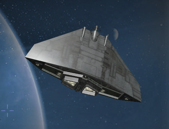
1] On some of the models when the 'light hit hardest' it looks like the new system removes some of the depth/details,
several models look less detailed.
Left part of the picture, light
Right part of the picture the cobra is darker and retains some of the details
2] when the new system works well with a model i find the light model subtle realistic

Re: Progress
Posted: Wed Oct 31, 2018 5:57 pm
by another_commander
cbr wrote: ↑Wed Oct 31, 2018 12:44 am

1] On some of the models when the 'light hit hardest' it looks like the new system removes some of the depth/details,
several models look less detailed.
Left part of the picture, light
Right part of the picture the cobra is darker and retains some of the details
You need to take into account that there are no normal maps in the default ship set. This plays a significant role in how lighting behaves. If a normal map is added, things improve a lot.
Edit: Just to put this into context, here is a Cobra3 as it comes with the default ship set above and how it looks like with a simple addition of a normal map below (this normal map here is taken from Griff's shipset). See what a difference the normal map makes; that's where the depth you refer to is coming from.
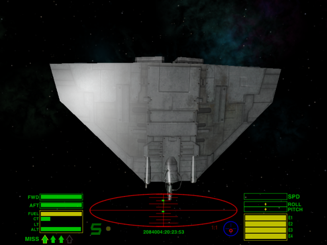
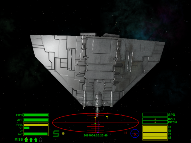
Still, the way it is shown in your screenshot is the correct way light works. Specular light overrides the diffuse and, in doing so, it may hide some diffuse texture details, depending also on the angle of incidence and the amount of gloss.
Re: Progress
Posted: Sat Nov 03, 2018 10:01 pm
by Redspear
I've found previously (especially facing the star) that there are some angles at which the detail odf the normal map is 'lost' and onme is suddenly left with a very flat looking surface (i.e. that of the model itself).
Is this situation improved with the new lighting?
Re: Progress
Posted: Sat Nov 03, 2018 10:14 pm
by another_commander
Redspear wrote: ↑Sat Nov 03, 2018 10:01 pm
I've found previously (especially facing the star) that there are some angles at which the detail odf the normal map is 'lost' and onme is suddenly left with a very flat looking surface (i.e. that of the model itself).
Is this situation improved with the new lighting?
Yes, I am certain you will find it has been visibly improved.
Edit to add: You will not see any difference with shipsets that use their own shader sets, like Griff's, Staer9's etc. Those will look the same as before. You will see the difference with ships that rely on the core game shaders, such as gsagostinho's and Deep Horizon Nav Buoys.
Re: Progress
Posted: Sun Nov 04, 2018 9:45 am
by Redspear
another_commander wrote:Yes, I am certain you will find it has been visibly improved.
Edit to add: You will not see any difference with shipsets that use their own shader sets, like Griff's, Staer9's etc. Those will look the same as before. You will see the difference with ships that rely on the core game shaders, such as gsagostinho's and Deep Horizon Nav Buoys.
Thanks for the clarification. Sounds good!
Re: Progress
Posted: Sun Nov 04, 2018 9:49 pm
by cbr
Perhaps the older light system is more forgiving for models with only diffusemaps and simulated light(maps)
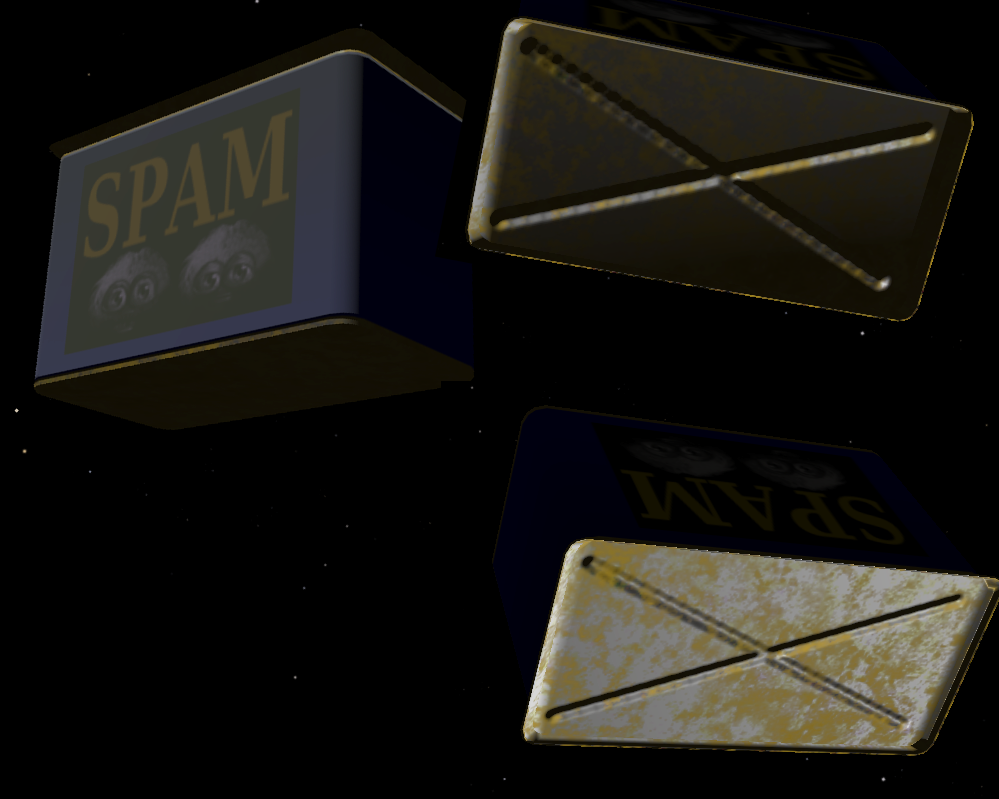
Back to an old friend, tin of spam, the normal map i think makes the huge difference here,
the 'metallook' being a texture.
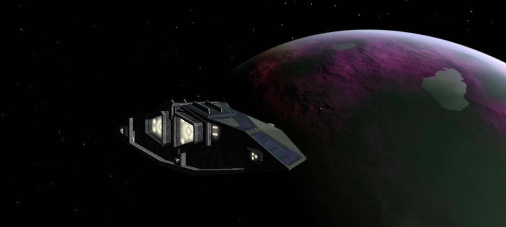
planets are a sight to behold

Maybe the oxp with the boxes and the nummers showing model behaviour could be expanded upon
including the way to incorporate the use of the new system with specular/gloss maps, au,al,cu settings on
a simple model.

Re: Progress
Posted: Mon Nov 05, 2018 6:37 am
by another_commander
cbr wrote: ↑Sun Nov 04, 2018 9:49 pm
Perhaps the older light system is more forgiving for models with only diffusemaps and simulated light(maps)
This is correct. In fact, one of the "requirements" for good looking assets with the new system is that no light information gets baked into the diffuse maps.

Maybe the oxp with the boxes and the nummers showing model behaviour could be expanded upon
including the way to incorporate the use of the new system with specular/gloss maps, au,al,cu settings on
a simple model.

The Materials.oxp has already been updated for the new system and the only thing that has not been incorporated yet are gloss maps. If anyone would like to contribute a test specular-with-gloss-in-alpha map for it, please feel free.
Re: Progress
Posted: Mon Nov 05, 2018 7:47 pm
by cbr
Code: Select all
diffuse_map = "oolite_shader_test_suite_diffuse_blank.png";
specular_map = "oolite_shader_test_suite_17_spec_gloss.png";
normal_map = "oolite_shader_test_suite_normal_17.png";
Well I can try... specular map with alpha layer
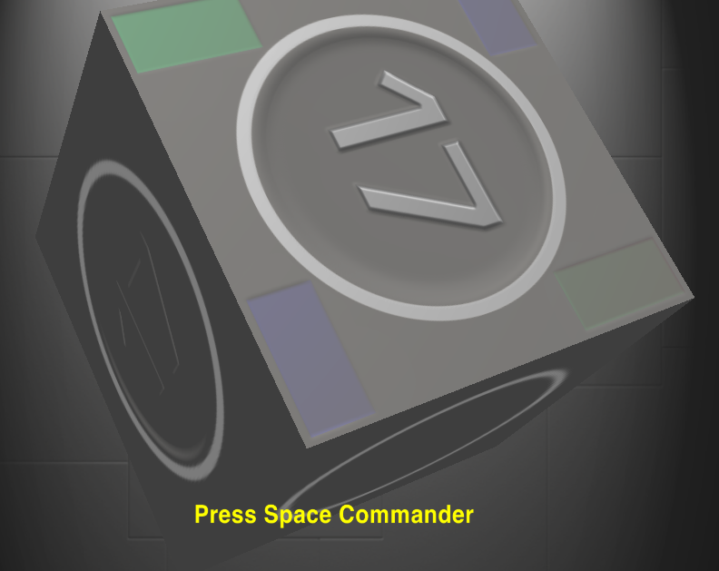
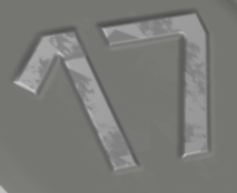
The seventeen is normal mapped and is 'highly glossy'.
This is
'13' with gloss layer and it's own normalmap

specular map with alpha

normal map 17

Re: Progress
Posted: Mon Nov 05, 2018 8:33 pm
by another_commander
@cbr: Thanks for that. Could you please upload your actual source textures somewhere? I'd like to take a closer look. Also, can you please post only the alpha layer of your spec map? I am trying to understand how gloss changes over the provided map. Thanks again.
Re: Progress
Posted: Mon Nov 05, 2018 9:38 pm
by cbr
The actual textures used are the ones you see above, these are png
And here is the separate gloss layer saved as png

Re: Progress
Posted: Mon Nov 05, 2018 9:51 pm
by another_commander
OK thanks, the reason I asked for an upload was that I wanted to be sure that we work with exactly the same source material; sometimes images get saved in a weird fashion, sometimes alpha channels disappear etc. However, I run a quick scan of your spec image on Foto Forensics and it looks like it does contain an alpha channel, so I will have to take it that I have the right image on my hard drive.
The alpha channel posted confirms my suspicion: It is either black or white, with a very small stripe of gradient from fully glossy to fully rough at the circle's edge. In order to test properly, we really need something that contains more than the two extremes of gloss, also because a gloss of 1.0 is actually something that does not produce visible specular highlights. The specular light is so concentrated and sharp, that it becomes less than one pixel in size and is not seen. And of course, a gloss of 0 does not produce specular highlights either.
It would be really helpful if we could have various shades of gray in the gloss layer, so that we can actually see how light behaves on different gloss map settings.
Re: Progress
Posted: Mon Nov 05, 2018 11:05 pm
by cbr
I wanted to clearly see the effect so used perhaps non realistic values.
If used with the following gloss map

The 17 looks now more like shiny brushed metal because of the irregular glossiness


I think for texture artists it will be a bit harder to make use of this system because you have to think in advance
what kind of effect you want ( instead of stamping your favorite pattern or grabbing your paintbrush.)
You have to think in several layers which is a little different than starting up paint.

When changed to this gradient it did not really showcase the gloss to me
Re: Progress
Posted: Tue Nov 06, 2018 6:20 am
by another_commander
Can you please post your modified textures (spec+gloss basically), so that I can include Test #17 in the distribution of the Material Test Suite?
think for texture artists it will be a bit harder to make use of this system because you have to think in advance
what kind of effect you want ( instead of stamping your favorite pattern or grabbing your paintbrush.)
You have to think in several layers which is a little different than starting up paint.
Indeed. We've had already mentioned a change of mindset that is needed in order to utilize the new system to its full power. I think the end result is well worth it though.
Re: Progress
Posted: Tue Nov 06, 2018 6:33 pm
by cbr

This is the combined specular + gloss in alpha texture used in


Maybe the oxp with the boxes and the nummers showing model behaviour could be expanded upon

