Page 14 of 17
Re: (NEW RELEASE) NumericHUDv3.oxp
Posted: Mon Jun 30, 2014 3:46 pm
by Norby
Diziet Sma wrote:Downloading via the OXZ Manager fails..
Fixed, thanks.
Re: (NEW RELEASE) NumericHUDv3.oxp
Posted: Mon Jun 30, 2014 4:11 pm
by Diziet Sma
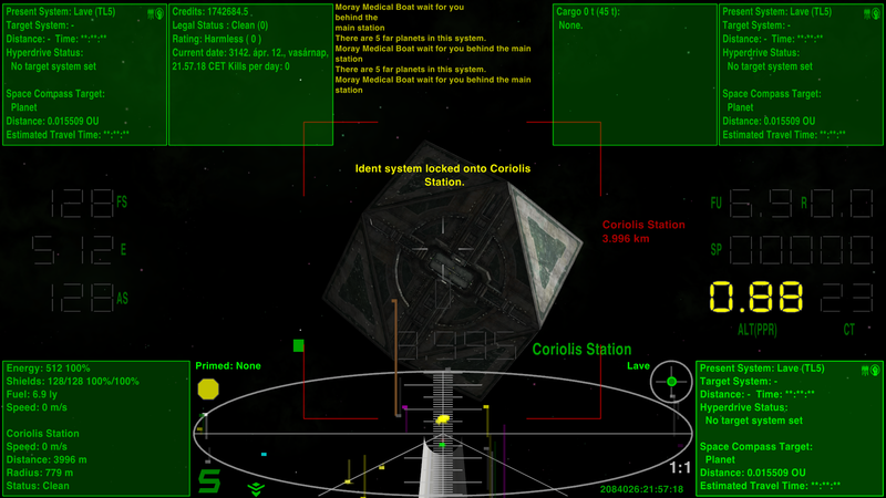
It might be an idea to put a note up on the Wiki explaining that the Comms Log does not auto-display in this version of the HUD, as it would cover other instrumentation, and that the player must use the Comms Log key to view it.
Re: (NEW RELEASE) NumericHUDv3.oxp
Posted: Mon Jun 30, 2014 4:21 pm
by Norby
Done, thanks. Feel free to edit the wiki if you have a good idea.

Re: (NEW RELEASE) NumericHUDv3.oxp
Posted: Mon Jun 30, 2014 4:30 pm
by Diziet Sma
Ok.. will do.. in the meantime, here's a good idea that you could use to bump NumericHUD up to version 3.20
 https://bb.oolite.space/viewtopic.php?p=220809#p220809
Re: (NEW RELEASE) NumericHUDv3.oxp
Posted: Mon Jun 30, 2014 4:35 pm
by Norby
The x_origin=1; is already in 3.19.
Re: (NEW RELEASE) NumericHUDv3.oxp
Posted: Mon Jun 30, 2014 4:40 pm
by Diziet Sma
For the MFDs, yes.. but that post is talking about doing the same thing for the Comms Log.. so that it too sits up by the edge of the screen. At the moment, it only has
y_origin=1;
See the
screenshot immediately above that post to see how it currently looks on my laptop using 3.19.
Re: (NEW RELEASE) NumericHUDv3.oxp
Posted: Mon Jun 30, 2014 4:55 pm
by Norby
Well, I fit the width and position of comms for 4:3 screens where touch the border, and I think widescreen users can read the text better if not fit to the side but use the more available space between the crosshairs and numbers, so I would like to leave this as is.
Re: (NEW RELEASE) NumericHUDv3.oxp
Posted: Mon Jun 30, 2014 5:08 pm
by Diziet Sma
Fair enough.. but it does look strange.
Particularly when the 4:3 comms looks ok in 16:9 as well.
I'd much rather see this:

than this:

Norby wrote:I think widescreen users can read the text better if not fit to the side but use the more available space between the crosshairs and numbers, so I would like to leave this as is.
Not really.. as you can see, it just looks strange and unbalanced, and unnecessarily blocks the view forward.
(If you're inclined to change it, the values you need are
x_origin=1 and
x=-124)
Re: (NEW RELEASE) NumericHUDv3.20.oxp
Posted: Mon Jun 30, 2014 8:06 pm
by Norby
Finally in
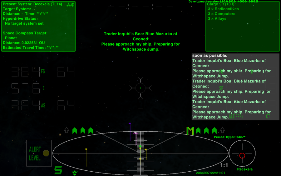
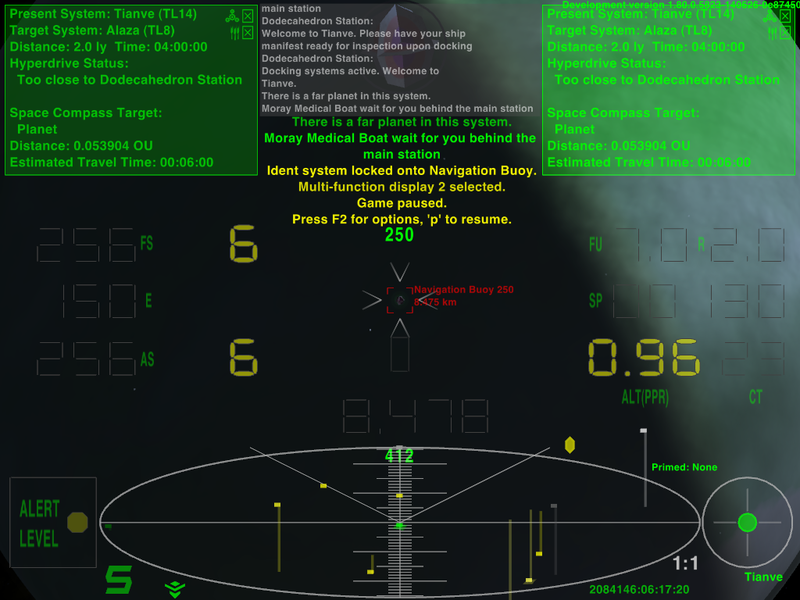
NumericHUDv3.20 I fit comms into the top center region:
Re: (NEW RELEASE) NumericHUDv3.oxp
Posted: Tue Jul 01, 2014 3:39 am
by Diziet Sma
Interesting solution.. looks good!

(what are the '250' and '412' about? Some other OXP?)
Re: (NEW RELEASE) NumericHUDv3.oxp
Posted: Tue Jul 01, 2014 9:26 am
by Norby
Yes, my [wiki]Detectors[/wiki] (almost a debug tool in the balance scale due to show the energy+armour(IronHide and HardShips)+shield(CustomShields) value of the current target, almost is due to the willful inaccuracy) - included to verify the occupied space.
The bottom number is the player's energy+armour+shield+shield capacitor value facing the target (150+0+256+6=412). I am a bit slow to summarize these, especially if armour is installed which is not shown otherwise.
A very numeric HUD together.

Re: (NEW RELEASE) NumericHUDv3.oxp
Posted: Tue Jul 01, 2014 9:49 am
by StathisR
It looks great. Good job Norby.
Re: (NEW RELEASE) NumericHUDv3.oxp
Posted: Wed Jul 02, 2014 12:05 am
by Norby
Thanks for the warm words, these are motivated me to make a widescreen-optimized
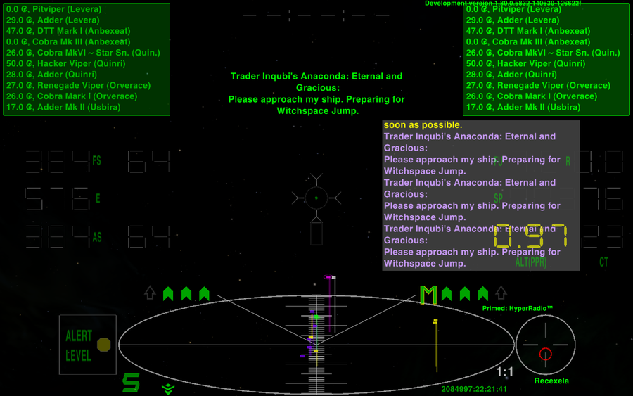
v3.21 fitted with 4 MFDs:

The used MFDs in order:
![[EliteWiki]](/images/elitewikismall.png) Combat MFD
Combat MFD,
Navigation MFD,
Useful MFDs and
Manifest MFD.
In 4:3 screens the 1. and 4. MFD is usable as before, and the center ones with some compromise due to the comms and old console messages are not shown continually.

Re: (NEW RELEASE) NumericHUDv3.oxp
Posted: Wed Jul 02, 2014 8:01 am
by Zireael
That 4 MFD version is brilliant!
Re: (NEW RELEASE) NumericHUD v3.22
Posted: Fri Jul 04, 2014 11:48 pm
by Norby
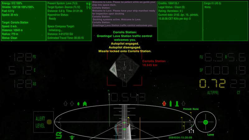
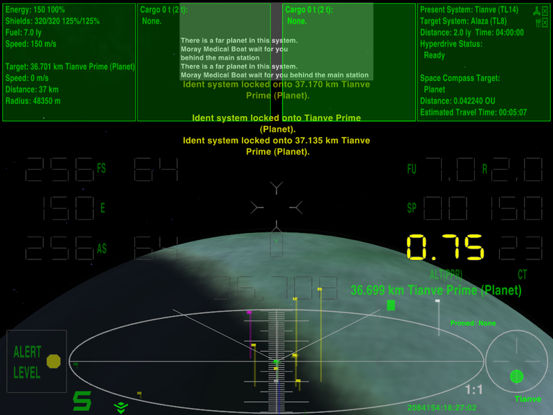
How about 6 MFDs?

In
NumericHud v3.22:

The first two is at the bottom, if these are enough for you then the upper part will be free (in widescreens, 4:3 should use the top corners).
