hiran wrote: ↑Mon Aug 14, 2023 6:41 pm
Maybe that would be good enough for you to keep an overview?
It might be sufficient for some versions of the game I keep for testing. I don't have every OXP I use in every environment, so it might work for those. But for my main installation, it wouldn't work. I spend most of my time in a code window (using VS Code), and it keeps the folder structure in a window for me, so I can quickly collapse or expand whatever section I'm working on to quickly find what I need.
As for the folder depth, mostly it's just two deep - the main category, and then the OXP's. Except for Ships, where I've added another layer for the author (eg: Ace, Griff, KillerWolf, etc).
What I would expect is for the app to honour my folder structure. If I told it to disable an expansion, it would turn it off, and the put it back in the same spot if I asked it to turn it back on. In some ways, I think you're working too hard by actually moving folders/files into different folders. A simple rename, adding ".hide" or ".disabled" to the OXP folder or OXZ file would disable the AddOn quite effectively, with no chance that files could get lost in the move. Plus, it would be much easier to keep the users desired folder structure, because you don't have to remember where everything was to start with.
With that out of the way, here's some more feedback on the app so far.
I get an “Error” when I select “C:\Oolite” as the home folder for an Oolite installation. That should work as that is the folder used when Oolite is installed. It should be able to work out that there is an oolite.app folder in the one I selected and go from there. At the very least, the unhelpful "Error" dialog box should be given a more descriptive reason as to why it was an error.
Once the correct folder is selected, it continues.
Nice to have: right-click context menu on the different Oolite installations with “Select/Edit/Delete” options.
If you only have one installation, it should auto-select it when you go to the OXPs/OXZs tab. At the very least, you should get a message when you go to the Addons tab that you haven’t selected an Oolite installation to work with.
(As an aside, using “OXPs/OXZs” is rather unnecessary. No one needs to know the extensions – just call it “AddOns”, which is much clearer. I’m going to do that from here on.)
Once you have selected an installation and go to the AddOns tab, there is no visual cue about what installation you are working with. I’d suggest putting something above the “Filter” and “Expansion Set” groups, something like “Current installation: C:\…”. It could then be highlighted if the user comes to this page without selecting an installation. You should have the same piece of info on the "Start Game" tab.
Concerning the order of the tabs: The logical flow of the process is (1) Enter your installation(s), (2) Select your AddOns, and then (3) Launch Game. I think it would make more sense to put the tabs in that order.
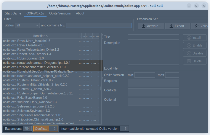
Moving on to the expansion list, there is no need to have the Identifier in the grid - it's really only used internally. You could have it on the details side if you really want, but that is a confusing piece of information to have as the very first column in the grid. The title should be the first column. If users really want the identifier, make it an option somewhere.
The “Date” column is problematic. The format works well for sorting, but not for reading. Ideally a localised date format would make more sense. And is the time value important? I don’t think it’s completely relevant to anything to do with AddOns, so you could probably strip this back to to just the date.
I found the Status column confusing: It took me a little while to work out what the letters were referring to. I think, if the identifier column was removed, it might be possible to have 5 extra columns with just a checkbox in them for each of the different statuses.
There is also a need to have some tooltips on functions. For instance, what does “Reload” (on the AddOns page) actually do? What does “Reload”
do on the “Start Game” page? Tooltips will help users navigate the app without needing a guide.
The two chevrons to the right of the header row of the grid are (a) too small to use, and (b) not really required. You already have the slider so users can adjust the screen as required, but being able to fill the screen with one side or the other feels unnecessarily complicated. But maybe that’s just me.
Anyway, that's all for now.
