Page 118 of 474
Posted: Mon Feb 15, 2010 6:48 am
by Zieman
pagroove wrote:
Just launched form a DS Ico (Deepspace ICO)
Hate to (= love to

) nitpick, but that's a Dodecahedral station in the pic.
And people: PLEASE use thumbnail linking for thos BIG pictures !
Posted: Mon Feb 15, 2010 12:12 pm
by Corny
WIP of a HUD:

Posted: Mon Feb 15, 2010 4:47 pm
by Poro
The HUD is looking good, what colours are you going for with the scanner, crosshair etc.?
Posted: Mon Feb 15, 2010 5:05 pm
by Sarin
Interesting, just a little thingie, I'd personally cut the space for laser temp to one line and use that space for additional missiles if possible, with maximum of 16 missiles they can go way off...
Posted: Mon Feb 15, 2010 6:14 pm
by Corny
Poro wrote:The HUD is looking good, what colours are you going for with the scanner, crosshair etc.?
Mostly the same green as you can see already.
Sadly, I wasn't able to change everything to it (e.g. the text for the time)...
Sarin wrote:Interesting, just a little thingie, I'd personally cut the space for laser temp to one line and use that space for additional missiles if possible, with maximum of 16 missiles they can go way off...

I never think of players with 16 missiles - I always think of 4-6 since they are usually that low...
Can I even make line breaks in the missile-line?
Anyway, when it fills the whole width, it overlays the text messages

And I'm too lazy to make a new draft that has a fitting height now

Maybe I can solve this satisfyingly with just scaling it down (and not use the complete width)...
On the other hand, I don't know which text messages are super-important when you use a rather complete sound set with speech and all. Hmm.

Edit: Lesson learned - the scanner doesn't work as expected as a circle. Time for a new draft!

Posted: Sat Feb 20, 2010 11:16 pm
by pagroove
Had my first Long Range Cruiser Encounter. Impressive ship. Just look at the (tiny) anaconda left of it. Good work there ADCK


Posted: Thu Feb 25, 2010 3:05 am
by Cody
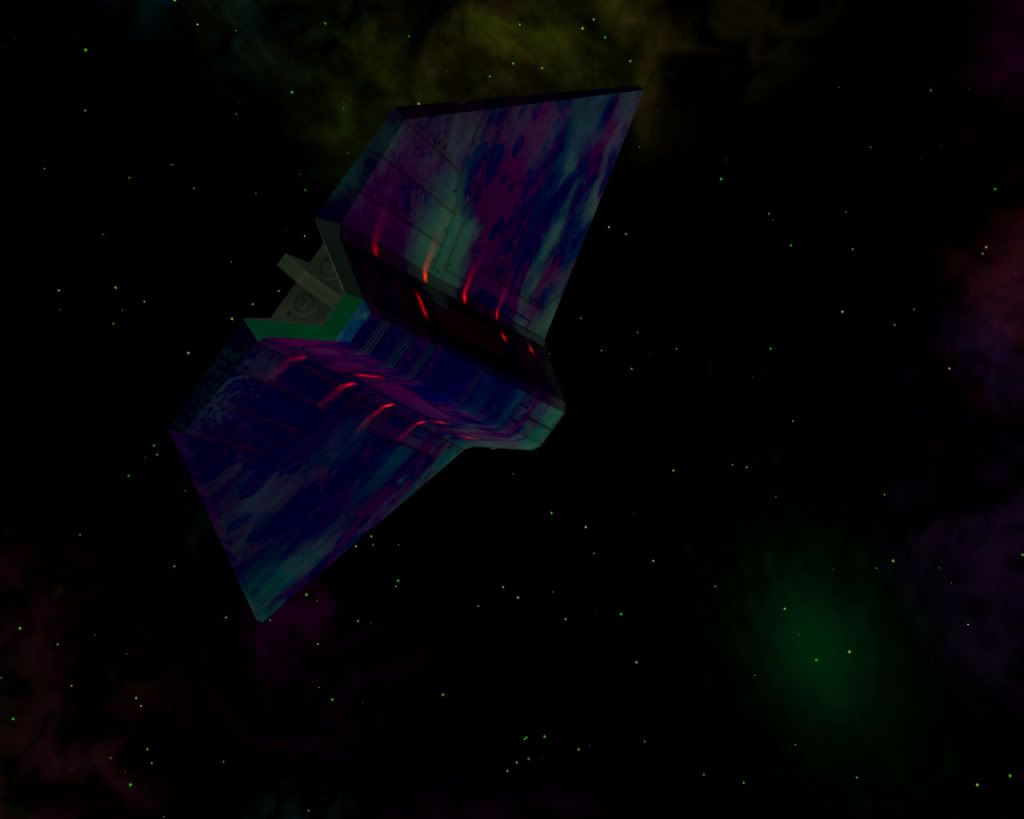
A Griff Moray in all it's glory.

Posted: Thu Feb 25, 2010 3:34 pm
by Selezen
Damn, THAT is PURDY!
Posted: Thu Feb 25, 2010 11:59 pm
by DaddyHoggy
El Viejo wrote:A Griff Moray in all it's glory.

Is that the newly tweaked shader? Looking good - gonna have to download and check my fps!
Posted: Fri Feb 26, 2010 12:14 am
by Cody
DaddyHoggy wrote:
Is that the newly tweaked shader? Looking good - gonna have to download and check my fps!
Sure is... here's another view:

Posted: Fri Feb 26, 2010 9:49 am
by Chrisfs
El Viejo wrote:A Griff Moray in all it's glory.

The colors look great,
but it also looks like it's flat (or am I look at it wrong?)
where is the space for engines, crew and cargo ?
Posted: Fri Feb 26, 2010 10:15 am
by Griff
it is fairly flat, there's a big lumpy bit at the front they could all cram into though if they didn't mind pressing tightly up against each others crotches, maybe the moray could get nicknamed 'the love boat'

on account of everyone getting up close and personal in the limited space
there's a few shots of the model here when it was being worked on that show the overall shape a bit better
https://bb.oolite.space/viewtopic.php?t= ... &start=149
engines are missing i'm afraid, there just wasn't any texture space left for them and their glow effects - they could get added in as subentites thoug since these could have thir own maps - maybe some sort of cool 'space propellor' thing would suit, it would give us a chance to play with rotations and stuff in the vertex shaders!
edit: y'know, it really needs a periscope sticking out the top
Posted: Fri Feb 26, 2010 11:00 am
by Cody
Griff wrote:edit: y'know, it really needs a periscope sticking out the top
Run silent, run deep.
Posted: Fri Feb 26, 2010 11:21 am
by Killer Wolf
i've never understood the word "submarine". surely they're in it, not under it?
Posted: Fri Feb 26, 2010 11:28 am
by Cody
The correct term would be 'submersible', I suppose.
(As in SSN... submersible ship nuclear.)

