Screenshots
Moderators: winston, another_commander
Click it to see full screen version:
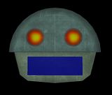
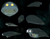
So not only did I retexture the ship, but made a whole new model for it using the exact same dimensions as the older version, painstakingly by hand. But it fixed the texture problems and lowered the poly count significantly. But looks exactly the same externally.
(Theres a weird light glitch in the right pics upper hull)
- DaddyHoggy
- Intergalactic Spam Assassin
- Posts: 8515
- Joined: Tue Dec 05, 2006 9:43 pm
- Location: Newbury, UK
- Contact:
I like but could I suggest one thing? Have a variation of intensity (subtle) and hue across the porthole lights - indicating that each room behind it is creating slight variations in the light which is escaping into space?
Well done on reducing poly count - by hand you say! staggering!
Oolite Life is now revealed hereSelezen wrote:Apparently I was having a DaddyHoggy moment.
- pagroove
- ---- E L I T E ----
- Posts: 3035
- Joined: Wed Feb 21, 2007 11:52 pm
- Location: On a famous planet
Really impressed that you did a complete rebuild of the ship. I also like the variants. release on the end of this week
For P.A. Groove's music check
https://soundcloud.com/p-a-groove
Famous Planets v 2.7. (for Povray)
https://bb.oolite.space/viewtopic.php?f=4&t=13709
https://soundcloud.com/p-a-groove
Famous Planets v 2.7. (for Povray)
https://bb.oolite.space/viewtopic.php?f=4&t=13709
- DaddyHoggy
- Intergalactic Spam Assassin
- Posts: 8515
- Joined: Tue Dec 05, 2006 9:43 pm
- Location: Newbury, UK
- Contact:
And I was just about to ask where I could get hold of the new version! Glad I read to the end of the thread!pagroove wrote:Really impressed that you did a complete rebuild of the ship. I also like the variants. release on the end of this week
Oolite Life is now revealed hereSelezen wrote:Apparently I was having a DaddyHoggy moment.
- DaddyHoggy
- Intergalactic Spam Assassin
- Posts: 8515
- Joined: Tue Dec 05, 2006 9:43 pm
- Location: Newbury, UK
- Contact:
Blogged! http://www.jonnierocket.com/blog/to-exp ... new-worldspagroove wrote:Well not a screenshot but a video:
View the Famous Planets Promo Video on Youtube
I made a promo video of the WIP Famous Planets 2.0. Worlds of Galaxy 2.0.OXP with custom music!
Enjoy. Also a great showcase of some Griff Objects. Make sure you view it in HQ.
http://www.youtube.com/watch?v=13bq-R0jWnA
I'll also put it in my RL(tm) blog too when I next do one (soon - I'm supposed to do one a week and haven't done for nearly 3!! Oops!)
Oolite Life is now revealed hereSelezen wrote:Apparently I was having a DaddyHoggy moment.
- DaddyHoggy
- Intergalactic Spam Assassin
- Posts: 8515
- Joined: Tue Dec 05, 2006 9:43 pm
- Location: Newbury, UK
- Contact:
Is each ship named uniquely (using decals as per Griff/Ahruman technique) or are their multiple like_ship variants with just this naming different?
And I concur - big is beautiful!
Oolite Life is now revealed hereSelezen wrote:Apparently I was having a DaddyHoggy moment.
-
- Quite Grand Sub-Admiral
- Posts: 6682
- Joined: Wed Feb 28, 2007 7:54 am
- Griff
- Oolite 2 Art Director
- Posts: 2483
- Joined: Fri Jul 14, 2006 12:29 pm
- Location: Probably hugging his Air Fryer
wow A_C, you really do know how to frame a cool screenshot!
To whoever made them those asteroids look great! The normal mapping is brilliant, look at the lovely light falloff between the lit and shadowed side, there's no hint of the underlying polygon mesh getting in the way at all - fantastic stuff!
edit: actually, thinking about it what have i got wrong in my ship shaders, why are they lit a lot more harshly that the asteroids - something to do with the ambient light, have i forgotten to include it in the shader?
edit: ah yes, line 169 in the fragment shaders
that's not right for a start, shouldn't be using light 0's ambinet
To whoever made them those asteroids look great! The normal mapping is brilliant, look at the lovely light falloff between the lit and shadowed side, there's no hint of the underlying polygon mesh getting in the way at all - fantastic stuff!
edit: actually, thinking about it what have i got wrong in my ship shaders, why are they lit a lot more harshly that the asteroids - something to do with the ambient light, have i forgotten to include it in the shader?
edit: ah yes, line 169 in the fragment shaders
Code: Select all
diffuse += gl_FrontMaterial.ambient * gl_LightSource[0].ambient;
-
- Quite Grand Sub-Admiral
- Posts: 6682
- Joined: Wed Feb 28, 2007 7:54 am
Credits due for asteroids shown above:
Initial design: Charlie
Retouch and improvements to initial models: Eric Walch / Griff (you did not remember that, Griff? )
Normal mapping: Eric Walch
All these and many more are contained in the new trunk-only Asteroid Storm mission pack, made available by Eric in this post.
Initial design: Charlie
Retouch and improvements to initial models: Eric Walch / Griff (you did not remember that, Griff? )
Normal mapping: Eric Walch
All these and many more are contained in the new trunk-only Asteroid Storm mission pack, made available by Eric in this post.