Page 12 of 15
Posted: Wed Sep 09, 2009 10:28 pm
by DaddyHoggy
Take care KZ! Hope to see you soon (RL got in the way for a year for me - hope it's not the same for you!)
...
Posted: Wed Sep 09, 2009 10:39 pm
by Lestradae
Sad to hear that RL is going to keep you from here for a time

... but looking forwards to your return

Oh, and I really like the badges now that they have sprouted both wings again! Definitely would like to see them ingame

Cheers
L
Posted: Tue Sep 15, 2009 12:14 pm
by KZ9999
Hi, I'm just having a quicky squiz at what's happening on BB. Which is a bunch, apparently. Any-ho, did a quick logo mock-up since Ahruman finally let slip on a few details on what he actually wanted, so pay that thread a visit.
I want you folks to have a real think about how you use the electronic documentation you get with software. I'll be posting a link for a on-line survey about the subject, when I find a site that doesn't want to charge for the service. <mutter.> I'll let you know with a new thread about it when it's ready.
See you soon, well hopefully sooner than later.
Posted: Fri Sep 18, 2009 12:25 pm
by KZ9999
Turns out that RL (TM) was kind to me this week.
*
Given the ++good feedback to the
Ahruman response I whipped up on the Oolite Icon Comp' thread, I present to you the
iStarbird in all it's many forms.
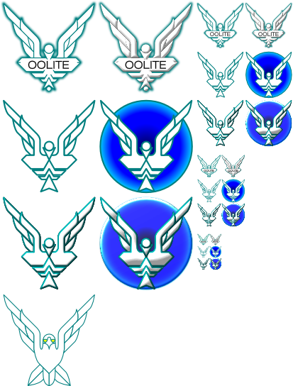
One thing i've noticed, when the design goes to a >48x48 pixel size, the bird becomes washed out. Add the wormhole behind it and it really pops. Also just for fun I tried turning into a real bird, which doesn't look half bad.
Anyhow, the normall +/+/good & +/+/ungood comments insert below.
* Turns out I should be able pop in about once a week till xmas. After that, I could be pulling 80 hour weeks (40 working + 40 studying if everything goes to plan.) so who knows.
Posted: Fri Sep 18, 2009 12:41 pm
by Cody
Hi KZ
The realistic bird... yes!
Regards
Posted: Fri Sep 18, 2009 1:42 pm
by Kaks
Personally, I really, really like the second bird from the left!
And you can quote me on that!

Posted: Fri Sep 18, 2009 1:55 pm
by Cody
Kaks wrote:Personally, I really, really like the second bird from the left!
I've muttered that phrase in a few gin joints in my time.
Posted: Sat Sep 26, 2009 11:38 pm
by KZ9999
Once again KZ drifts through the bb and drops off another doodle after the request for a realistic bird.

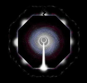
I though I might try taking the logo away from the classic design and this is what I cam up with. The discs at the top are meant to be a sun and planet while the disc the bird is holding is a wormhole witchcloud. I'm not too sure about them so voice an opinion.
BTB, is there a boot print on my ass
. Seriously, I'll have to pick up my game after
McSpider's entry in the compo' thread. I love a challenge
 <Rubs hands while laughing like a Bond villian.>
Posted: Mon Sep 28, 2009 2:54 pm
by Cody
Hi KZ.
Personally, I don't like either of them.
I think they remind me of an airline logo, but I can't place which one.
From the previous batch, I'd like to see the "real bird" with talons holding a scroll or something saying OOLITE, and a wormhole behind it.
You're right about the small designs needing the wormhole behind them.
Regards
Posted: Mon Sep 28, 2009 9:13 pm
by ZygoUgo
I know it's the opposite of the flow, just an idea..

Can't remember where I got the font, but it was a free site
Posted: Mon Sep 28, 2009 9:17 pm
by ovvldc
Personally, I don't like any of the real birds.
The second doodles KZ remind me of Zak McKracken somehow, and the first real bird of a cartoon animation, not a spaceflight game. The bottom wormhole also looks more like it pops up from the webpage than a several lightyear-deep hole.
I like the top right the most in terms of texture, and would prefer it coupled with the shape of the second row instead of the word over a wormhole. So a topright and middle right combination.
my 2€ct,
Oscar
Posted: Mon Sep 28, 2009 9:23 pm
by JensAyton
ZygoUgo wrote:I know it's the opposite of the flow, just an idea..
Can't remember where I got the font, but it was a free site
Oddly, this is familiar to me, as if it were from an old dream, but I can’t exactly remember.
Posted: Mon Sep 28, 2009 9:36 pm
by ZygoUgo
Ooh yeah, what's that from?
Missed that one, or if you're feeling sentimental..
http://www.abandonia.com/en/games/24624 ... andal.html
Hmm, they don't seem to have the Mac version.
http://marathon.sourceforge.net/
Posted: Tue Sep 29, 2009 7:51 pm
by goran
Marathon... first game that put production in my old company to a halt. Sweet memories (of burning sprites flying around after wisely placed nuke)...
Posted: Sat Jan 09, 2010 5:02 pm
by Lucidor
Perhaps it would be best to move away from insignia that looks like the original Elite logo.
Maybe we could have a simple badge that's built upon for every level?
Something like this:
