Page 110 of 474
Posted: Sun Jan 10, 2010 12:32 am
by pagroove
ADCK wrote:pagroove wrote:ADCK:
Good work on the ships. Maybe add some glow to the engines?
??? They are glowing, in most of those pics (specifically 40 & 42) its shot from behind with the light source below... wait a sec why is there a light source in deep space? This doesn't make any sense *head explodes*

But yeah, they are glowing, it they weren't you wouldn't even see the red at that angle, it would just be a dark patch. If you mean the hull around the engines, on a ship that size if the hull was glowing, you'd have a small problem... Like a hull breach

The windows are also glowing, but its hard to tell because of the mysterious previously mentioned deep space source of light...
Try pasting this in your engines.

Or this one (higher power)

Posted: Sun Jan 10, 2010 12:56 am
by pagroove

I designed new Behemoth engines free to use. (also if you want to use it for something else)
Posted: Sun Jan 10, 2010 2:02 am
by ADCK
Cool, thanks.
Posted: Sun Jan 10, 2010 2:30 am
by ADCK
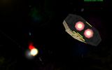
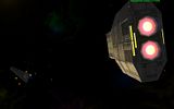
Pics of Type 1 Behemoth with upgraded engines:


Posted: Sun Jan 10, 2010 3:43 am
by pagroove
O yeah! Rock on commander

Posted: Sun Jan 10, 2010 8:25 am
by Killer Wolf
Griff wrote:
Never in a million years would I have guessed that that piece of music was called 'Entry Of The Gladiators'
fkn A. i'm now tormented by the image of Russell Crowe facing off against a huge tiger-maked opponent, dodging to one side and splatting a cream pie in his face.
Posted: Tue Jan 12, 2010 1:06 pm
by ADCK
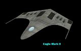
Another OXP I'm working on, these are the first ships I've actually made the models for. (Well, technically I modified them... The original was from FFED3D, but was missing the back, canopy and the nacelles.)
Yes, I know there's an Eagle 2 OXP, but it doesn't have the eagle 1 and 3, and the texture's rather dull, and this is a much higher poly count model (some might see that as bad)
Pics:
Eagle 1:

Eagle 2:

Eagle 3:

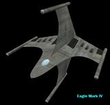
Introducing, my own take on the Eagle series, the Eagle 4:

Textures still need work, and havn't shadered them yet, I expect to be done on them in 2 or 3 days.
Posted: Tue Jan 12, 2010 1:40 pm
by DaddyHoggy
On the Mk4 the horizontal wings are nice and sweeping, the vertical wings have a fairly nasty looking join point - if that could be smoothed out (with drastically upping polys still further) I think it would look better - plus - the advantages of a + wing design?
Posted: Tue Jan 12, 2010 1:48 pm
by Killer Wolf
what are the advantages? in NPC you could fit guns i suppose, but for a player the only thing they seem to do is greatly increase your height, which would have to be a consideration when docking.
Posted: Tue Jan 12, 2010 1:51 pm
by DaddyHoggy
Killer Wolf wrote:what are the advantages? in NPC you could fit guns i suppose, but for a player the only thing they seem to do is greatly increase your height, which would have to be a consideration when docking.

clang-clang-clang-clang-booooooom.....
Posted: Tue Jan 12, 2010 2:48 pm
by ovvldc
I quite like the mk 1-3 variations, but I share the misgivings already raised against the + configuration. I also wonder if the way the grooves are in the texture really work at the nosecone end.
But well done so far! I look forward to seeing this with a normal map and some lighting effects

. (Griff, Simon and others have completely spoiled me).
Best wishes,
Oscar
Posted: Tue Jan 12, 2010 4:17 pm
by Selezen
ADCK wrote:Yes, I know there's an Eagle 2 OXP, but it doesn't have the eagle 1 and 3, and the texture's rather dull
<Selezen picks up his feelings from a pile on the floor>
ADCK wrote:and this is a much higher poly count model (some might see that as bad)
yeah, I went for low poly count with the Eagle (like most of my models) so that lower-end systems wouldn't scream in pain if loads of sips turned up. Since the Eagle is an escort ship it follows that more of them might be around, especially if more OXPers shove it into some of their work.
In all seriousness, the Eagle texture is pants, I know. It's one of many things I meant to go back and make more pretty and more realistic. The basic green colour is meant to evoke Frontier and its opening movie...
Nice work though, the Eagles look Nice. I'll delete my badly textured attempts at the Mk 3 and 1 and pass the Eagle crown to you...
Posted: Tue Jan 12, 2010 11:34 pm
by DeepSpace
Posted: Tue Jan 12, 2010 11:41 pm
by Lucidor
I like the Coriolis.
Posted: Tue Jan 12, 2010 11:52 pm
by DaddyHoggy
I like it all.
<Firefly_mode>Shiny</Firefly_mode>


