Page 11 of 24
Posted: Fri Mar 21, 2008 5:44 pm
by pagroove
Thats a big task,
Do you still need the texture?
Posted: Sat Mar 22, 2008 4:16 am
by Kaks
Posted: Sat Mar 22, 2008 11:10 am
by CaptKev

@Kaks, first two look excellent in-game

, the third one was created by adding water to the low lying areas of planet one.
Not one hundred percent convinced by the last two, what does everyone else think?
@pagroove, keep sending them but try to make them 1024 x 512 if possible.
Posted: Sat Mar 22, 2008 11:15 am
by pagroove
KAKS,
The first 3 look REAL good. The others are 2 bleu or the city grid is too big.
So I like the first 3. Keep it up!
@CaptKEV.
Is my other luxury city planet also ingame? I want to see it


Posted: Sat Mar 22, 2008 11:44 am
by Kaks
Glad you like, I did spend a stupid amount of time on those two!

Plus, really like the water on the third planet. Puts my aborted - unpublished - water efforts to shame!

And yes, tech planets are a nuisance to get just right.
<hope>
Does it mean that a greyed out planet 5 would be kind of ok, though?
</hope>
Posted: Sat Mar 22, 2008 12:00 pm
by Commander Mysenses
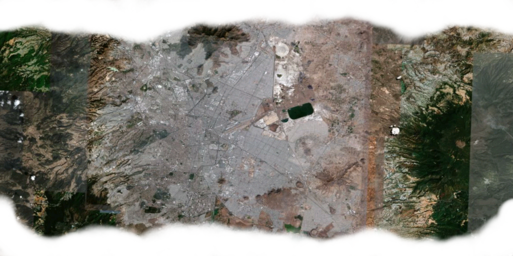
How about Mexico City for a industrial planet

(courtesy of Google Earth)
Or is the scale too whack still?
Posted: Sat Mar 22, 2008 12:23 pm
by Kaks
Hmmm, I've found it difficult to tell the city grid at that scale, but maybe that's where I've been going wrong...
Posted: Sat Mar 22, 2008 1:28 pm
by CaptKev
Two more to go!


0 Earth (from Kaks)
1 Wet Mars
2 Earth with more land to sea ratio
3 Earth with craters
4 Earth with lots of mountains (from Kaks)
5 Mars
6 Mars 2
7 Mars with vegetation
8 Mars with veins
9 Industrial world (from pagroove)
A Sea world with just a small island
B Industrial world 2
C Mars 3 (from Kaks)
D Mars 4 (from Kaks)
E Industrial world 3 (from Kaks)
F Tropical Earth (from Kaks)
Posted: Sat Mar 22, 2008 1:34 pm
by Cmdr. Maegil
Whoa, guys, you're doing wonders, and it should look great.
Just please don't use the Earth texture!
Posted: Sat Mar 22, 2008 3:17 pm
by elite
How about the texture I used to start this in the first place?
It came in the original download.
elite wrote:Ok I did a bit of tinkering to the Planetinfo.plist file of the System_Redux.oxp.
I am currently at Lerelace in Galaxy one.
At the moment main planets look like this for me:

After changing the posistion and size of the planet from...
position = "pwm 655444 -3783808 556540";
radius = 18000;
to
position = "pwm 0 0 0";
radius = 3300;
the main planet now looks like this which is much better:

Unfortunately this only works for this planet at Lerelace because it is sized to just slightly overlap the size of the normal main planet.
At least this shows that placing a planet with png textures at the center of the system
"pwm 0 0 0" does work.
Now, if only we had an OXP that could read the size of all the planets and then place a png textured planet of the correct size at the center of each system.
That would work.
Posted: Sat Mar 22, 2008 5:00 pm
by Kaks
Good points! Earth standing in for an alien planet feels pretty strange.
The original texture seems pretty good, and if you also include mars 3 with oceans, all you'd need is just one more texture!
Talking about textures, here's two more for your consideration. I tried two slightly different ways to get a nicer coastline, hope at least one of them worked out ok!


 edit:
edit: and here's the grey version of planet 5 above!


Posted: Sat Mar 22, 2008 5:57 pm
by ovvldc
CaptKev wrote:Not one hundred percent convinced by the last two, what does everyone else think?
I think you used a very small scale (looks like a neighbourhood) map for this. Roads should not be visible from space. I suggest zooming out considerably. Any road-like structure should never be more than a pixel wide on the texture, and even that would be a huge structure to see that far off from space. The Mexico City texture looks much more useful.
Planets 1-3 look very nice!
best wishes,
Oscar
Posted: Sun Mar 23, 2008 6:45 am
by Kaks
Posted: Sun Mar 23, 2008 2:00 pm
by pagroove
@KAKS,
Good work on the landscape textures
@CapKEV
Do you have my 2nd city planet also in game??
Me too think we must not use the earth texture as there is no earth in the Elite space[/img]
Posted: Sun Mar 23, 2008 3:56 pm
by Kaks
Thanks Pagroove, I think I finally figured out how to make seamless planets...

Quite surprisingly, it seems to be pretty addictive. Probably because I always thought I couldn't use a graphic program to save my life, and it turns out I'm not too bad!

Anyways, I just had to have one more go before I get shipped to graphics rehab...


