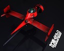
Haha, you're rightDaddyHoggy wrote:Nice - although I would take out the laser fire against the station - it looks like its held up on wires otherwise...
Web redesign
Moderators: another_commander, winston
-
Cmd. Cheyd
- ---- E L I T E ----

- Posts: 934
- Joined: Tue Dec 16, 2008 2:52 pm
- Location: Deep Horizon Industries Manufacturing & Research Site somewhere in G8...
Take this simply as my opinion, but -
I would not use that screenshot as the basis for advertising the game. It's suggestive of stuff the game can't actually do. I saw that for the first time, remembering old Elite, and I'd think: "Oh cool! I always tried to blow up those stations! Now I can! And look, I'll see progressive damage as I do!" I just think it'd set us up for a lot of complaints and negative feelings, which would be an absolute travesty as Oolite IS damn cool and the graphics can be wonderful...
What might be cool, and take this with a grain of salt, would be a screenshot of Griff's wireframe cobra fighting a fully shaderfied Griff Tharoid or something. Advertise the fact the game stays true to it's roots and can be played as such, but also that the game has SOOOO much more that it can do.
Find my OXP's at:
Deep Horizon Industries - Your Planet Our Design
Deep Horizon Industries - Your Planet Our Design

What, more work? 
I suppose we could have some nice eye candy on the top left hand corner of the site, but I definitely wouldn't go for flash: it's way too easy to err on the side of tacky with that one...
Anyway, I take it as read that we:
a) like the popularity
b) want a spruced up oolite.org, so it's prettier looking by the time we release 1.74
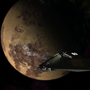
I think we could do something about point b in the next couple of weeks: Corny, I like that mockup, though a higher resolution shot of the station would make it look better, IMO!
I'm off to have a look at the screenshots thread to see which ones we could use as backdrops...
I suppose we could have some nice eye candy on the top left hand corner of the site, but I definitely wouldn't go for flash: it's way too easy to err on the side of tacky with that one...
Anyway, I take it as read that we:
a) like the popularity
b) want a spruced up oolite.org, so it's prettier looking by the time we release 1.74
I think we could do something about point b in the next couple of weeks: Corny, I like that mockup, though a higher resolution shot of the station would make it look better, IMO!
I'm off to have a look at the screenshots thread to see which ones we could use as backdrops...
Last edited by Kaks on Mon Jan 04, 2010 7:57 pm, edited 1 time in total.
Hey, free OXPs: farsun v1.05 & tty v0.5! :0)
Well, since you refrained from insulting me, I'll do exactly as you wishCmd. Cheyd wrote:Take this simply as my opinion, but -
Damn right! So, from now on, treat this picture as a fancy placeholder.Cmd. Cheyd wrote:I would not use that screenshot as the basis for advertising the game. It's suggestive of stuff the game can't actually do. I saw that for the first time, remembering old Elite, and I'd think: "Oh cool! I always tried to blow up those stations! Now I can! And look, I'll see progressive damage as I do!" I just think it'd set us up for a lot of complaints and negative feelings, which would be an absolute travesty as Oolite IS damn cool and the graphics can be wonderful...
Neat idea!Cmd. Cheyd wrote:What might be cool, and take this with a grain of salt, would be a screenshot of Griff's wireframe cobra fighting a fully shaderfied Griff Tharoid or something. Advertise the fact the game stays true to it's roots and can be played as such, but also that the game has SOOOO much more that it can do.
Edit:
Ah, didn't read this while I posted this. So, yeah. Need to change the background. If you find something better, that'd be great!Kaks wrote:b) want a spruced up oolite.org, so it's prettier looking by the time we release 1.74
I think we could do something abot point b in the next couple of weeks: Corny, I like that mockup, though a higher resolution shot of the station would make it look better, IMO!
I'm off to have a look at the screenshots thread to see which ones we could use as backdrops...
There are these fancy banners made by Ahruman (I think), maybe use them (if he has nothing against it, of course, but I doubt he would have
By the way, what Cmd. Cheyd is saying about raising false expectations is a very good point. The semi destroyed station in that screenshot is not used anywhere yet - though it would make a fantastic scene setter for an oxp - so yes, I'd avoid 'staged' pictures too, don't want people to download Oolite just to be disappointed that they can't see what the screenshot 'promised'...
Hey, free OXPs: farsun v1.05 & tty v0.5! :0)
Yeah, I completely agree with him.
By the way
By the way
is that still recent? I mean, is the logo mandatory to be on every page of the website very big? I'm afraid that the site could look overloaded.Ahruman wrote:Other than the application icon, the design will be used in other contexts such as:
- Branding on official and semi-official documentation
- The game’s splash screen
- The web site
- Rank icons on the forum
- Other stuff, almost certainly
-
another_commander
- Quite Grand Sub-Admiral

- Posts: 7172
- Joined: Wed Feb 28, 2007 7:54 am
-
DaddyHoggy

- Intergalactic Spam Assassin

- Posts: 8515
- Joined: Tue Dec 05, 2006 9:43 pm
- Location: Newbury, UK
- Contact:
Actually is that true - i.e. not being able to show progressive damage? With Griff's texture nibbling shader, could it not be tied to the energy level of the station and thus a portion of the texture removed based on this level - and thus the innards of the station can be revealed...Cmd. Cheyd wrote:Take this simply as my opinion, but -
I would not use that screenshot as the basis for advertising the game. It's suggestive of stuff the game can't actually do. I saw that for the first time, remembering old Elite, and I'd think: "Oh cool! I always tried to blow up those stations! Now I can! And look, I'll see progressive damage as I do!" I just think it'd set us up for a lot of complaints and negative feelings, which would be an absolute travesty as Oolite IS damn cool and the graphics can be wonderful...
What might be cool, and take this with a grain of salt, would be a screenshot of Griff's wireframe cobra fighting a fully shaderfied Griff Tharoid or something. Advertise the fact the game stays true to it's roots and can be played as such, but also that the game has SOOOO much more that it can do.
Oolite Life is now revealed hereSelezen wrote:Apparently I was having a DaddyHoggy moment.
-
JazHaz

- ---- E L I T E ----
- Posts: 2991
- Joined: Tue Sep 22, 2009 11:07 am
- Location: Enfield, Middlesex
- Contact:
I have as well.ADCK wrote:As for the boards, they're servicable, I've designed and maintained phpbb2 boards in the past
I'm the webmaster for our local Scout marching band and when we had a phpbb2 board (not any more) as part of our website, we used to get a fair bit of spammers joining every day, like on this board. Until I found a couple of Mods that block spammers!
I think this board could do with an active admin who can install Mods and perhaps reskin the board with a better design too.
JazHaz
Thanks to Gimi, I got an eBook in my inbox tonight (31st May 2014 - Release of Elite Reclamation)!Gimi wrote:Maybe you could start a Kickstarter Campaign to found your £4500 pledge.drew wrote:£4,500 though!<Faints>
Cheers,
Drew.
-
JensAyton

- Grand Admiral Emeritus
- Posts: 6657
- Joined: Sat Apr 02, 2005 2:43 pm
- Location: Sweden
- Contact:
(Harsh design criticism mode engaged. Mollycoddling protocols disabled.)
The text is also unreasonably small (or the navigation links are unreasonably big), the navigation links aren’t set apart clearly enough, and body text on an image background is always a bad thing. (So is light text on dark, but it felt appropriate in this particular case.) I’m also leery of using anything that isn’t standard game content as a splash image. When the new planet generator is complete, we’ll have some better “standard package” eye candy to show off.
Also, glow effects are not supported by most browsers at this time (the current design uses them, but as a secondary thing), and using images for text is an inaccessible and high-maintenance non-solution.
As for roolite.org, the scanner thing is cute (but would be irritating if I were just there to use the site). Apart from that, the site appears to be an unstructured mess. The content is just scattered around haphazardly. Sorry.
I would welcome a new design, but not one that sacrifices functionality. In particular:
Er, no it isn’t. It’s Century Gothic or similar. Which we couldn’t use on the web, and even if we could, it would be illegible with Windows’s text rendering.Corny wrote:On the other hand, I just found a perfect excuse for not doing anything related to mathematics. :DCorny wrote:I could do it when I'm through with the exams in February (although, knowing me, I'd probably start earlier as a break from learning for them)
Design idea sketch thingy.
(The word "Krait" is above the Krait! :D)
Font is Optima, would have to be changed probably.

The text is also unreasonably small (or the navigation links are unreasonably big), the navigation links aren’t set apart clearly enough, and body text on an image background is always a bad thing. (So is light text on dark, but it felt appropriate in this particular case.) I’m also leery of using anything that isn’t standard game content as a splash image. When the new planet generator is complete, we’ll have some better “standard package” eye candy to show off.
Also, glow effects are not supported by most browsers at this time (the current design uses them, but as a secondary thing), and using images for text is an inaccessible and high-maintenance non-solution.
As for roolite.org, the scanner thing is cute (but would be irritating if I were just there to use the site). Apart from that, the site appears to be an unstructured mess. The content is just scattered around haphazardly. Sorry.
I would welcome a new design, but not one that sacrifices functionality. In particular:
- It must be simple enough to load fast, even on slow connections. If Commander McLane can’t use it from Tanzania without difficulty, we have a problem. :-) This means largely text-based, and also without this newfangled web font stuff.
- It must be easy to maintain once the designer gets bored and wanders off. Claiming that you won’t get bored and wander off is not a substitute. This means no CMS and no complex scripting.
- Navigation must be clear, simple and easily found. (In particular, keep in mind that people will look for navigation without reading text, which is why I said the big links on your example aren’t set apart clearly.)
E-mail: [email protected]
-
ClymAngus

- ---- E L I T E ----
- Posts: 2514
- Joined: Tue Jul 08, 2008 12:31 am
- Location: London England
- Contact:
so are we talking frames here? It's old tec sure but it is easy to upkeep if all pages are kept to a standard size. The graphics wouldn't have to be ott. you could probably get away with a styalized retro look. Keeps the bit size down anyway.
http://eab.abime.net/showthread.php?t=20428
or maybe something a little bitmappy.
http://1.bp.blogspot.com/_WySBsSkR8Yc/S ... enon2b.jpg
http://eab.abime.net/showthread.php?t=20428
or maybe something a little bitmappy.
http://1.bp.blogspot.com/_WySBsSkR8Yc/S ... enon2b.jpg
No! Frames are bad! Bad, bad frames. (can't bookmark a specific page within a framed site, you need to add extra 'hidden' code for search engines to be able to index your site, and in general you don't really save any decent amount of bandwidth to account for the extra complexity)
However, Oolite.org can use server side includes, which means all common elements (page header, menu, page footer) are written only once. Any changes will be instantly propagated to all site pages, without the need of frames.
Basically the design needs to be a standards compliant 'flat' html page, with css. The best way to do this is to 'save page as' for each of the 4 main Oolite.org pages, fiddle with one page until happy with the result, copy the relevant html across to the other 3 pages so they all look as if they belong to the same site, and zip it up for our perusal.
Easy! (Ok, fiddly & time conusming! That's probably the reason the oolite.org layout has stayed more or less the same since launch)
Hey, free OXPs: farsun v1.05 & tty v0.5! :0)

Err woops, Futura. As I said, I would change it anyway.Ahruman wrote:(Harsh design criticism mode engaged. Mollycoddling protocols disabled.)Er, no it isn’t. It’s Century Gothic or similar. Which we couldn’t use on the web, and even if we could, it would be illegible with Windows’s text rendering.Corny wrote:Font is Optima, would have to be changed probably.
The latter. Font-size for the content is 12.Ahruman wrote:The text is also unreasonably small (or the navigation links are unreasonably big)
I disagree with the general statement. Also, in this case, I'd say it's readable. I could reduce the background brightness further, though. On the other hand, since the background image will be change, maybe the problem won't even exist.Ahruman wrote:and body text on an image background is always a bad thing. (So is light text on dark, but it felt appropriate in this particular case.)
But the ship textures would stay the same?Ahruman wrote:I’m also leery of using anything that isn’t standard game content as a splash image. When the new planet generator is complete, we’ll have some better “standard package” eye candy to show off.
I didn't include the logo yet, so if a new logo is out, I could use that as an image for the upper part, too.
No effects, but images were planned to be used. Accessibility is given with the alt-tag, if I'm not mistaken. Since the "glow effects" are done on 5 words with gaussian diffusing, I'd disagree with "high maintenance". First, the site is not very complex (and you won't change the name that fast, I guess), so you wouldn't have to change it if the content stays vaguely the same, and second, anyone with GIMP can reproduce this effect. I'd even give a step-by-step explanation how.Ahruman wrote:Also, glow effects are not supported by most browsers at this time (the current design uses them, but as a secondary thing), and using images for text is an inaccessible and high-maintenance non-solution.
As surprising as that sounds, I thought about Commander McLane already. More about this later.Ahruman wrote:I would welcome a new design, but not one that sacrifices functionality. In particular:
- It must be simple enough to load fast, even on slow connections. If Commander McLane can’t use it from Tanzania without difficulty, we have a problem.
No CMS, no scripting ( hover-effects and opening-effects (lightbox) for pictures with JavaScript at most. Definitely no must).Ahruman wrote:[*] It must be easy to maintain once the designer gets bored and wanders off. Claiming that you won’t get bored and wander off is not a substitute. This means no CMS and no complex scripting.
That's the kind of criticism I wanted to hear.Ahruman wrote:[*] Navigation must be clear, simple and easily found. (In particular, keep in mind that people will look for navigation without reading text, which is why I said the big links on your example aren’t set apart clearly.)[/list]
All in all, your wished kinda contradict the requirements I made the mockup after. I thought Oolite needed a new, nice-to-look-at, more modern site. Of course, this is achieved by using images instead of plain text. Seriously, many people who would be interested in Oolite may have played in the era of Elite already, but that doesn't mean their graphic taste is stuck in that time. And most of them probably have at least DSL 1000.
But, yes, _most_ of them. That doesn't mean "screw the rest". As I said, I thought about Commander McLane already, so I also want to do a lo-fi version. Or the old site is kept for lo-fi reasons.