Posted: Mon Dec 01, 2008 1:09 am
Sorry for the delay. (my compy needed a reinstall) Old mac chip set HATES the new OS.
Anyway with this:
www.crimsonforge.co.uk/cloister/oolitebutton.jpg
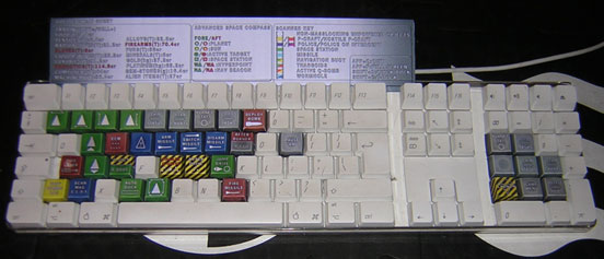
You should be able to make all of these:

it's 600 dpi so it's a bit big. but it should fit portrait onto a4, test one out first then twiddle with your printer settings if it doesn't fit.
These should cover all the major controls (I know there are lots of minor ones missed but it is a basic tool after all). If there is anything that Really annoys I can update this file no problem.
Right, back to ship design.
Anyway with this:
www.crimsonforge.co.uk/cloister/oolitebutton.jpg
You should be able to make all of these:

it's 600 dpi so it's a bit big. but it should fit portrait onto a4, test one out first then twiddle with your printer settings if it doesn't fit.
These should cover all the major controls (I know there are lots of minor ones missed but it is a basic tool after all). If there is anything that Really annoys I can update this file no problem.
Right, back to ship design.