Page 92 of 136
Posted: Tue Sep 07, 2010 1:29 pm
by Dave McRoss
Another three...

Uploaded with
ImageShack.us

Uploaded with
ImageShack.us

Uploaded with
ImageShack.us
+1

Uploaded with
ImageShack.us
Uploaded with
ImageShack.us
Posted: Wed Sep 08, 2010 11:52 am
by Darkbee
Is this still maintained? Are there any free slots?
I'm not very graphically inclined but I did have a couple of ideas:
The Federation Against Ship Theft
Welcomes you and thanks you
for flying carefully!
Just Say No!
To Arcturan Megaweed
Sponsored by Galcop
Message from Galcop:
Fly Safe!
Don't Forget to Buckle Up!
Then maybe a couple of visual gags (based on US and other countries traffic signs):
"Blind Pilot Area" (yellow diamond warning sign)
"Thargoid Crossing" (Another yellow diamond sign like an "Animal Crossing")
"Asteroid Belt Warning" (Visual representation only, no text. Red triangle warning sign)
"Do Not Shoot" (Like the US "Do Not Pass" sign, black text on white rectangular background)
There's probably a million and one of these but this might inspire some people with ideas.
Posted: Wed Sep 08, 2010 2:11 pm
by Dave McRoss
Perhaps we should build mini-beacos buoy next asteroid field or along the space lanes, and the use your warning.
Posted: Wed Sep 08, 2010 2:17 pm
by Darkbee
Dave McRoss wrote:Perhaps we should build mini-beacos buoy next asteroid field or along the space lanes, and the use your warning.
It's more about comedic rather than practical value, but yes, that'd be a possibility.
Posted: Wed Sep 08, 2010 2:23 pm
by Dave McRoss
Darkbee wrote:Dave McRoss wrote:Perhaps we should build mini-beacos buoy next asteroid field or along the space lanes, and the use your warning.
It's more about comedic rather than practical value, but yes, that'd be a possibility.
I was thinking 'bout a Lonely Toons effect, do you remeber Will.E. Coyote?

Posted: Fri Sep 10, 2010 6:44 pm
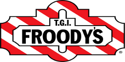
by Thargoid
 In honour of the night out Mrs T had last night, and the house full of helium balloons we now seem to have...
Maybe needs a little tweaking around the OO's.
Posted: Fri Sep 10, 2010 9:24 pm
by DaddyHoggy
<Ford Prefect>Froody Ad</Ford Prefect>
But you're right about the OOs
Posted: Sat Sep 11, 2010 8:26 am
by Thargoid
 The O's are in a similar style to the i in the original, but just look out of place in the tweaked one as they are more obvious. Not sure what font it's in (I don't have Ahruman's font identification optics installed) so will have to leave it to you artistic folks to adjust.
Posted: Sat Sep 11, 2010 10:47 am
by DaddyHoggy
How's this:

Posted: Sat Sep 11, 2010 11:12 am
by Commander McLane
Or, to keep somehow in-theme with the original, put the oo's on top of each other, vertically instead of horizontally.
Posted: Sat Sep 11, 2010 11:35 am
by Thargoid
I think McLane's idea would look better. Your OO's still don't scan correctly with the other letters.
Posted: Sat Sep 11, 2010 12:19 pm
by Kaks
Since we're tweaking stuff, what about tgo froody's? it kind of seems appropriate!:)
Posted: Sun Sep 12, 2010 12:17 am
by DaddyHoggy
Thargoid wrote:I think McLane's idea would look better. Your OO's still don't scan correctly with the other letters.
They will when I expand the width of the logo to better fit the dimensions of the 256x128 box - I just wanted to see what I could do in c. 30 mins (I'm supposed to be writing lectures - it was a nice distraction).
The O is exactly the same height as the rest, just 87.25% of the width, which would have been OK I think, but scaling also narrowed the width of the blackness. If I crack on through my lectures tomorrow - I'll try and show you what I mean...
Posted: Sun Sep 12, 2010 12:48 pm
by DaddyHoggy
Dimension's of whole logo edited to fit the final 256x128, OOs now the same dimensions as the rest of the letters.
Better? or indeed "Froody"?
I think so, but it's not my design its Thargoids.
Really must do my lectures - right after my 8yr olds 9th b'day party...

Posted: Sun Sep 12, 2010 3:15 pm
by Switeck
That sign might look "better" if FROODYS was done more like FrOodys, (1 big O, then 1 small o) since it's a take-off of Oolite.


