Page 9 of 15

Posted: Tue Aug 25, 2009 1:39 pm
by zevans
There are also the Liberation fonts, which are free as in GPL (not Creative Commons...)

They are metric-compatible with Arial so presumably pretty close to Helvetica. Lots of distros/download sites have an earlier version of these fonts because there was a bit of wrangling about licenses, which you as a fonty type person probably know more about than I do! So I honestly don't know where to find a copy of the best version for Windows. [EDIT: Might be one of these files https://fedorahosted.org/releases/l/i/liberation-fonts/ since this looks like the authoritative version...]

I could always pick the rpm apart if you like... RPM because these fonts were brought to us by RedHat.

Posted: Tue Aug 25, 2009 3:37 pm
by Cody
KZ
How about:

G1 Riedquat, Zadies
G2 Ladibe, Recexela
G3 Atistiso, Birera
G4 Soenisti, Edorqu
G5 Xevera, Biesmaan
G6 Lerela, Enqura
G7 Quandixe, Angeriri
G8 Tequenes, Vegedius

Underneath that lot: Raxxla

Again, thanks for the great artwork.

Regards

Re: Boy Howdy

Posted: Tue Aug 25, 2009 5:13 pm
by JensAyton
KZ9999 wrote:
Ahruman there's a couple of slight problems in using the Mac Helvetica Bold. If memory serves me correct, Apple owns the copyright on the font and I'm trying to keep things as GPL/Creative Commons friendly as possible.
The licensing situation for fonts is a bit brain-bending. My understanding is that a font rendered as a bitmap or curves is not subject to the font creator’s copyright, either in Sweden or the US, but I can’t speak for all the other jurisdictions in the world…
Secondly, being a PC user, I don't have ready access to it. That's why I ended up pulling the Vera off the BerilOs website because that was all I could find
Nimbus Sans L is a GPLed Helvetica clone. It’s included among the Ghostscript fonts, in Windows Postscript format only. Truetype versions exist, but I can’t find any free ones.
A question, when you say expanded by 16.67%, do you mean character width or stroke thickness?
Everything, it’s a stretched bitmap.

Posted: Tue Aug 25, 2009 8:57 pm
by Disembodied
Regarding fonts, as I understand it, as long as the person or organisation has paid for them (either bought them, or paid for a system which has them legitimately pre-installed), that person/organisation is free to make products which use the fonts for either commercial or noncommercial purposes. You're obviously not allowed to give or sell copies of commercial font files to people, but if you make a PDF with the fonts embedded, that's fine – nobody can extract the fonts from there. Publishers don't have to ask permission or pay fees to make publications, print or electronic, which use commercial fonts, as long as they paid for the font in the first place.

Posted: Wed Aug 26, 2009 11:43 am
by KZ9999
What's been said about font copyright is fairly true, but...

(Now forgive me as I'm trying to remember a documentary on the subject I watched a couple of years ago. The following facts I state may be totally off the mark.)

Firstly the translation of a font from it's source to another medium doesn't change or remove the copyright on it. It's covered under the modern rules of copyright as format shifting. While I don't know of any cases dealing with it, I'm sure most lawyers would have no problems in applying it.

Secondly, the licence that users get for use on personal computers is only a personal use licence. There are difference degrees of licence for difference of business. Publishing houses and design firms who use it for their business have to pay much higher fees than the everyday joe who does some DTP for a garage sale signs. How it apply to an open-source creative commons project like Oolite is beyond me.

In real terms both cases really don't apply to my real issue, Font Consistency. (In fact I can't remember the point I was trying to make in the last post.)

I've been seriously thinking about the long term issue of producing a consistent documentation. My goal is product templates that any one can use no matter what OS or application. Ideally someone makes a oxp, should be able to download a template of BerilOS website, drop the text and image in, and have a high quality doc' that matches all other Oolite docs. To give the game a trademark (or is that creative commons :? ) look.

Unfortunately, fonts are one of the most variable set of features found across the computer spectrum. While all three OSs have a Sans fonts (Hevlica - Mac, Arial - Win, Vera Sans - Linux), each one has slight differences and are general uncommon on the other systems. This is why I've adopted the use of Deja Vu typefaces for the documents I'm creating. DV has many advantages: it licences as GPL/Creative Commons, available for all three OSs, the serif and sans match in style, has some best uni-code support I've seen (Oolite in Canadian Aboriginal or Arabic anyone), and has a narrow versions which is missing from many fonts. While there are some issues, inconsistent family naming across the OS's being one, it does seem to me to be the best solution.

Image
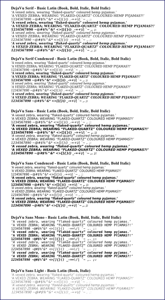
The fonts in questioin.

Wow, that was long winded. Now for some fun stuff. I'm stuck on the last section of the manual at the mo' (on the combat ranks no less :x .) Seeking some respite, I've had a bit of a play with the combat rank badges again.

[Edited... 200708027-10:00 +13gmt]
Image

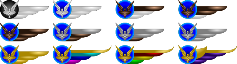
In order we have (reading left-to-right then row-by-row):
Harmless, Mostly Harmless, Poor, Average
Above Average, Competent, Dangerous, Deadly
Elite, multi-coloured specials 1, multi-coloured specials 2, Supreme Commander.
I've only did one `wing' for speed, but having a second look, I think the they could work quite well on the BB as they are.

(I'll blame a late night and storm induced sinus headache on that stuffup on that one Daddy Hoggy.)
[End Edit.]

That's it for now, I'm going to bed and wonder how to explain the fact that GCW would not only condone the act of executing of criminal without trial but include it as part of the Commanders' Profile info. :?: :roll:

Posted: Wed Aug 26, 2009 11:57 am
by Sendraks
KZ the badges look great and I think the one wing look is rather neat. An alternative approach if you wanted to simplify the colours at each rank (not that I think that is necessary) would to be have the higher ranked badges as having two wings.

But as I said, I think they look great as is.

Posted: Wed Aug 26, 2009 12:27 pm
by DaddyHoggy
Can you (when you wake up again!) put the ranked badges in order I'm a little confused about how the coloured bars on each change to reflect the increasing rank... :)

BTW, I like very much (Spam assassins of course should be PINK and BLACK (pink because it's spam and black, well, because, we're assassins!))

Posted: Wed Aug 26, 2009 12:55 pm
by Disembodied
Publishers don't pay any more for fonts than ordinary individuals do. When I buy fonts from a foundry, they don't ask me what I'm going to do with it: there's no special license – beyond paying for it in the first place – required to use any font to make material for public distribution. Just in case anyone gets paranoid about what fonts they've used making ads for YAH or anything!

I agree though that consistency in font usage is to be applauded! And the DejaVu fonts are good-looking and, with its Creative Commons license, is definitely within the spirit of Oolite.

Posted: Wed Aug 26, 2009 1:40 pm
by Cody
Yes, the Deja Vu fonts look the part.

The style of the badges also look the part.

Posted: Wed Aug 26, 2009 10:51 pm
by KZ9999
Quick follow up....

Edited previous post to sort the rank badges for greater clarity. I should also add that the colour of the starbird is a clue to the rank of the pilot: White for Harmless, Bronze for Poor-AAverage, Silver for Competent-Deadly, Gold for Elite and specials. The designs are currently unfiltered, and will have much more 'bling' once I throw some glowing metal effects on it.

Daddy Hoggy, pink wings/feathers? Well guess I could do the pale pink/skin colour of spam for wings. Then again I could always do Barbie pink, for the more 'girly' commanders out there. I have that colour burnt into my brain from working in a toy department and having to clean and face-up 12 square metres of that stuff on a daily basis. <suppresses a post traumatic disorder shudder.>

Thanks for putting me right Disembodied. As I said, I could be wrong and it turns out I was. Well that my new thing learnt for today. :lol:

Thanks for the planets El Viejo. There's enough room to have four planets per chart, so does anyone have a few more suggestions?

As a final note, for those who want to try out the Deja Vu fonts for themselves, their wiki has links to all the os sets. A word of warning. In use the fonts may miss-behave or look crude on screen, the narrow fonts tends to glitch in Open Office for instance, the actual output to the printed page / pdf / art file is pretty much perfect.

Ps I've sorted out the combat ranks issues. I'm calling it a product of government/society in transition to a true unified whole. I see the GCW being like 1900's New Zealand or Australia; highly policed/populated urban centres surrounded by fairly lawless countryside where the government is hampered by a lack of man-power and infrastructure. They issued special bounty-hunter licences to civilians, which allowed them to kill in the line of duty if need with the same legal protection that the police have. (That law is still on the NZ books, so people can get '007' licences apparently!) For the game, part of earning a commanders licence includes vetting them to have the same bounty-hunter license.

Posted: Thu Aug 27, 2009 8:00 am
by JensAyton
Hmm. There’s something I don’t like about DV Sans…

Oh, that’s it: it looks a lot like Verdana, the dull font of dull sites everywhere. Including this one. :-)

Posted: Thu Aug 27, 2009 11:31 am
by Captain Tylor
How about a different colour for harmless as silver and white look very similar too me.

I do like though.

Posted: Thu Aug 27, 2009 3:15 pm
by wackyman465
They issued special bounty-hunter licences to civilians, which allowed them to kill in the line of duty if need with the same legal protection that the police have. (That law is still on the NZ books, so people can get '007' licences apparently!)

I know where I'm moving to...

The badges look great.. would these be used in-game as well?

Posted: Thu Aug 27, 2009 4:49 pm
by Disembodied
Captain Tylor wrote:
How about a different colour for harmless as silver and white look very similar too me.

I do like though.
Green is a traditional colour for rookies ...

Posted: Thu Aug 27, 2009 7:12 pm
by Thargoid
Speak for yourself ;)