Replacing Constores with Griff Trade outposts@Griff and Doc
Moderators: another_commander, winston
- wackyman465
- ---- E L I T E ----

- Posts: 831
- Joined: Thu Nov 06, 2008 10:15 pm
- Location: Currently hunting you down in an Imperial Courier
- Selezen
- ---- E L I T E ----

- Posts: 2530
- Joined: Tue Mar 29, 2005 9:14 am
- Location: Tionisla
- Contact:
What's my job? Would someone like me to remodel a torus station? Could be done....not a hard job, or one that would take a while. Would you like i remodelled to hold advertising billboards?pagroove wrote:I think this is selezens job (maybe something with shaders oh!! boy) but i really do not want to see a torus with ads!!. Some things are clasic and torus stations are defenetly one of them. Moreover we can not expect from Griff to change every model in the game and every model in every oxp.
I'll do the remodelling if someone else does the texturing (that's the bit I don't have much time for at the moment, especially if adding shaders is part of the plan...)
- Pangloss
- ---- E L I T E ----

- Posts: 303
- Joined: Wed Dec 13, 2006 5:57 pm
- Location: Scranton, PA (via Stevenage, Herts)
I have a busy day today, so I'll get started on this tomorrow. I'll just provide the 256 x 256 image in 100% opacity and you can tone it down to the required amount.Griff wrote:wow, you guys are on a roll! Very cool stuff!
here's the template for all the tiny billboards dotted around the hull
the two grey bits in the image are used to texture some of the structures the ads are stuck onto so don't paint any ads over those or they will look weird!
Thanks, Griff!
"All is for the best in this best of all possible worlds..."
Dr.Pangloss, Voltaire's 'Candide'.

Dr.Pangloss, Voltaire's 'Candide'.

- Pangloss
- ---- E L I T E ----

- Posts: 303
- Joined: Wed Dec 13, 2006 5:57 pm
- Location: Scranton, PA (via Stevenage, Herts)
I thought the same thing when I posted my Sunooco logo (sorry: the GAME'S Sunooco logo) onto the decals, logos etc. thread. Someone could use these logos and make a ship look like it's sponsored. Just like an F1 car. Go fancy on the color scheme... it'd look great!gogz69 wrote:
Hi all,
I've been looking at this ship from Pangloss here, which seems to have a striking resemblance to a certain moto gp racing team.
With that said, I'm a little surprised that the autosport genre hasn't been explored yet.(or has it?) There could well be a "killing two birds with the one stone" scenario here too, with Captain Hesperus making use of the ships to update the racing teams in the wiki.
I would love to be able to contribute more guys, but I can clearly see that your skills are WAY beyond mine.
So, I hope my input here is of some help to you.
Cheers,
G.
"All is for the best in this best of all possible worlds..."
Dr.Pangloss, Voltaire's 'Candide'.

Dr.Pangloss, Voltaire's 'Candide'.

- DaddyHoggy
- Intergalactic Spam Assassin

- Posts: 8515
- Joined: Tue Dec 05, 2006 9:43 pm
- Location: Newbury, UK
- Contact:
Apologies for the delay - applying all those hi-tec white polymers took longer than the chop-shop said (or it could just be massive RL overload!)
Anyway, consider this a placeholder only - I'm working on an improved version and after that I'll be working on an even more improved version - I will learn to texture properly - and it will be with this ship!
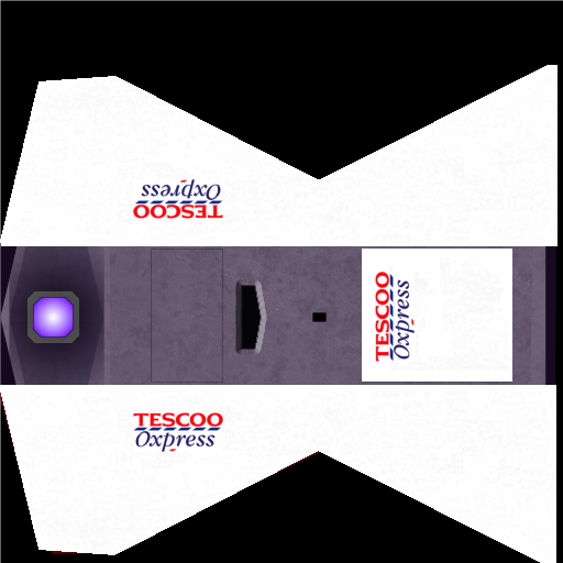
Anyway, consider this a placeholder only - I'm working on an improved version and after that I'll be working on an even more improved version - I will learn to texture properly - and it will be with this ship!

Oolite Life is now revealed hereSelezen wrote:Apparently I was having a DaddyHoggy moment.
- Pangloss
- ---- E L I T E ----

- Posts: 303
- Joined: Wed Dec 13, 2006 5:57 pm
- Location: Scranton, PA (via Stevenage, Herts)
I'm back for an hour and a bit (the morning task that could have taken 4 hours... took just over 2).DaddyHoggy wrote:Apologies for the delay - applying all those hi-tec white polymers took longer than the chop-shop said (or it could just be massive RL overload!)
Anyway, consider this a placeholder only - I'm working on an improved version and after that I'll be working on an even more improved version - I will learn to texture properly - and it will be with this ship!
I'm thinking of starting a thread of How To Do Certain Things In GIMP (or in my case, PhotoShop 7). I'll provide a tip or a trick, and someone else with GIMP can show how it's done using GIMP, which is free to download and basically does the same things.
The way I changed the ship's colors without touching the texture was easy. And using this web page to demonstrate it for GIMP, I'll consider this my first lesson.
Open the texture map of the ship you're changing the colors of. In our case, the Sidewinder.

If you remember, the ship was originally purple in color. I made this one deliberately grey. I have a top layer for the engine (copy / paste after selecting that area) so I don't accidentally balls that up, so that's still purple at the end of things. You'll see that the ship is basically split into three segments. The cockpit in the middle, and the wings at the side.
Select the wing areas (in Photoshop, pressing down Shift lets you select multiple areas of an image... is it the same in GIMP?).
Now go to COLORS --> HUE/SATURATION in GIMP.

If you manage to make the wings look just like one color (which if you're working on the original, they're purple), sliding the Hue slider takes you through the rainbow. Change the intensity and brightness too (for white wings, you just might want to Desaturate (CoLORS --> DESATURATE) and brighten those two areas a bit so it's a lighter grey).
Then you just open your logo in another image. Get it looking right, reduce it down to about 50-70 pixels high, and copy it the right way up and paste it onto the ship for the right wing... rotate the standalone version, and copy again to paste it for the left (top of image) wing, then rotate it 90 degrees for the bottom of the ship.
Et voila, a texture to be proud of!
"All is for the best in this best of all possible worlds..."
Dr.Pangloss, Voltaire's 'Candide'.

Dr.Pangloss, Voltaire's 'Candide'.

- DaddyHoggy
- Intergalactic Spam Assassin

- Posts: 8515
- Joined: Tue Dec 05, 2006 9:43 pm
- Location: Newbury, UK
- Contact:
@Pangloss - I use GIMP - currently working on 3 different versions depending on whether I'm using my W98SE laptop (old version), my Ubuntu box or my XP work machine!
I wanted to play around with the dodge and burn bit of this tutorial: http://wiki.alioth.net/index.php/F_C_Textures so deliberately chose not to do it your way, however, texturing, for the non-texturers, who want to become neo-texturers, your suggestion of a new topic is a good one - perhaps a sticky in the same vein as the Modellers and Shader's thread - people could build their models using the details in the Modellers sticky, move on to the texturing one and then when they're brave, whizz through the Shader's sticky....
Because Hoopy Sidewinder had set a precedent which you then continued I didn't actually texture the ship the way I would have done if I'd got there first which was to have the texture make more emphasis of the natural angles of the ship itself - that will be the "improved" version and eventually I want to do at least glow maps and possibly even normal maps...
Oolite Life is now revealed hereSelezen wrote:Apparently I was having a DaddyHoggy moment.
- Pangloss
- ---- E L I T E ----

- Posts: 303
- Joined: Wed Dec 13, 2006 5:57 pm
- Location: Scranton, PA (via Stevenage, Herts)
We really aren't giving Griff the kudos he deserves. Finding inspiration for all those ads for the boards is harder than doing Ad Rings. For the Ad Rings, I just have to put a few images together on a standard background, trim off a few bits, add Stroke to the images to cover the jadded edge problem and they're done.
Here's the last one I think we need. It's a version of one I did previously... I just added it to the rainbow background we have from the others I made. It all ties in with the antenna on top... if space stations can be thought of having a 'top'. If you're inside one, and it's spinning, 'up' would be the center of the station (which would have zero-g, making it the prime location for the Zero-G Hockey Arena, and any manufacturing that works best in weightless conditions).

The larger version can be seen here. You might notice it's 2100 pixels wide instead of the 2048... that's because I deliberately made it wider, putting more red at the sides, so when I shrink it to 64 pixels high I can then save THAT as the PNG, then re-open it and trim off the edges so it's seamless.
I'm 70% done with the board. I'm now seeking inspiration with foreign language boards, and that Japanese Text Generator I mentioned earlier (just wrote Pangloss as "Panugurosu" in Katakana symbols). Expect that before I leave for work today. And with the sheer number of ads, I say we just leave that at two!!!
And good work, all. I'm wondering if the Tescoo ship shouldn't just remain as the ones with glossy wings. After all, MallWart are the only ones with heat-sink vents on the tops of their Sidewinders.
Here's the last one I think we need. It's a version of one I did previously... I just added it to the rainbow background we have from the others I made. It all ties in with the antenna on top... if space stations can be thought of having a 'top'. If you're inside one, and it's spinning, 'up' would be the center of the station (which would have zero-g, making it the prime location for the Zero-G Hockey Arena, and any manufacturing that works best in weightless conditions).

The larger version can be seen here. You might notice it's 2100 pixels wide instead of the 2048... that's because I deliberately made it wider, putting more red at the sides, so when I shrink it to 64 pixels high I can then save THAT as the PNG, then re-open it and trim off the edges so it's seamless.
I'm 70% done with the board. I'm now seeking inspiration with foreign language boards, and that Japanese Text Generator I mentioned earlier (just wrote Pangloss as "Panugurosu" in Katakana symbols). Expect that before I leave for work today. And with the sheer number of ads, I say we just leave that at two!!!
And good work, all. I'm wondering if the Tescoo ship shouldn't just remain as the ones with glossy wings. After all, MallWart are the only ones with heat-sink vents on the tops of their Sidewinders.
"All is for the best in this best of all possible worlds..."
Dr.Pangloss, Voltaire's 'Candide'.

Dr.Pangloss, Voltaire's 'Candide'.

- Pangloss
- ---- E L I T E ----

- Posts: 303
- Joined: Wed Dec 13, 2006 5:57 pm
- Location: Scranton, PA (via Stevenage, Herts)
Of course, if you contribute some, Ark MIGHT consider sending you the link to the OXP!!! I only have it so I can test out the work I've done, and even then I feel like I have been given a privelege I don't deserve!Ark wrote:The update of youradhere.oxp is not ready yet!! What you see is from an unfinished wipwackyman465 wrote:Where can I get some?
OK, I finished the ads. It was like hard work.
Don't know how you want them, Griff, so I did one set with a transparent background and one with a black background.


I did 'em in 24-bit PNG again, because there are a few gradients in there and those few extra KBs make a lot of difference to the smoothness of the transitions.
I was stuck for a lot of the logos, then I found a page that detailed lots of different versions of the letter 'A' in weird fonts. Like this.

A lot of those logos are just adapted from this one image! So now you know where the Designer Republic people got their inspiration from!!
Last edited by Pangloss on Fri Jan 09, 2009 4:10 pm, edited 1 time in total.
"All is for the best in this best of all possible worlds..."
Dr.Pangloss, Voltaire's 'Candide'.

Dr.Pangloss, Voltaire's 'Candide'.

Pangloss can i have the large version of this please. I think i want something in black for a changePangloss wrote:@Ark: the white one looks better. More light is needed to attract the eye around the structure.
I did another ring. Thanks to all those that I borrowed from (the RemLok design is mine).
Just a thought: will transparencies BE transparent on any of the PNGs? Because if so, I think I can have a bit of fun. Ads with the texture of the trading post visible through the gaps, for example.
- Pangloss
- ---- E L I T E ----

- Posts: 303
- Joined: Wed Dec 13, 2006 5:57 pm
- Location: Scranton, PA (via Stevenage, Herts)
That was my first one, and I only did that one in 1024 by 64. It wasn't until the second 'rainbow' one that I did it double-sized. But as all the ads (except one) were from the Your Ad Here thread, they will all be 128 pixels high in there.Ark wrote:Pangloss can i have the large version of this please. I think i want something in black for a changePangloss wrote:@Ark: the white one looks better. More light is needed to attract the eye around the structure.
I did another ring. Thanks to all those that I borrowed from (the RemLok design is mine).
Just a thought: will transparencies BE transparent on any of the PNGs? Because if so, I think I can have a bit of fun. Ads with the texture of the trading post visible through the gaps, for example.
The only one NOT a YAH entry was my RemLok one, and I only did that as a 64 px image for this banner. So I found the same image online I used for the plastic spacesuit and redesigned it with the ZeroHour font.

"All is for the best in this best of all possible worlds..."
Dr.Pangloss, Voltaire's 'Candide'.

Dr.Pangloss, Voltaire's 'Candide'.

- Pangloss
- ---- E L I T E ----

- Posts: 303
- Joined: Wed Dec 13, 2006 5:57 pm
- Location: Scranton, PA (via Stevenage, Herts)
I just tested out the black version of the neon graphics. They're at 100% opacity, so they don't flash or anything ...but as a work in progress, they look like they're meant to.

Please note: this is still a work in progress. Griff has final say on what goes where. Repeat: this is a Work In Progress! Thank you!!

Please note: this is still a work in progress. Griff has final say on what goes where. Repeat: this is a Work In Progress! Thank you!!
"All is for the best in this best of all possible worlds..."
Dr.Pangloss, Voltaire's 'Candide'.

Dr.Pangloss, Voltaire's 'Candide'.

What???? are you nuts or something !!!!!!!! you are the reason for all of thisGriff wrote:Wow, that is very cool! Guys please consider this your oxp and i just happened to contribute a model too, what you've (Ark, DaddyHoggy & Pangloss) have done here is amazing!
I'll tidy up the mistakes i made in the shaders and get the re-colouring stuff for the stations hull added in this weekend!


