Page 80 of 81
Posted: Sun May 02, 2010 10:49 am
by Simon B
Gimmie a bit to upload the models and current textures and you lot can play with them.
Anyone wants me to look at a model design should give me a link to what they refer to. Thanks.
The Vangelis writing is a Deja-Vu Sans written flat and put through the polar-coord filter, so it can probably be better, yeah.
Starfire looks like the neolite fer-de-lance because it is long and thin with stubby wings at the back. The obvious mark II would have two external engines, like the nfdl, with more speed and power and mass, all other stats the same. That would make it cheaper and less manouverable than the super-cobra, but with about the same economics. I figured that a company making a basic flying-crate starship would want to give it a sexy name. This could well be the same company that makes the fdl.
- I have a feeling I am about to get seriously snowed for another month or so ... I have two papers to write by July: one a law article on the right to privacy in secondary school and the other a proposal for an information literacy program to the Ministry of Education. 15000 words between them and I haven't even started!
Oh all right ...
Posted: Mon May 03, 2010 6:16 pm
by Simon B
OK I went and looked:

Happy?!
These paper-dart craft are quite dull.
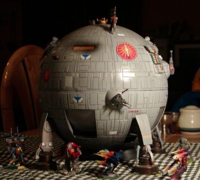
Here's a challenge for traveller fans ... anyone want to skin this one?


Re: Oh all right ...
Posted: Mon May 03, 2010 8:32 pm
by pagroove
Simon B wrote:OK I went and looked:

Happy?!
These paper-dart craft are quite dull.
Here's a challenge for traveller fans ... anyone want to skin this one?


Hi Simon B,
Very Cool. Maybe dull in a modeling way but very Elite. Thank you for making it
Posted: Mon May 03, 2010 8:45 pm
by DaddyHoggy
Although from Traveller - it's quite like the 'Mech dropship from Battletech
Edit:

Posted: Mon May 03, 2010 9:23 pm
by Cmd. Cheyd
Long Live House Davion!
Posted: Mon May 03, 2010 9:41 pm
by JensAyton
Posted: Mon May 03, 2010 9:57 pm
by DaddyHoggy
Always a Dragon man myself!
Posted: Mon May 03, 2010 9:58 pm
by DaddyHoggy
Indeed - clearly a common mind-set for "drop-ships"

Re: Oh all right ...
Posted: Tue May 04, 2010 10:53 am
by Simon B
pagroove wrote:Simon B wrote:OK I went and looked:
These paper-dart craft are quite dull.
Hi Simon B,
Very Cool. Maybe dull in a modeling way but very Elite. Thank you for making it
Well - maybe I can use it to experiment with some of griffs shaders - there's a decal and some paint there ...
Posted: Tue May 04, 2010 11:12 am
by Simon B
I worked out what I was doing wrong with texturing the Broadsword.

With this model, the challenge was to cut the two holes for the cutters.
BTW: if you like the decal, look through tattoo sites - they often have sample images on a permissive licence.
Back on neolites ... I'm experimenting with thargorn designs to complete the navy pack:

... I know: too much yellow. Also, the cruiser design has not the middle bit so the green will be gone. I'm thinking a retexture with overlapping plates.
The disc is supposed to rotate and the bright red and green is supposed to glow.
Posted: Tue May 04, 2010 4:43 pm
by tonyhippy
Simon B your Broadsword Mercenary Cruiser is wonderfull. Does it come with detatchable Modular Cutters?
Posted: Wed May 05, 2010 12:42 am
by Simon B
Absolutely - if you look to the right of the skinned pic, you'll see one of the cutters undocked. The other is in its bay.
If you check the
unskinned screenshots you'll see that the cutter also has detachable modules. One of those shots shows you the bays.
I doubt I could script this for oolite though.
Putting this in the came would involve three versions to sort-of imply that the cutters dock. I could use the cutters as missiles and replace the ship model on launch - but I'd have to adjust the bays to suit the launch angle and the cutters face the wrong way.
It doesn't really fit the feel.
An oolite edition of the mercenary cruiser would have a small fighter-size docking slit instead and single plasma cannon on the turrets. It would also be much bigger.
I kind-of like the way traveller engines go and am speculating doing those for a remake of the commies oxp... having commie ships all based on cylinders rather than the boxes they are now. (Also opens the possibility of having different kinds of commie.)
Posted: Fri Jun 04, 2010 4:34 pm
by Simon B
Another shot at the isoc station ...

Not happy with the dock - it is too wide and short, hairy getting in and out.
However, I think I've hit the correct approach with the station panels - by putting flat metal on the diamonds and having the fine texture in the triangles, this reverses the pattern on the coriolis. I figure I'd put window lights on the metal like with coriolis too.
For the dodo, I've figured out how to extract the blue from the texture for a glow, but not implimented it yet.
Just reviewing the thread, I see I've been teasing everyone a bit too much. I'll have to see about putting those models up like I promised.
Posted: Fri Jun 04, 2010 4:36 pm
by Thargoid
Simon B wrote:Not happy with the dock - it is too wide and short, hairy getting in and out.
Perhaps need to be flying a floppy disc? It looks like a disc drive!
Posted: Fri Jun 04, 2010 6:12 pm
by Eric Walch
Thargoid wrote:Simon B wrote:Not happy with the dock - it is too wide and short, hairy getting in and out.
Perhaps need to be flying a floppy disc? It looks like a disc drive!
Its a high tech station, only dockable by ships that contain a lot of data.


