Join us at the Oolite Anniversary Party -- London, 7th July 2024, 1pm
More details in this thread.

Wheel Reinvention - The Oolite Icon

General discussion for players of Oolite.

Moderators: winston, another_commander

User avatar
Diziet Sma
---- E L I T E ----
---- E L I T E ----
Posts: 6311
Joined: Mon Apr 06, 2009 12:20 pm
Location: Aboard the Pitviper S.E. "Blackwidow"

Post by Diziet Sma »

As the youngsters these days would say, that is one fully sick looking Cobra MkIII !!
Awesome job!

8) 8) 8) :D :D :D

(I'm so tempted to make up a oxp just so that I can have that as my cobra in the game.)
Please, please please share it with us some day if you do... :D


* I did have an idea on a number 8 solution to the problem. Create a new user called avatar-submission managed by the moderators. When a user become above average they can post their avatar to avatar-submission, and if it passes the moderators approval it get uploaded by them. It's not an ideal solution, but it is at least a solution.
Seconded.. that could work..
Most games have some sort of paddling-pool-and-water-wings beginning to ease you in: Oolite takes the rather more Darwinian approach of heaving you straight into the ocean, often with a brick or two in your pockets for luck. ~ Disembodied
User avatar
wackyman465
---- E L I T E ----
---- E L I T E ----
Posts: 831
Joined: Thu Nov 06, 2008 10:15 pm
Location: Currently hunting you down in an Imperial Courier

Post by wackyman465 »

Here's an idea: what about some new icon that doesn't look like the original? Don't yell at me yet though. I'll try something.
I shot him back first. That is to say, I read his mind and fired before he would have fired on me. No, sir, he wasn't a fugitive.
User avatar
KZ9999
Deadly
Deadly
Posts: 225
Joined: Fri Jan 23, 2009 8:55 pm
Location: Lost in Witchspace being hunted by a Thargoid Swam.

Post by KZ9999 »

wackyman465 wrote:
Here's an idea: what about some new icon that doesn't look like the original? ... I'll try something.
Go for it, there is no reason why it should look like the star bird. The t-shirt is a product of an non-starbird logo design.
wackyman465 wrote:
Don't yell at me yet though.
Why would anyone yell at you for suggesting it? Some of the best ideas are the ones from left field. No one on this BB would ever shoot anyone down for suggesting anything, this is after all the friendliest board etc.

For those who are interested I've uploaded a 600dpi PNG and a Postscript version of the design to my box space. Be warned they are both 4Mb+ in size. The Inkscape source (20kb) is in the source files sub folder. You may want to hold off till next week when I should have a working PDF of the design that will be in the <1Mb file size. (Inkscapes PDF support is flaky, and Scribus doesn't like the layered Postscripts that Inkscape generates so I'm having to convert the stuff by hand piece by piece.)
KZ999's Oolite documents, including the new draft Oolite Game Manual, can be found at www.box.net
User avatar
wackyman465
---- E L I T E ----
---- E L I T E ----
Posts: 831
Joined: Thu Nov 06, 2008 10:15 pm
Location: Currently hunting you down in an Imperial Courier

Post by wackyman465 »

oops it lookslike I triple posted that... that, I believe, is a new record.

[another_commander: Removed the multiple posts to make topic easier to follow.]
I shot him back first. That is to say, I read his mind and fired before he would have fired on me. No, sir, he wasn't a fugitive.
User avatar
KZ9999
Deadly
Deadly
Posts: 225
Joined: Fri Jan 23, 2009 8:55 pm
Location: Lost in Witchspace being hunted by a Thargoid Swam.

Post by KZ9999 »

I've got the PDF version on line now in my box space. I've done a little fine tuning to improve the look sightly. The Inkscape source file is in the draft documents sub folder.
Image
Yes, now the subtext spells FATE. Thanks Thargoidfor that one.

Now to pick you folks brains for some ideas....

The current logo design with some ideas of how to put the Oolite name in the logo.
Image

The question is, do I stick with the Oolite typeface of Bitstream Vera Sans, or do I do a custom type-style? Here are some of the ideas come up with.
ImageImage

So lets hear what suggestions you folks can come up with.
KZ999's Oolite documents, including the new draft Oolite Game Manual, can be found at www.box.net
another_commander
Quite Grand Sub-Admiral
Posts: 6579
Joined: Wed Feb 28, 2007 7:54 am

Post by another_commander »

Regarding the FATE poster thingy, it's all nice and cool, but I really don't like the Cobra. I would rather use a standard texture there, the snake head attempt makes it look way too cartooney for my tastes. Others' mileage may vary, of course.
User avatar
Disembodied
Jedi Spam Assassin
Jedi Spam Assassin
Posts: 6884
Joined: Thu Jul 12, 2007 10:54 pm
Location: Carter's Snort

Post by Disembodied »

I think a_c is right, regarding the snakehead Cobra ... it makes it hard to read as a ship. I just see the face.

Re. the logos, my personal preference would be for the top right (with "OOLITE" inside the round-ended capsule). As for typefaces – I like the two "goggles" ones (3rd and 4th in the left-hand column)! Although I think these would work better as large banners: at smaller scales there might be a problem with readability.
User avatar
Cody
Sharp Shooter Spam Assassin
Posts: 16079
Joined: Sat Jul 04, 2009 9:31 pm
Location: The Lizard's Claw
Contact:

Post by Cody »

I agree with A_C and Disembodied re the Cobra. I still prefer the earlier design, without the Space Station. As you said before, more is less (or was it less is more).
As for the logo, bottom right.
Great work, KZ.
I would advise stilts for the quagmires, and camels for the snowy hills
And any survivors, their debts I will certainly pay. There's always a way!
User avatar
Commander McLane
---- E L I T E ----
---- E L I T E ----
Posts: 9520
Joined: Thu Dec 14, 2006 9:08 am
Location: a Hacker Outpost in a moderately remote area
Contact:

Post by Commander McLane »

Agreeing as well.

For the fonts: the first and third on the left hand side, and perhaps as something different the last on the right hand side.
lfnfan
Deadly
Deadly
Posts: 250
Joined: Tue Mar 24, 2009 1:29 pm
Location: london, uk

Post by lfnfan »

wary of mixing it with some of the grandees of Oolite, my Cr 0.02 fwiw:

Overall on the poster: 8)
The thing I like about having some more detail on the Cobra is that it is a nod to the fantastic graphics esp in 1.73. A standard texture may leave us back in the '80s? At the same time, I don't like the blue tongue (looks like a 'tache), and the fangs are not quite doing it for me either.
The scoops and contours, I love tho'. Re. the url, I have never knowingly visited oolite.org - only aegidian.org/bb or alioth.net/index/oolite

Overall on the icon: 8)
Bottom left. The full triangle draws my eye down through the wonderfully done wings to the body of the starbird. the other designs don't have this, and my eye is continuously hopping between the 'banner' and the body. Digging the wormhole background also. Font-wise, I am on the fence, but not the three fonts from top right down.
User avatar
Cody
Sharp Shooter Spam Assassin
Posts: 16079
Joined: Sat Jul 04, 2009 9:31 pm
Location: The Lizard's Claw
Contact:

Post by Cody »

Does that make me a grandee? Ha!

As for a font: try Wide Latin.

BTW KZ, the back of the t-shirt - the idea was maybe twelve or sixteen systems. Two from each octant, perhaps.
Last edited by Cody on Mon Aug 24, 2009 3:51 pm, edited 1 time in total.
I would advise stilts for the quagmires, and camels for the snowy hills
And any survivors, their debts I will certainly pay. There's always a way!
lfnfan
Deadly
Deadly
Posts: 250
Joined: Tue Mar 24, 2009 1:29 pm
Location: london, uk

Post by lfnfan »

well, you are dangerous

but we're neither of us Quite Grand Sub-Admirals, or Intergalactic Spam Assassins.
User avatar
Lestradae
---- E L I T E ----
---- E L I T E ----
Posts: 3095
Joined: Tue Apr 17, 2007 10:30 pm
Location: Vienna, Austria

..

Post by Lestradae »

I like the logo right on top best, and would like the "fate" one if the front Cobra lost its teeth and stuff, the jets went away and the second Cobra on its way to the sun too.

So much for my personal taste (?).

:idea:

L
User avatar
JensAyton
Grand Admiral Emeritus
Posts: 6657
Joined: Sat Apr 02, 2005 2:43 pm
Location: Sweden
Contact:

Post by JensAyton »

KZ9999 wrote:
The question is, do I stick with the Oolite typeface of Bitstream Vera Sans, or do I do a custom type-style?
For reference, “the” Oolite font is Helvetica Bold (in some cases expanded by 16.67 %, as seen in GUI screen titles). Not necessarily a good choice for a logo, but a good starting point for posters and the like.
User avatar
KZ9999
Deadly
Deadly
Posts: 225
Joined: Fri Jan 23, 2009 8:55 pm
Location: Lost in Witchspace being hunted by a Thargoid Swam.

Boy Howdy

Post by KZ9999 »

Well that last post sure 'n 'nuff got a lot's a folks talking. :shock: <Said in hick western accent.>

All points dully noted. I will....
* Revamp the cobra. Lose the snake head design and add Griff Riveted Plate Battleship(tm) look. (Bear in mind I'm nowhere in Griff's artistic league.)
* Provide a versions without: the station, the mini coby, thruster glow trails. (Multiple page pdf anyone?)
? Would people like to have a choice of cobra colours too, with options for the stencils too? (Doable with alpha channels overlays Inkscape.)
? El Viejo. If you just want the cornerstone worlds of each chart, care to make some suggestions?

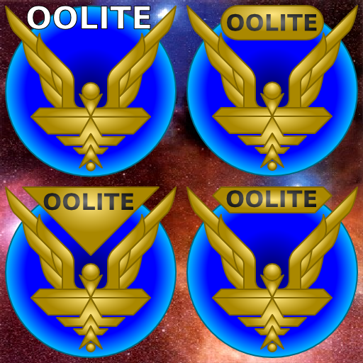
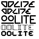
Opinion is pretty split over the three badge placement on the starbird. I'll go and see if there's any more variants I can pull out. Font choices seem to lean to the Stop 70 typeface (second and third down on the left hand column). (Commonly referred to as the Blade Runner font.)

Ahruman there's a couple of slight problems in using the Mac Helvetica Bold. If memory serves me correct, Apple owns the copyright on the font and I'm trying to keep things as GPL/Creative Commons friendly as possible. Secondly, being a PC user, I don't have ready access to it. That's why I ended up pulling the Vera off the BerilOs website because that was all I could find. I will have to stick using Deja Vu for now. A question, when you say expanded by 16.67%, do you mean character width or stroke thickness?

This stuff will have to sit on the back burner for the next week. I'm just about finished the first draft the game manual (25k word, 35 a4 pages). The plan is to uploaded the very buggy alpha version on Monday for peer-review in the Testing and Bug Reports fourms, so watch that space.
KZ999's Oolite documents, including the new draft Oolite Game Manual, can be found at www.box.net
Post Reply