Wheel Reinvention - The Oolite Icon
Moderators: another_commander, winston
- KZ9999
- Deadly

- Posts: 225
- Joined: Fri Jan 23, 2009 8:55 pm
- Location: Lost in Witchspace being hunted by a Thargoid Swam.
In answer to everyone noting the similar colours for the white and silver ranks...
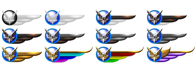
I hope this clear it up for you. The matt drawing I post are my equivalents to sketches since all my art is vectored based, not bit-mapped. I only apply the bling of filter effect at the last stage as it drags so much on my poor old laptop. I will also add that the final versions will have a much better finish as they are 16x the size.
If they were to be used in-game I personally feel that a dual wing version would look more balanced. Single wing is better for the BB since it allows for a good amount of detail without being too massive. (you could cut and paste them in right now.)
Well Ahruman you find that most people don't really see the difference between the Hevlica sans-serif derived designs.
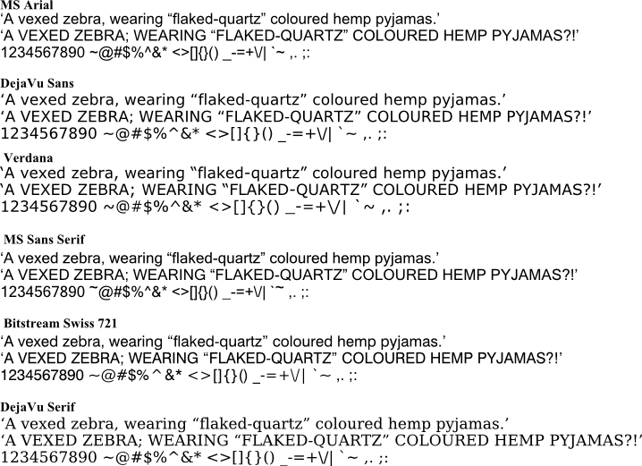
Personally speaking, I don't think it matters a lot in the document body text, especially as I'm going serif for clarity. (At 9pt serif is fare more readable than sans-serif.) However I did find a copy of the Bitstream Swiss721 family (on one of my many-many-many CD's) which is a Hevlica clone and will use that for the logo text to remain true with the game text. (with a 16.67% width expansion.)
wackyman456 you'll find that most Commonwealth/Westen nations have a bounty-hunter style laws on their statutes. If the nation has been colonised during the age of empires, then you find that law. Most nations never remove it either, because it can be handy in very unusual situations.
As a final note, may i say that Inkscape 0.47 kicks 0.46 ass. I'm using a snapshot at the moment and it's way more stable and the new path effect (sketch shading and scribble outline), and new filters (bright metal as seen in the witchspace cloud) rock.

I hope this clear it up for you. The matt drawing I post are my equivalents to sketches since all my art is vectored based, not bit-mapped. I only apply the bling of filter effect at the last stage as it drags so much on my poor old laptop. I will also add that the final versions will have a much better finish as they are 16x the size.
If they were to be used in-game I personally feel that a dual wing version would look more balanced. Single wing is better for the BB since it allows for a good amount of detail without being too massive. (you could cut and paste them in right now.)
Well Ahruman you find that most people don't really see the difference between the Hevlica sans-serif derived designs.

Personally speaking, I don't think it matters a lot in the document body text, especially as I'm going serif for clarity. (At 9pt serif is fare more readable than sans-serif.) However I did find a copy of the Bitstream Swiss721 family (on one of my many-many-many CD's) which is a Hevlica clone and will use that for the logo text to remain true with the game text. (with a 16.67% width expansion.)
wackyman456 you'll find that most Commonwealth/Westen nations have a bounty-hunter style laws on their statutes. If the nation has been colonised during the age of empires, then you find that law. Most nations never remove it either, because it can be handy in very unusual situations.
As a final note, may i say that Inkscape 0.47 kicks 0.46 ass. I'm using a snapshot at the moment and it's way more stable and the new path effect (sketch shading and scribble outline), and new filters (bright metal as seen in the witchspace cloud) rock.
KZ999's Oolite documents, including the new draft Oolite Game Manual, can be found at www.box.net
- KZ9999
- Deadly

- Posts: 225
- Joined: Fri Jan 23, 2009 8:55 pm
- Location: Lost in Witchspace being hunted by a Thargoid Swam.
Well now that the first daft version of the game manual is out for public review I figured I better get back to the T-shirt like I promised.
So am I heading in the right direction with my coby3 revamp?

I know it doesn't match Griffs' but frankly I'm just not that skilled enough to copy it accurately. I've try embody it within the limits of my own skill.
Ok Daddy Hoggy you wanted black and pink wings for the spam assassin badge so here you are. Translucent black plastic wings with pink highlight.

Be glad that I didn't the make pink match the colour of spam. When I tried it, it looked like the badge had mouldy-decaying-flesh for wings. Likewise be glad that I didn't go completely pink either.
Wait a minute, I did...

Hello Kitty Oolite
Why not! They do everything else, from toaster, through complete marriages where you and your partner have a dual wedding with hello kitty and her boyfriend; and of course, because she's Japanese, you can buy HK 'marital aids.' I kid you not!
Now on to the matter of the badges on the BB.
Since the badges are build around a ratio of 4 wide to 1 tall when we scale the dual wing down to fit the side pannel, this is the result.

See that most of the detail is lost. If I do it matt, then most of the cool bling is gone and we have the white/silver issue.
If we we use one wing style so that the image is 2.5 wide by 1 tall

The badge becomes taller, but more of the detail is retained making more shiny. We always got to have the shiny. Shiny is good. Love the shiny. Shiny, shiny shiny <Slap.> Sorry about that,.
Anyway, for the sake of clarity on the BB the single wing is cleaner, and the dual wing for the game (1.75 no doubt since there are other cooler stuff to deal with first.)
One final thought, would people be interested in my ideas for kill markers that could be used in the game along with the rank badges?
TTFN. Don't forget to read my game manual cause I need you input.
So am I heading in the right direction with my coby3 revamp?

I know it doesn't match Griffs' but frankly I'm just not that skilled enough to copy it accurately. I've try embody it within the limits of my own skill.
Ok Daddy Hoggy you wanted black and pink wings for the spam assassin badge so here you are. Translucent black plastic wings with pink highlight.

Be glad that I didn't the make pink match the colour of spam. When I tried it, it looked like the badge had mouldy-decaying-flesh for wings. Likewise be glad that I didn't go completely pink either.
Wait a minute, I did...

Hello Kitty Oolite
Why not! They do everything else, from toaster, through complete marriages where you and your partner have a dual wedding with hello kitty and her boyfriend; and of course, because she's Japanese, you can buy HK 'marital aids.' I kid you not!
Now on to the matter of the badges on the BB.
Since the badges are build around a ratio of 4 wide to 1 tall when we scale the dual wing down to fit the side pannel, this is the result.

See that most of the detail is lost. If I do it matt, then most of the cool bling is gone and we have the white/silver issue.
If we we use one wing style so that the image is 2.5 wide by 1 tall

The badge becomes taller, but more of the detail is retained making more shiny. We always got to have the shiny. Shiny is good. Love the shiny. Shiny, shiny shiny <Slap.> Sorry about that,.
Anyway, for the sake of clarity on the BB the single wing is cleaner, and the dual wing for the game (1.75 no doubt since there are other cooler stuff to deal with first.)
One final thought, would people be interested in my ideas for kill markers that could be used in the game along with the rank badges?
TTFN. Don't forget to read my game manual cause I need you input.
KZ999's Oolite documents, including the new draft Oolite Game Manual, can be found at www.box.net
- DaddyHoggy
- Intergalactic Spam Assassin

- Posts: 8515
- Joined: Tue Dec 05, 2006 9:43 pm
- Location: Newbury, UK
- Contact:
Thank-you for the spam assasin icon - gets my vote!
Re: revamped CobraIII - central nose section without colouring/shading looks a little busy to tell what is where and the wing tip "feathering" - reminds me of something my two-yr old did recently to my cheque-book and a pair of scissors... Can't think why tips would be feathered and therefore can't give it a big thumbs up, just a little one, to say I like where it's going!
I think you're doing an amazing and responsive job to the whims of the forum. Bravo!
Re: revamped CobraIII - central nose section without colouring/shading looks a little busy to tell what is where and the wing tip "feathering" - reminds me of something my two-yr old did recently to my cheque-book and a pair of scissors...
I think you're doing an amazing and responsive job to the whims of the forum. Bravo!
Oolite Life is now revealed hereSelezen wrote:Apparently I was having a DaddyHoggy moment.
- pagroove
- ---- E L I T E ----

- Posts: 3035
- Joined: Wed Feb 21, 2007 11:52 pm
- Location: On a famous planet
Very good work on the manual KZ9999. Invaluable work for the community. This badges thing. Will everyone get such a badge? I missed the 'how does it work'. about this. Does everyone get a skill badge? and how does it get implemented on the Bulletin Board? I ask that because I believe that the avatars still don't work (didn't check though)
Greetings,
P.A. Groove
Greetings,
P.A. Groove
For P.A. Groove's music check
https://soundcloud.com/p-a-groove
Famous Planets v 2.7. (for Povray)

https://bb.oolite.space/viewtopic.php?f=4&t=13709
https://soundcloud.com/p-a-groove
Famous Planets v 2.7. (for Povray)

https://bb.oolite.space/viewtopic.php?f=4&t=13709
- Cody
- Sharp Shooter Spam Assassin

- Posts: 16081
- Joined: Sat Jul 04, 2009 9:31 pm
- Location: The Lizard's Claw
- Contact:
Hi KZ.
It seems that there are no other suggestions coming in, so I've revised the list of planets.
G1 Lave Riedquat Zadies Xexedi
G2 Ladibe Recexela Arorar Onatbeza
G3 Atistiso Birera Leorendi Soiserla
G4 Soenisti Edorqu Gebiisso Orxeteed
G5 Xevera Biesmaan Laesinma Gediesqu
G6 Lerela Enqura Xeeden Bearrabe
G7 Quandixe Angeriri Raedre Geteve
G8 Tequenes Vegedius Zabixedi Esusale
Raxxla
I'm looking forward to seeing the finished Cobra.
Regards
Last edited by Cody on Tue Sep 01, 2009 7:56 am, edited 1 time in total.
I would advise stilts for the quagmires, and camels for the snowy hills
And any survivors, their debts I will certainly pay. There's always a way!
And any survivors, their debts I will certainly pay. There's always a way!
- KZ9999
- Deadly

- Posts: 225
- Joined: Fri Jan 23, 2009 8:55 pm
- Location: Lost in Witchspace being hunted by a Thargoid Swam.
Firstly, thanks El Viejo for the planets, I'll put them together on a page for the pdf over the next week.
Since you ask Pagroove, this is how I think the badges would work in the game. Firstly this is how the badge would appear in the Commanders' Profile screen.
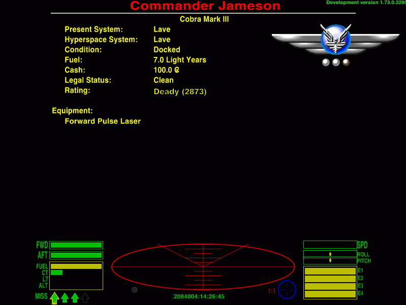
There is plenty of space to the right at the screen top for sticking some medals without blocking the text.
During game play when you clock over to the next rank, the text entry will update on the profile but the badge will stay the same until you dock with a GCW station. Using the same routine as for the mission messages you would see something like this.
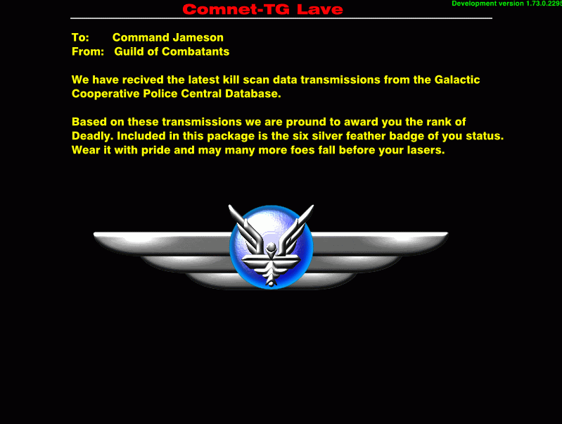
Now the canny among you may have notice the small pips under the starbird. As you hit the silver ranks the feedback for your combat skill becomes very scant. It struck me if that the game give you a 'Right On Commander' after clocking up 256 kill, that perhaps it should acknowledged more of them. I also noticed that it would take 25 blocks of 256 kills to become Elite. So here are the kill badges.
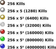
In order: Bronze, Silver, Gold, Diamond, Ruby, Emerald, Sapphire.
Again, there would be a com message for ever 256 kills and when you dock with a GCW station you would get.
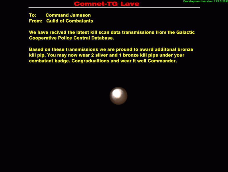
The game calcualtes the pips on base 5x256 scale. A commander can have 4 gold, 4 silver and 4 bronze pips at 31999 kills, then only a single diamond pip at 32000.
(All the game images are just quick hacks so forgive their rough look
Anyway it's all just some subjective flights of fancy since there are more important features/bug-fixing to be done first.
Finally, for those who are interested in such things, here's my new look of the t-shirt cobra.

I want to thank everyone for pushing me on the design. It's so much better than the snakehead version. It is your feed back that is making the work fun and improves both my skill and quality of the product.
Since you ask Pagroove, this is how I think the badges would work in the game. Firstly this is how the badge would appear in the Commanders' Profile screen.

There is plenty of space to the right at the screen top for sticking some medals without blocking the text.
During game play when you clock over to the next rank, the text entry will update on the profile but the badge will stay the same until you dock with a GCW station. Using the same routine as for the mission messages you would see something like this.

Now the canny among you may have notice the small pips under the starbird. As you hit the silver ranks the feedback for your combat skill becomes very scant. It struck me if that the game give you a 'Right On Commander' after clocking up 256 kill, that perhaps it should acknowledged more of them. I also noticed that it would take 25 blocks of 256 kills to become Elite. So here are the kill badges.

In order: Bronze, Silver, Gold, Diamond, Ruby, Emerald, Sapphire.
Again, there would be a com message for ever 256 kills and when you dock with a GCW station you would get.

The game calcualtes the pips on base 5x256 scale. A commander can have 4 gold, 4 silver and 4 bronze pips at 31999 kills, then only a single diamond pip at 32000.
(All the game images are just quick hacks so forgive their rough look
Anyway it's all just some subjective flights of fancy since there are more important features/bug-fixing to be done first.
Finally, for those who are interested in such things, here's my new look of the t-shirt cobra.

I want to thank everyone for pushing me on the design. It's so much better than the snakehead version.
KZ999's Oolite documents, including the new draft Oolite Game Manual, can be found at www.box.net
There's plenty of room to the right of the screen when you're somewhere short like Lave, but with a lot of the OXP locations (I'm thinking here Random Hits and Planetfall, but there are probably others) some of those descriptions go all the way to the right hand side of the screen.
So I would suggest if that kind of display does happen, it's limited to only main stations. That would also arguably make most sense anyway as it'd presumably be Galcop awarding and recording such things anyway.
So I would suggest if that kind of display does happen, it's limited to only main stations. That would also arguably make most sense anyway as it'd presumably be Galcop awarding and recording such things anyway.
My OXPs via Boxspace or from my Wiki pages  .
.
Thargoid TV
Dropbox Referral Link
Thargoid TV
Dropbox Referral Link
- KZ9999
- Deadly

- Posts: 225
- Joined: Fri Jan 23, 2009 8:55 pm
- Location: Lost in Witchspace being hunted by a Thargoid Swam.
Thanks for pointing that out. How about then making it a mini version right beside the rank entry. Of couse that then would spoil the look of the shiny badges. (yea shiny)Thargoid wrote:There's plenty of room to the right of the screen when you're somewhere short like Lave, but with a lot of the OXP locations (I'm thinking here Random Hits and Planetfall, but there are probably others) some of those descriptions go all the way to the right hand side of the screen.
How about this, that a large size size version at the end of the page, after the ship equipment list. The system already supports paging since there's so much kit. You could follow the equipment with a Medalsentry. That would nicely dove-tail with a lot of the OXPs, Galactic Navy springs to mind. We could also award some medals for the in-build missions. A bronze star for Constrictor and the sash of compassion for Nova perhaps.
[Edit & bending reality in the process.]
A blue/pruple coby3? For you, El Viejo not a problem.
[End edit.]
Last edited by KZ9999 on Tue Sep 01, 2009 6:44 am, edited 1 time in total.
KZ999's Oolite documents, including the new draft Oolite Game Manual, can be found at www.box.net
- Cody
- Sharp Shooter Spam Assassin

- Posts: 16081
- Joined: Sat Jul 04, 2009 9:31 pm
- Location: The Lizard's Claw
- Contact:
KZ.
I like the Cobra, but I think blue or purple would be better.
The badges are cool.
edit: edits are a bit like time travel...
I like the Cobra, but I think blue or purple would be better.
The badges are cool.
edit: edits are a bit like time travel...
Last edited by Cody on Tue Sep 01, 2009 7:58 am, edited 1 time in total.
I would advise stilts for the quagmires, and camels for the snowy hills
And any survivors, their debts I will certainly pay. There's always a way!
And any survivors, their debts I will certainly pay. There's always a way!
- Diziet Sma
- ---- E L I T E ----

- Posts: 6312
- Joined: Mon Apr 06, 2009 12:20 pm
- Location: Aboard the Pitviper S.E. "Blackwidow"
