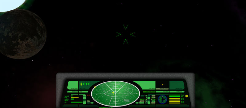
So here's my first attempt at a HUD, very much in the Star Trek theme. It's optimsed for a 1680 x 1050 display, so the hud.plist may need tweaking for other resolutions. I'll test other resolutions soon and include alternate hud.plist files if needed.
Fantastic! Installed this as my default hud! Couple of minor tweaks to suggest: Its set a little high (although without the grey it would be fine) so it covers the mission screen a little. Maybe expand the box for energy bars a bit. Its fine for the Cobra IIII for 4 bars, but some of the big haulers (like the inbuild Boa or a expensive fighter like the Tiger) 7 energy bars, so they get squashed out of the box. Maybe also slightly expand the Missiles bit, as quite a few ships can carry 6. Looks Great though!
Screenie (Imperial Courier with 7 bars of energy and six pylons) - shows slight overlap with the mission screen:
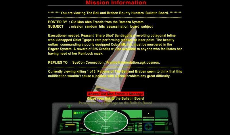
OXPS : The Assassins Guild, Asteroid Storm, The Bank of the Black Monks, Random Hits, The Galactic Almanac, Renegade Pirates can be downloaded from the Elite Wiki here.
Very pretty! I'd lose most or all of the clunky gray padding though.
Maybe just a thin black border to mark the visual transition to the HUD. Like the new macbooks . With a fixed thickness around the main HUD part, without the bulging triangles on the top corners. That will emphasize the nice drawing work you've done.
Edit: The HUD already has a black border. Maybe make it slightly thicker, or just leave it at that...
The issue where ships with 7 energy bars are not displaying the bars is due to the height for the bars being set to 20 in the hud.plist file. If its set high enough for 7 bars to look good then ships with 4 bars look too thick.
My preferred solution is to give any ship with 7 energy bars its own custom hud.plist with tweaked settings a slightly modified background image. I have managed to achieve this by including a modified shipdata.plist in the config directory within the OXP. The modified file includes a new "ship-player" object for the affected ship which points to the modified hud.plist file.
I just want to double check that there are no issues with this approach as I am not too familiar with the game architecture. It goes without saying that the only property I am changing is the hud property.
Ooo that's pretty. It's always interesting to see how people work around the round (or varying degrees of eliptical) scanner with the other (usually squarer) controls. One thing I do have to say is it's very clean (as in clean lined) Something I was trying to get with mine but didn't quite get as close as this does. I'd be interested to see how it plays. Still, got a hud built Woot!
I'd just like to add that the artwork was done by an artist Joe Ralat who kindly gave me permission to use his design as long as I credit his work, which I'll do as soon as I set up a wiki page for this hud.
I'm hoping to persuade him to create some more designs at some point but for now I'm just happy he gave me permission to use an existing design
... as long as I credit his work, which I'll do as soon as I set up a wiki page for this hud.
You probably should do it in the OXP's readMe as well.
Okay, downloaded it. Credits are there, so forget my remark.
Would be really nice to get the energy bars issue sorted. My Imperial Courier has 8!
And I don't know if this is even possible, but would it be an idea to break the missile icons to two lines, in order to suit more than four of them? IIRC the most ridiculous ship I've ever seen has no less than 13(!) missile slots.