HTML5 Galaxy Maps
Moderators: another_commander, winston
- phkb
- Impressively Grand Sub-Admiral

- Posts: 5625
- Joined: Tue Jan 21, 2014 10:37 pm
- Location: Writing more OXPs, because the world needs more OXPs.
HTML5 Galaxy Maps
I'm a big user of the wiki, but there are times I'd like to "take the info with me", when I'm offline for extended periods. This is particularly a problem when I want to do some browsing of the galaxy maps. Yes, there are spreadsheets available, but using Excel makes me feel like I'm at work. Besides, I much prefer the way the "New Galaxy Guide" arranges things, with sortable tables and clickable maps.
I've been meaning to do this for a while, but I finally got around to converting the script I used to update the wiki with all the extra chart information to output instead as HTML. The result was quite good, I thought, so I thought I'd share what I've come up with.
This is essentially a local copy of most (but not all) of the information on the wiki in the New Galaxy Guides. I limited the data to just the basic system information, plus routes and regions. The wiki is still the place to get the final word on systems and their contents. The wiki is also the only place you can do a galaxy-wide search (although you can probably do a file search to achieve the same thing).
I put things together into a HTML5 website, which should work OK in most browsers. I've tested the latest Chrome, Firefox, IE and Edge browsers, and the only thing that doesn't work in IE and Edge are the collapsible sections (those browsers don't support the new details/summary tags).
Anyway, here's a link for the download: OoliteGalaxyMaps.zip. Unzip into a folder and double-click on the "OoliteGalaxyMaps.html" file to start it up. The download size is about 19mb. I'm not planning on hosting this anywhere - this is just for offline use.
Comments welcome.
Last edited by phkb on Thu Jan 25, 2018 12:40 am, edited 2 times in total.
Re: HTML5 Galaxy Maps
That looks very nice. Well done and thank you!
When you have the top (or bottom when it is collapsed) entry selected in the sector overview, the focus box is clipped. I guess some div needs padding or spacing or whatever you kids call things these days. (Picture that shows it.) This is in Chrome on OSX 10.10.5
It would be cool if the chart in the chart overview were an svg that scales with the browser window size.
It would also be cool it it had pan/zoom controls .. and beyond certain zoom levels start showing more info and names...
- phkb
- Impressively Grand Sub-Admiral

- Posts: 5625
- Joined: Tue Jan 21, 2014 10:37 pm
- Location: Writing more OXPs, because the world needs more OXPs.
Re: HTML5 Galaxy Maps
Thanks for the feedback, hoqllnq!
A fix for the clipping issue: download this file (main.css) and plonk it in the "assets\css" folder, replacing the existing file.
SVG, yeah, that would be cool. If I had more time...
Pan/zoom controls, yes, uber-cool. Still hitting that available time issue thing. I've worked on some time compression algorithms, without success so far, I'm afraid. I'll let you know if I make any headway.
Re: HTML5 Galaxy Maps
Thanks. This fixes the clipping for the bottom item. For the top item, 1px is not enough, but 4px is.
- phkb
- Impressively Grand Sub-Admiral

- Posts: 5625
- Joined: Tue Jan 21, 2014 10:37 pm
- Location: Writing more OXPs, because the world needs more OXPs.
Re: HTML5 Galaxy Maps
That's weird. 1px was enough on my machine.
Anyway, new main.css is available with a 4px top margin. Thanks for pointing out the issue.
Anyway, new main.css is available with a 4px top margin. Thanks for pointing out the issue.
- phkb
- Impressively Grand Sub-Admiral

- Posts: 5625
- Joined: Tue Jan 21, 2014 10:37 pm
- Location: Writing more OXPs, because the world needs more OXPs.
Re: HTML5 Galaxy Maps
A new version of this resource is available from the link above, which fix a number of broken links on lanes and regions.
Edit (29/8/2017): New version now available, which fixes a very obvious spelling mistake (I have not idea where "Rich Agrricultral" came from! )
)
Edit (29/8/2017): New version now available, which fixes a very obvious spelling mistake (I have not idea where "Rich Agrricultral" came from!
- phkb
- Impressively Grand Sub-Admiral

- Posts: 5625
- Joined: Tue Jan 21, 2014 10:37 pm
- Location: Writing more OXPs, because the world needs more OXPs.
Re: HTML5 Galaxy Maps
New version of this resource is now available, via above link. Fixes a number of missing planet links and corrects some of the distances between systems.
This includes a first pass at using SVG images rather than PNG. I haven't done anything too fancy with the SVG images, though. I'll look at that for next time. Plus, there are local maps for each of the systems, and all the planets have a popup when you hover over them. Here's an example:
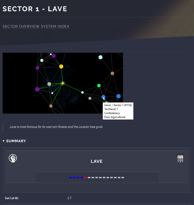
Clicking on a planet will take you to that planet's data page.
I've tested this in Chrome, Firefox, Edge and IE, and apart from the limited HTML5 support in Edge and IE (as noted previously), the only limitation is that IE doesn't put the linebreaks into the popups. All the info is there, though.
This includes a first pass at using SVG images rather than PNG. I haven't done anything too fancy with the SVG images, though. I'll look at that for next time. Plus, there are local maps for each of the systems, and all the planets have a popup when you hover over them. Here's an example:

Clicking on a planet will take you to that planet's data page.
I've tested this in Chrome, Firefox, Edge and IE, and apart from the limited HTML5 support in Edge and IE (as noted previously), the only limitation is that IE doesn't put the linebreaks into the popups. All the info is there, though.
- Getafix
- Quite Grand Sub-Admiral

- Posts: 979
- Joined: Tue Apr 01, 2008 12:55 pm
- Location: A small ice asteroid, orbiting Oresrati in Galaxy 8 (a.k.a. northwest Armorica).
- Contact:
Re: HTML5 Galaxy Maps
Thank you for adding value to the Commander's tool belt! 
"Any sufficiently advanced information is indistinguishable from noise." [Newman, Lachmann, Moore]
- phkb
- Impressively Grand Sub-Admiral

- Posts: 5625
- Joined: Tue Jan 21, 2014 10:37 pm
- Location: Writing more OXPs, because the world needs more OXPs.
Re: HTML5 Galaxy Maps
OK, last update on these for a while!  Link in the first post.
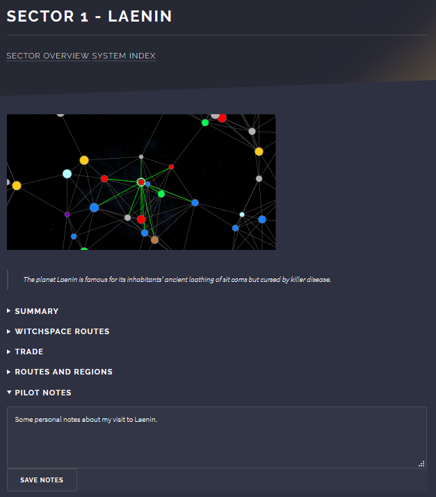
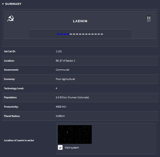
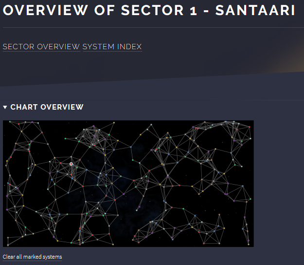
The latest version has some small tag error corrections, and general HTML formatting improvements. But mostly the new version has the ability to store personal notes against any of the information screens, and to mark systems so they are high-lighted on all the chart displays. Please note, however, that this only works in Firefox and Chrome at the moment (I haven't tested on Safari). IE and Edge will not allow access to the storage object when using local files. (There may be ways around this, but I haven't had the time to investigate it thoroughly.)
Here's some screenshots of these features in action:
Adding notes to a system:
Marking a system:
Marked system on main chart:
Marked system on spacelane chart:
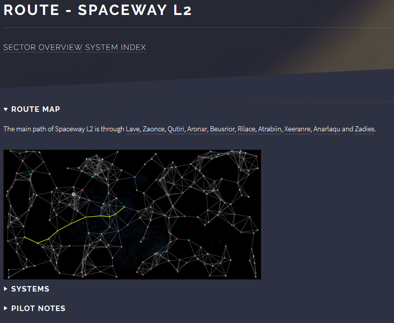
The data is stored by each browser separately, so if you make notes in Chrome, then open the page in Firefox, your note won't be there. The data is stored indefinitely, and should withstand future updates to the source.
Let me know if you encounter problems.
The latest version has some small tag error corrections, and general HTML formatting improvements. But mostly the new version has the ability to store personal notes against any of the information screens, and to mark systems so they are high-lighted on all the chart displays. Please note, however, that this only works in Firefox and Chrome at the moment (I haven't tested on Safari). IE and Edge will not allow access to the storage object when using local files. (There may be ways around this, but I haven't had the time to investigate it thoroughly.)
Here's some screenshots of these features in action:
Adding notes to a system:

Marking a system:

Marked system on main chart:

Marked system on spacelane chart:

The data is stored by each browser separately, so if you make notes in Chrome, then open the page in Firefox, your note won't be there. The data is stored indefinitely, and should withstand future updates to the source.
Let me know if you encounter problems.
Re: HTML5 Galaxy Maps
Are the averages for the market hard-coded (tedious work for 2,048 systems) or do you get them off a database somewhere?
- phkb
- Impressively Grand Sub-Admiral

- Posts: 5625
- Joined: Tue Jan 21, 2014 10:37 pm
- Location: Writing more OXPs, because the world needs more OXPs.
Re: HTML5 Galaxy Maps
From the wiki, actually. There’s only 8 types, one for each economy type.
- montana05
- ---- E L I T E ----

- Posts: 1174
- Joined: Mon May 30, 2016 3:54 am
- Location: lurking in The Devils Triangle (G1)
Re: HTML5 Galaxy Maps
Thanks a lot for the maps, they proofed very useful for a lot of issues. 
Scars remind us where we've been. They don't have to dictate where we're going.
Re: HTML5 Galaxy Maps
Glad I stumbled across this.
It will help out a lot for me since I live off grid and have limited data on my phone.
Thanks.
It will help out a lot for me since I live off grid and have limited data on my phone.
Thanks.
Creativity is a gift, use it well.
- phkb
- Impressively Grand Sub-Admiral

- Posts: 5625
- Joined: Tue Jan 21, 2014 10:37 pm
- Location: Writing more OXPs, because the world needs more OXPs.
Re: HTML5 Galaxy Maps
A new version of the HTML Galaxy Maps is now available (here's a link: OoliteGalaxyMaps.zip). In this version I've added an "All Pilot Notes" page, which lists all the pilot notes entered for any of the pages in the sector (Overview, Index, Routes/Regions and Planet pages). This makes is a little easier to do a sector-wide note search.
Also, on each page where notes have been added, an "*" will display on the "Pilot Notes" summary item, to alert you to the fact that notes exist on this page.
There are a couple of other small interface tweaks as well. One fix is that the notes for the Overview and System Index page were stored around the wrong way. If you have notes in either of those areas you'll need to manually move them to the right spot.
