Font updates

Discussion and information relevant to creating special missions, new ships, skins etc.

Moderators: another_commander, winston

Post Reply

Should I update "Dangerous" and "Dangerous Square"

Yes, do the update.
1
100%
No, leave them alone!
0
No votes
 
Total votes: 1

User avatar
phkb
Impressively Grand Sub-Admiral
Posts: 4612
Joined: Tue Jan 21, 2014 10:37 pm
Location: Writing more OXPs, because the world needs more OXPs.

Font updates

Post by phkb »

I've been having a close look at two of the fonts available for Oolite, Dangerous and Dangerous Square, both by edgepixel, and there are a couple of issues with the fonts I'd like to address, but I'm not sure about the best way to do it. Here's what I've found.

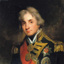
With "Dangerous" (the font based on 'Dosis'), edgepixel experimented with new icons for government type and economy. While the government type icons are quite readable and understandable, the economic ones suffer from an oversimplification to the point where a lot of meaning has been removed. Here's what I mean:

Image

Those economic icons have lost much of their meaning, which creates issues on pages like this where you really need to be able to understand everything at a glance.

My proposal is to swap out the economy icons in Dangerous and replace them with the other icon set edgepixel created for Dangerous Square.

With the "Dangerous Square" font (based on the "Eurostile" file), the issue relates to one two icons, the hollow star (used for the "Deadly" rating), and the filled star (used for the "Elite" rating). The hollow star isn't too bad, but the filled star is too busy and big. It shouts "look at me!", but it's too big for the space and makes everything look out of place next to it. Here's what I mean:

Image

My eyes are bleeding!

My proposal for this issue is to revert the two star icons back to the original form, both of which are smaller and match the text much better.

Now, I can do this update in one of two ways (three ways if you include "Don't touch anything"): (1) I can just update the original fonts. This keeps things simple for everyone, and two of the most populate fonts for Oolite get a welcome refresh. edgepixel hasn't been around in over a year and hasn't looked at my pm's so I think it's OK to do the update. Or (2) I can create 2 new fonts, called "Dosis" and "Eurostile" that implement the changes, leaving edgepixel's fonts the way he created them.

I know the forum is a bit quite at the moment (either that or I've reached that stage of forum membership where I post too often and no one reads my posts anymore :D), but I'd appreciate some direction from anyone!
User avatar
Cody
Sharp Shooter Spam Assassin
Posts: 16055
Joined: Sat Jul 04, 2009 9:31 pm
Location: The Lizard's Claw
Contact:

Re: Font updates

Post by Cody »

phkb wrote:
My eyes are bleeding!
<chortles> I removed all those stars from my personal descriptions.plist - Elite rating doesn't need stars!
I would advise stilts for the quagmires, and camels for the snowy hills
And any survivors, their debts I will certainly pay. There's always a way!
User avatar
maik
Wiki Wizard
Wiki Wizard
Posts: 2020
Joined: Wed Mar 10, 2010 12:30 pm
Location: Ljubljana, Slovenia (mainly industrial, feudal, TL12)

Re: Font updates

Post by maik »

Wouldn't the way forward depend on the license? If permitted, I would update the existing fonts.
User avatar
phkb
Impressively Grand Sub-Admiral
Posts: 4612
Joined: Tue Jan 21, 2014 10:37 pm
Location: Writing more OXPs, because the world needs more OXPs.

Re: Font updates

Post by phkb »

"Dangerous Square" was released with Creative Commons Attribution-NonCommercial 4.0 International License. Unfortunately "Dangerous" didn't have a license applied to it (although, given that edgepixel put a license on his second font, it could be assumed that he'd be OK with the same license applying to his first font, but, yes, I know - I'm assuming, which is a no-no in legal terms).

I'm now lost as to what to do with Dangerous. I think when I put all the font info together on the Wiki I (again) assumed a CC-BY-SA-3.0 license (which is what is displaying atm), but I suspect that needs to be removed. In fact, with no license I should probably remove the font altogether, and redo the thing as "Dosis", give it an appropriate license and leave it at that. I could still copy the icons out of "Dangerous Square" (based on it's license), resulting in an equivalent font as to what we have now.

*sigh* Licensing... (very) important, I know, but a real pain in the neck.
User avatar
maik
Wiki Wizard
Wiki Wizard
Posts: 2020
Joined: Wed Mar 10, 2010 12:30 pm
Location: Ljubljana, Slovenia (mainly industrial, feudal, TL12)

Re: Font updates

Post by maik »

phkb wrote:
*sigh* Licensing... (very) important, I know, but a real pain in the neck.
Both true. Major hurdle at work, too.
User avatar
phkb
Impressively Grand Sub-Admiral
Posts: 4612
Joined: Tue Jan 21, 2014 10:37 pm
Location: Writing more OXPs, because the world needs more OXPs.

Re: Font updates

Post by phkb »

Here's a thought: Dangerous is really based on Google's "Dosis" font (see here), which was released under SIL Open Font License, 1.1. In which case, the only part of the font file that edgepixel is really responsible for, and for which a license is necessary, are the government and economy icons. Now, if I copy the icons from "Dangerous Square", which edgepixel did release with a license, would that then enable me to re-release "Dangerous" under the SIL Open Font License, with appropriate notation about the source of the icon images? Does that work, or have I just created a Frankensteinian monster of license mutation that threatens the very fabric of space/time?
User avatar
Cody
Sharp Shooter Spam Assassin
Posts: 16055
Joined: Sat Jul 04, 2009 9:31 pm
Location: The Lizard's Claw
Contact:

Re: Font updates

Post by Cody »

phkb wrote:
I know the forum is a bit quite at the moment...
No doubt of that - very quiet, in fact.
phkb wrote:
... but I'd appreciate some direction from anyone!
Lack of input/feedback goes hand-in-hand with the above, I'm afraid.

As for the license stuff - keep it simple! Easily said, I know, but...
I would advise stilts for the quagmires, and camels for the snowy hills
And any survivors, their debts I will certainly pay. There's always a way!
Fritz
---- E L I T E ----
---- E L I T E ----
Posts: 591
Joined: Sun Jul 12, 2015 2:30 pm
Location: Bavaria, Germany
Contact:

Re: Font updates

Post by Fritz »

To be honest, I don't really know what the topic is about, and perhaps I'm not the only one. The font in my standard Oolite 1.82 looks just fine - in my eyes better than the "thin" font shown above - and I don't see a reason to change it, and I didn't even know that changing it would be possible. I never bothered to learn the government and economy symbols, and I never used the I-modus in the map, so I probably wouldn't even notice a change. But I think the new economy symbols would be harder to learn, while the current ones are at least partly self-explaining.

But yes, the Elite stars are much too detailed and don't look good beside this rather modern looking font. I think, the stars are useless anyhow, because the make the F5 page look untidy (I don't know if they are used anywhere else). Simply deleting them from descriptions.plist is probably not a bad idea ... <opening notepad++> ...
No doubt of that - very quiet, in fact.
Really? The forum is quiet? I actually started to have a bad feeling about posting too much, having accumulated almost 200 posts in only 4 months... :roll:
"You wouldn't kill me just for a few credits, would you?" – "No, I'll do it just for the fun!"
User avatar
Norby
---- E L I T E ----
---- E L I T E ----
Posts: 2577
Joined: Mon May 20, 2013 9:53 pm
Location: Budapest, Hungary (Mainly Agricultural Democracy, TL10)
Contact:

Re: Font updates

Post by Norby »

Fritz wrote:
changing it would be possible.
[wiki]Oolite Fonts[/wiki] page can help in selection.
Fritz
---- E L I T E ----
---- E L I T E ----
Posts: 591
Joined: Sun Jul 12, 2015 2:30 pm
Location: Bavaria, Germany
Contact:

Re: Font updates

Post by Fritz »

I didn't stumble over that page yet! But I must admit that I have no sense for fonts (except that I wouldn't use Comic Sans for business correspondence). The C-64 only had one font, DOS too, and to be honest, most of what I'm writing today is in Arial... :oops:
"You wouldn't kill me just for a few credits, would you?" – "No, I'll do it just for the fun!"
User avatar
phkb
Impressively Grand Sub-Admiral
Posts: 4612
Joined: Tue Jan 21, 2014 10:37 pm
Location: Writing more OXPs, because the world needs more OXPs.

Re: Font updates

Post by phkb »

Fritz wrote:
in my eyes better than the "thin" font shown above - and I don't see a reason to change it
If you like the default Helvetica font, that's fine. This topic really only relates to those who are using either of the fonts mentioned. Font choice is a very personal thing. As Norby mentioned there is a page that lists all of them, and they are all available via the download manager. All I'm talking about is a couple of small tweaks to "Dangerous" (which is really "Dosis") and "Dangerous Square" (which is really "Eurostile").
User avatar
maik
Wiki Wizard
Wiki Wizard
Posts: 2020
Joined: Wed Mar 10, 2010 12:30 pm
Location: Ljubljana, Slovenia (mainly industrial, feudal, TL12)

Re: Font updates

Post by maik »

phkb wrote:
Here's a thought: Dangerous is really based on Google's "Dosis" font (see here), which was released under SIL Open Font License, 1.1. In which case, the only part of the font file that edgepixel is really responsible for, and for which a license is necessary, are the government and economy icons. Now, if I copy the icons from "Dangerous Square", which edgepixel did release with a license, would that then enable me to re-release "Dangerous" under the SIL Open Font License, with appropriate notation about the source of the icon images? Does that work, or have I just created a Frankensteinian monster of license mutation that threatens the very fabric of space/time?
I think that is the way to go, I would just name it differently to avoid confusion.
User avatar
phkb
Impressively Grand Sub-Admiral
Posts: 4612
Joined: Tue Jan 21, 2014 10:37 pm
Location: Writing more OXPs, because the world needs more OXPs.

Re: Font updates

Post by phkb »

OK then, "Font: Dosis" is on the way, I'll remove "Font: Dangerous" from the download manager (because it doesn't officially have a license), but I'll keep a link on the Wiki so you can still get it, and I'll update "Font: Dangerous Square" with the original star icons.
Post Reply