edgepixel wrote:I changed the images from the BGS oxp to some more to my liking, fitting the Elite: Dangerous itch I have, of which the fonts are just a part. I could release those images as a "BGS - Dangerous Flavor.oxp", but I'm not sure about the legality of using Elite: Dangerous images in an Oolite .oxp, even if they are freely available on the net.
You could always try politely asking Frontier for permission, but I'm pretty sure the answer would be "No". Which is a pity.. they look great!
edgepixel wrote:Diziet Sma wrote:might make a good font for the Pandora
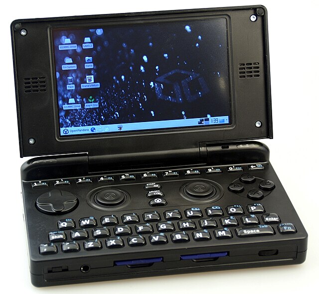
What is Pandora?
The Pandora is a small handheld game console and mobile personal computer with a Linux OS. A successor, the Pyra Dragonbox, is currently in development.
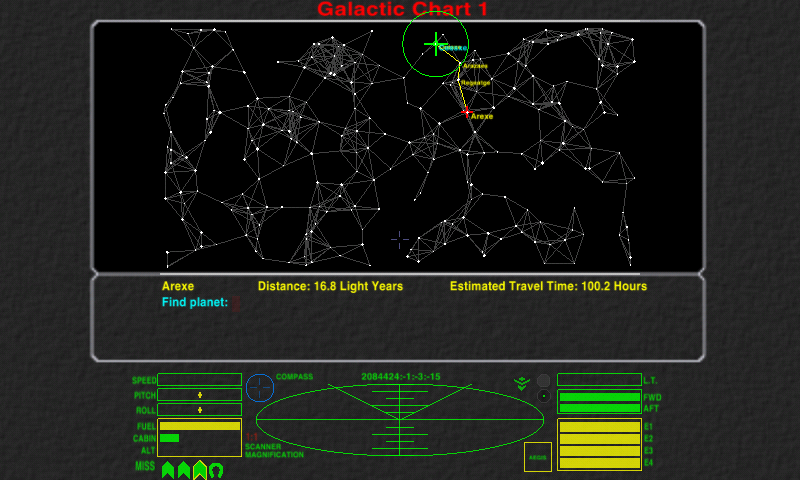
Recently, Oolite was successfully ported to the Pandora, which generated considerable excitement. However, due to the small screen size, there are some problems with font legibility on the Galactic Chart screen. With the help of some Pandora users (I don't have one myself, though a few members of the Oolite Board do), I did some testing and found that while it's not entirely suitable as-is,
OCR-A Extended (link is to a free version) may be a promising basis for building upon, but I'm a rank beginner in the entire area of font-making (and doubly so for Oolite), and it's beyond my current abilities and available time to produce something viable.
Here are a couple of images Neelix posted in the
Oolite thread on the Pandora Forum, illustrating the problem. As he pointed out in
his post, you should keep in mind that the Pandora Screen has only a 4.3" (11 cm) diagonal size, so the 800×480 resolution has a fairly high pixel density of 217ppi, so the screenshot may appear larger on some monitors than it does on the pandora itself.
With the default Oolite font:
With your new Square font:

The Oolite thread on the Pandora Forum has some more info and feedback on this, if you're inclined to look into it. I do know that if you succeeded in coming up with a font that looked good on that display, you'd earn the undying gratitude of quite a lot of Pandora-Oolite fans..