Download: http://www.keeper1st.com/Oolite/KeeperHUDv1.2.zip
VERSION 1.2:
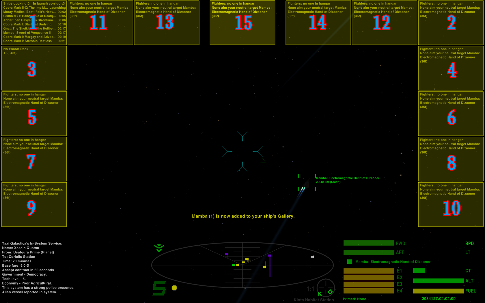
* Increases number of MFDs from four to 15. When I first added Multi-Function Displays, they were a future feature of Oolite. Now that they're commonplace, four of them may not be enough. You may never need 15 displays on at once, but this does give you options in MFD placement.
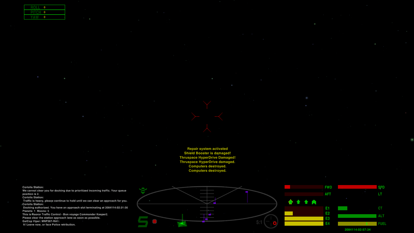
* The MFD screens will change color depending on ship status. This is particularly useful when waiting to get out of masslock, as the crosshair and status light changes may not get your attention quite as much. For red status, I didn't use the standard "redColor" as that was too hard to read; I used a lighter red -- 1.0,0.3,0.3).
* Removed the joystick yaw/pitch/roll indicators. They're just commented out, so if you want to use them, you can uncomment the lines from the green, yellow and red hud files (just then make sure not to use MFD screen number 1, which is drawn in the same place).
* Moved the FPS indicator to the middle of the screen so if you turn it on it only will conflict with MFD #15 (for trunk build, probably MFD #14 as well). Anyone with trunk build, let me know if the smaller text that gets included with the FPS counter is still readable for you (or if it even really matters to you!).
VERSION 1.1: Adds new elements introduced in Oolite 1.79, including a new element that all HUDs must implement for compatibility with future OXPs.
* A permanent line indicating what equipment currently is primed.
* A line next to the compass with information about the current ASC target.
* Multi-function display screens for future OXPs that may use them (or the new Tutorial mode which already uses one of them).
I also better positioned the "Weapons systems offline" text which previously was a bit too far to the right.
---
Original post follows:
JazHaz expressed an interest in my HUD after seeing an old screenshot of mine, so I wrote up a readme and uploaded it. I made this HUD in February 2013, modifying bits of ClearHUD by Tichy.
The readme follows, which explains as much as I can remember about the features I implemented, and contains links to screenshots.
--
This is the HUD I made in February 2013 for my high-resolution 16:10 monitor. For a time I also used it on a smaller 16:9 monitor, but it looks fine on that too (just a bit of margin on the sides as the screen is wider on 16:9 versus 16:10). Links to screenshots are below.
I worked on this HUD after downloading Tichy's ClearHUD. I enjoyed some aspects of it, but others I wanted to change, so I did.
I removed the sniper sight and the bars by the crosshairs, as I found them to be distracting. I moved all the ship status bars to the right side so you have one place to look instead of two, and reverted it to horizontal bars. This also allowed for a wider comms window on the left side, which reduces the rate of scroll-off when there's a lot of chatter. (If you have a lot of OXPs, you know how chatty the space lanes can be!)
I also removed the "dashboard" bar that ran across the entire screen, so now it is completely clear between HUD elements.
I reverted to the default size radar (ClearHUD had a squashed disc, making forward/behind distances more difficult to discern). Other things were moved around (see the screenshots). Then, I started really customizing stuff...
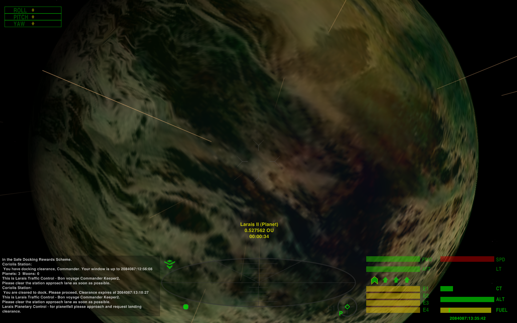
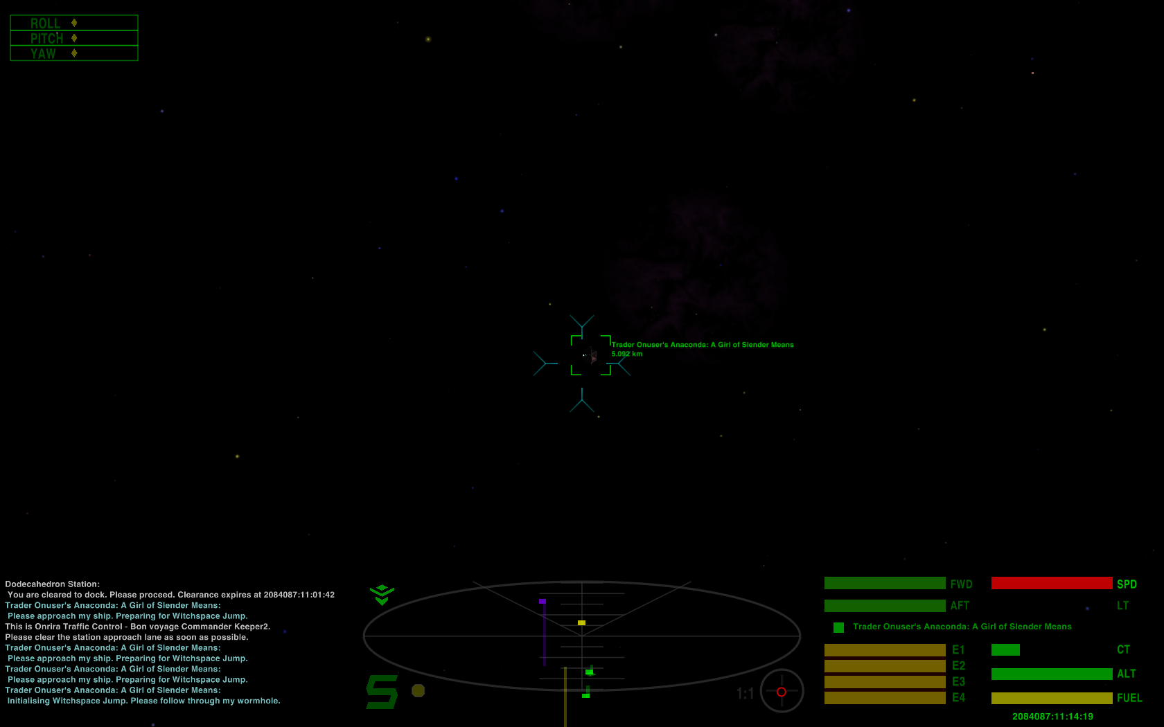
Different elements of this HUD will change in opacity/brightness depending on your current status. They'll only become fully bright and opaque when you really need them (e.g. there's no reason to have your shield status brightly displayed when you're in green status). The crosshairs also change color based on status -- a dull slightly transparent grey in green status, cyan in yellow status, and red in red status. It helps to get your attention in case the changing opacity of the gauges (or the status indicator light) wasn't enough. The MFDs also will change color based on status, for the same reason.
The area for display of missiles and target name is much wider than on other HUDs. This is especially good when you're using the RandomShipNames OXP, as now there's plenty of room to display the rather long ship names that can occur.
When docked, the HUD changes entirely, using some of the vertical bars from ClearHUD, but not all of them, and moved to the right side. It will not display the comms, radar, cabin temperature, speed, or altitude, as you don't need those while docked. It will display missiles, fuel, energy and shields. Under normal play, energy and shields are fully replenished when you dock, but I left them displaying here in case you run an OXP where that may not happen.
My explanation for the entirely different HUD gauges while docked: You're not in your ship looking out the window; you're walking around on the station, but you have a handheld or wrist-worn linkup to your ship that is showing you the vital information you need.
Full-sized screenshots:
The first three screenshots show the roll/pitch/yaw indicators active. These are not shown by default anymore.
Green status, 1680x1050 (16:10)
http://www.keeper1st.com/pics/oolite/keeperhudgreen.png
Yellow status, 1680x1050 (16:10) -- see notes below about target reticle
http://www.keeper1st.com/pics/oolite/ke ... yellow.png
Red status, 1366x768 (16:9)
http://www.keeper1st.com/pics/oolite/keeperhudred.png
Docked, 1366x768 (16:9)
http://www.keeper1st.com/pics/oolite/ke ... docked.png
All MFDs on (label numbers added), 1680x1050 (16:10), in yellow status, with MFD #15 highlighted:
http://www.keeper1st.com/Oolite/pics/keeperhudmfds.png
This HUD also has target sensitivity enabled, meaning the reticle and its text turn red when your lasers are likely to hit your target. Yes, this makes it easier for the player, but A) surely such technology would be commonplace, and B) my skittish joystick makes it more difficult for me to keep a distant target lined up, so I kinda need it! You can change the "reticle_target_sensitive" value in those three plists if you want to turn it off.
As this HUD is for larger, higher-resolution wide screens, the text size has been reduced all around. However, in Oolite versions 1.77.1 and earlier (i.e. all versions at the time this was released), the target reticle text will remain in the original, large size. This is because that text size was not adjustable in those versions. Oolite versions 1.79 and above allow it to be adjustable, and this HUD includes the "reticle_scale" value that reduces the reticle text size by half. The resulting size can been seen in the Yellow-status screenshots. That value also reduces the minimum size of the reticle box itself, as you can see in the same screenshots.
Please see the Clear-HUD_licence.txt for further credits, as some of the scripts used by Tichy were by others to begin with, which I have further modified (or may have; I made this HUD almost a year ago, so my memory of everything I changed or didn't may be a little rusty!).
And of course, you're free to modify this even further to your liking.
Remember to remove any other HUD OXP you may have before trying to use this one. Easiest is either to rename your existing HUD and change the ".oxp" extension to something else, or simply move it out of your AddOns directory.
KeeperHUD V1.2 (for widescreen high-res; 15 MFDs), Updated 4 Aug 2016
Moderators: another_commander, winston
-
Keeper
- ---- E L I T E ----

- Posts: 273
- Joined: Fri Feb 01, 2013 7:44 am
- Location: Indian Hills, Nevada, USA
KeeperHUD V1.2 (for widescreen high-res; 15 MFDs), Updated 4 Aug 2016
Last edited by Keeper on Thu Aug 04, 2016 11:29 pm, edited 5 times in total.
-
JazHaz

- ---- E L I T E ----
- Posts: 2991
- Joined: Tue Sep 22, 2009 11:07 am
- Location: Enfield, Middlesex
- Contact:
Re: KeeperHUD (for widescreen)
I'm actually really tempted to change from MilHud that I've used for several years. It does look good.
Unfortunately, Keeper, your website is not responding right now.?
EDIT: working now.
EDIT: working now.
-
Keeper
- ---- E L I T E ----
- Posts: 273
- Joined: Fri Feb 01, 2013 7:44 am
- Location: Indian Hills, Nevada, USA
Re: KeeperHUD (for widescreen)
Yeah, bad timing -- my hosting company is doing maintenance today, so there are intermittent outages.
BTW, I have unlimited space and unlimited bandwidth, so if ever someone's box account reaches a limit, I can host stuff as a backup.
BTW, I have unlimited space and unlimited bandwidth, so if ever someone's box account reaches a limit, I can host stuff as a backup.
Re: KeeperHUD (for widescreen)
A beautiful HUD Keeper, I was wondering if there is a version (for smaller screens) as the messages are a little difficult to see in the widescreen version for lap tops. 
Flying Python Class Cruiser, Chapter & Verse IV
-
Keeper
- ---- E L I T E ----
- Posts: 273
- Joined: Fri Feb 01, 2013 7:44 am
- Location: Indian Hills, Nevada, USA
Re: KeeperHUD (for widescreen)
You could go into each of the three main plists (i.e. the green, yellow and red), look up "comm_log_gui" and in there change the "row_height" value to 8 or 9 to increase the comms font size.Duggan wrote:A beautiful HUD Keeper, I was wondering if there is a version (for smaller screens) as the messages are a little difficult to see in the widescreen version for lap tops. :)
If you find the comms font size too small, you'll want to increase the "reticle_scale" value as well; when that feature gets implemented, the scale value I have entered will end up quite small. I find it easy to read at 1366x768 on the laptop I use now, but if you are using a small screen by today's standards, the target text will get quite small. The original value is commented out from the text; it's double the value at which I set it in the HUD. Something between the two may suit you (but of course the value will have no effect in the current version of Oolite).
Re: KeeperHUD (for widescreen)
Thank you Keeper, It worked a treat.
Flying Python Class Cruiser, Chapter & Verse IV

Re: KeeperHUD (for widescreen)
Very good!
I like the way you modified ClearHUD. It's much more comfortable with the big log screen on the left and all the gauges on the right.
I was thinking if it would be better to swap them. Normally, we are used to read from left to right, so we pay more attention to the things that are on our left view.
-
Keeper
- ---- E L I T E ----
- Posts: 273
- Joined: Fri Feb 01, 2013 7:44 am
- Location: Indian Hills, Nevada, USA
Re: KeeperHUD (for widescreen)
Interesting idea... There are advantages and disadvantages to swapping sides with the comms and ship gauges, I think.Tichy wrote:I was thinking if it would be better to swap them. Normally, we are used to read from left to right, so we pay more attention to the things that are on our left view.
Advantage: The start of each comms message will be closer to the radar, so you don't need to move your eyes much to see the new message (perhaps making it easier to see who is speaking to you).
Disadvantage: The missiles inventory (and thus the current target name) will be on the far left edge of the screen -- much farther away from the radar than it is currently. Also I think horizontal gauges would be weird on the left, so if you want to swap sides, I would suggest going back to vertical gauges (though of course the missile display must be horizontal, so that would have to go above or below the gauges).
-
JazHaz
- ---- E L I T E ----
- Posts: 2991
- Joined: Tue Sep 22, 2009 11:07 am
- Location: Enfield, Middlesex
- Contact:
Re: KeeperHUD (for widescreen)
Finally got around to installing the HUD. I've been using MilHud for many years, which I love, but think it's time for a change. Here's a screenshot, following my first launch. It's shot at full-HD resolution, ie 1920x1080 (using the Windows 64-bit test version of 1.77.1). I love that I don't have to fiddle with the GUI and Comms logs to get them to fit into my screen, which I had to do with MilHud.

New HUD - Keeper HUD by JazHaz, on Flickr
New HUD - Keeper HUD by JazHaz, on Flickr
-
JazHaz
- ---- E L I T E ----
- Posts: 2991
- Joined: Tue Sep 22, 2009 11:07 am
- Location: Enfield, Middlesex
- Contact:
Re: KeeperHUD (for widescreen)
This is the entry from MilHud. I'll probably just copy the entry.Keeper wrote:Oops. He's using my HUD. I've never even tried using the FPS display so didn't realize I'd left any feature out!another_commander wrote:That's probably a result of the HUD not containing a definition for FPS display.
Code: Select all
		{ // fps, taf, et al
			height		= 16;
			selector	= "drawFPSInfoCounter:";
			width		= 14;
			x		= -310;
			y		= -40;
			y_origin	= 1;
			alpha		= 0.65;
},-
JazHaz
- ---- E L I T E ----
- Posts: 2991
- Joined: Tue Sep 22, 2009 11:07 am
- Location: Enfield, Middlesex
- Contact:
Re: KeeperHUD (for widescreen)
Here's screenshots showing that I managed to remove the roll, pitch and yaw indicators successfully (yes I did also edit the other plists for green, red, and docked statuses!). Also found that the FPS indicator had been commented out, (I didn't need to import the MilHud settings for that) so I successfully reinstated that.

Oolite 1.77.1 64-bit test, Keeper HUD edited by JazHaz, on Flickr

Oolite 1.77.1 64-bit test, Keeper HUD edited by JazHaz, on Flickr
Oolite 1.77.1 64-bit test, Keeper HUD edited by JazHaz, on Flickr
Oolite 1.77.1 64-bit test, Keeper HUD edited by JazHaz, on Flickr
-
Keeper
- ---- E L I T E ----
- Posts: 273
- Joined: Fri Feb 01, 2013 7:44 am
- Location: Indian Hills, Nevada, USA
Re: KeeperHUD (for widescreen)
Ah, I think I hadn't been able to get FPS to show on my system, so I commented out that part of the HUD since I wasn't sure how it would look or if it would conflict with anything. Looks like it would have conflicted with the roll/pitch/yaw display, but clearly just commenting out that bit and uncommenting the FPS works a charm. I should adjust the position of the FPS display to make them both usable, eh?
-
JazHaz
- ---- E L I T E ----
- Posts: 2991
- Joined: Tue Sep 22, 2009 11:07 am
- Location: Enfield, Middlesex
- Contact:
Re: KeeperHUD (for widescreen)
Yeah I reckon so. I just uncommented it out to confirm it would work which resulted in the screenshot above. Next I'd like to move the position so that its left aligned with the comms log. I'd like to reduce the text size too, but I don't know if thats possible.Keeper wrote:I should adjust the position of the FPS display to make them both usable, eh?
Edit: would it be the
height = 16; variable that is the text size?-
Keeper
- ---- E L I T E ----
- Posts: 273
- Joined: Fri Feb 01, 2013 7:44 am
- Location: Indian Hills, Nevada, USA
Re: KeeperHUD (for widescreen)
That and the width variable, yeah. Aligning it with the comms log will be a matter of trial and error for you, as the comms log x position represents the middle of the comms log box -- not the absolute x position -- so you can't simply copy the value from the comms_log_gui. You'll have to decrease the x value of the FPS display from -300 to -400 and see how that works, and tweak from there.JazHaz wrote:Next I'd like to move the position so that its left aligned with the comms log. I'd like to reduce the text size too, but I don't know if that's possible.
Edit: would it be theheight = 16;variable that is the text size?
The HUD zip file has been updated with a version that has the FPS display available (with Shift-F as usual), moved over a bit so it doesn't conflict with the yaw/pitch/roll display, and font size shrunk to a value of 12 (original value was 18). Of course its position is not where you want it, JazHaz, but for others who want the FPS display and don't mind the y/p/r indicators, there it is.
The value of 12 keeps the smaller text (generated by the beta releases such as seen in JazHaz's screenshot) at a still easily readable size.
Re: KeeperHUD (for widescreen)
Hi Keeper.Keeper wrote:The HUD zip file has been updated with a version that has the FPS display available (with Shift-F as usual), moved over a bit so it doesn't conflict with the yaw/pitch/roll display, and font size shrunk to a value of 12 (original value was 18). Of course its position is not where you want it, JazHaz, but for others who want the FPS display and don't mind the y/p/r indicators, there it is.
I understand that you have updated the link in the first post to lead to the updated OXP?
If so, would you mind updating the version number of your OXP. With the number of OXPs available this becomes increasingly important even for the smallest changes.
Please refer to this Wiki page for best practice for [wiki]OXP Distribution[/wiki].
"A brilliant game of blasting and trading... Truly a mega-game... The game of a lifetime."
(Gold Medal Award, Zzap!64 May 1985).
(Gold Medal Award, Zzap!64 May 1985).