New splash screen and icon

General discussion for players of Oolite.

Moderators: another_commander, winston

Post Reply

Thoughts on the new icon/splash screen

I like it!
6
46%
Mixed feelings.
3
23%
I don't like it.
2
15%
I think it needs something...
2
15%
 
Total votes: 13

User avatar
phkb
Impressively Grand Sub-Admiral
Posts: 4643
Joined: Tue Jan 21, 2014 10:37 pm
Location: Writing more OXPs, because the world needs more OXPs.

New splash screen and icon

Post by phkb »

Oolite's splash screen and icon have been around for a while now, and I was thinking about doing a refresh. Something like this:

Icon samples
ImageImage

Splash screen sample
Image

(Updated to make the station a bit bigger)

Obviously, *very* open to comments/critiques/suggestions. Including "Don't change my Oolite icon, dammit!"
Last edited by phkb on Mon Oct 23, 2023 2:55 am, edited 1 time in total.
arquebus
---- E L I T E ----
---- E L I T E ----
Posts: 512
Joined: Sun Oct 31, 2021 6:07 am
Contact:

Re: New splash screen and icon

Post by arquebus »

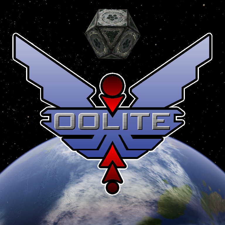
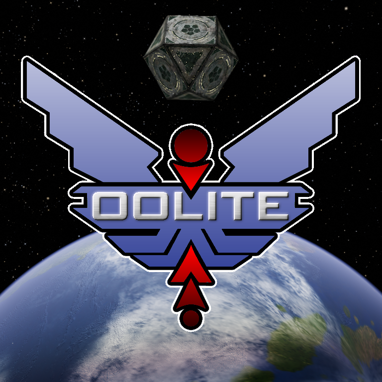
The colors do pop a lot more - it's a lot more attention grabbing.

My one critique, which is so minor as to be functionally irrelevant, is that those specific colors don't say "Oolite" to me. I feel like there should be an element of silver/gold in there. I don't know why. Maybe because that's the dominant color palette for ships?

Maybe the black outlines should be gold and the Oolite title maybe a bit "shinier"?

An overall "metalification" of the logo would maybe give it that extra oomph. Not necessarily a "brushed metal" look or the gunmetal style of the E:D logo; but a bit shinier.
Last edited by arquebus on Mon Oct 23, 2023 2:59 am, edited 1 time in total.
Here is my YouTube channel, where I play poorly: Arquebus X
User avatar
phkb
Impressively Grand Sub-Admiral
Posts: 4643
Joined: Tue Jan 21, 2014 10:37 pm
Location: Writing more OXPs, because the world needs more OXPs.

Re: New splash screen and icon

Post by phkb »

arquebus wrote: Mon Oct 23, 2023 2:51 am
Maybe the black outlines should be gold and the Oolite title maybe a bit "shinier"?

An overall "metalification" of the logo would maybe give it that extra oomph. Not necessarily a "brushed metal" look; but a bit shinier.
Thanks for the feedback. I'll have a play and see what I can come up with.

I've just updated the splash screen image, because I thought the Coriolis image was a bit small.
arquebus
---- E L I T E ----
---- E L I T E ----
Posts: 512
Joined: Sun Oct 31, 2021 6:07 am
Contact:

Re: New splash screen and icon

Post by arquebus »

Between this one and the current one, I definitely prefer this one. It's much bolder.
Here is my YouTube channel, where I play poorly: Arquebus X
User avatar
phkb
Impressively Grand Sub-Admiral
Posts: 4643
Joined: Tue Jan 21, 2014 10:37 pm
Location: Writing more OXPs, because the world needs more OXPs.

Re: New splash screen and icon

Post by phkb »

OK, couldn't get the gold looking OK. But had some success with the brushed metal look on the name:

Here's a straight brushed metal look
Image

And here's one with a "glow" effect as well.
Image

I'm quite liking the "glow" version.
User avatar
hiran
Theorethicist
Posts: 2053
Joined: Fri Mar 26, 2021 1:39 pm
Location: a parallel world I created for myself. Some call it a singularity...

Re: New splash screen and icon

Post by hiran »

I liked your first attempt, and I also like the glow version.
Brushed will be the first part to be lost when scaling, so we'd have to keep various sizes around.
Sunshine - Moonlight - Good Times - Oolite
User avatar
phkb
Impressively Grand Sub-Admiral
Posts: 4643
Joined: Tue Jan 21, 2014 10:37 pm
Location: Writing more OXPs, because the world needs more OXPs.

Re: New splash screen and icon

Post by phkb »

hiran wrote: Mon Oct 23, 2023 4:33 am
Brushed will be the first part to be lost when scaling, so we'd have to keep various sizes around.
I'd keep the first version of the text for icon files, which are generally a lot smaller. The text is even almost readable when reduced to 32x32.

I think the "glow" version will just be for the splash screen.
User avatar
Cholmondely
Archivist
Archivist
Posts: 4997
Joined: Tue Jul 07, 2020 11:00 am
Location: The Delightful Domains of His Most Britannic Majesty (industrial? agricultural? mainly anything?)
Contact:

Re: New splash screen and icon

Post by Cholmondely »

Abstaining - happy to go with whatever you decide!

Personal preferences tend towards Victorian neo-gothic, rococco and Bristol Byzantine...
Comments wanted:
Missing OXPs? What do you think is missing?
Lore: The economics of ship building How many built for Aronar?
Lore: The Space Traders Flight Training Manual: Cowell & MgRath Do you agree with Redspear?
User avatar
Cody
Sharp Shooter Spam Assassin
Posts: 16059
Joined: Sat Jul 04, 2009 9:31 pm
Location: The Lizard's Claw
Contact:

Re: New splash screen and icon

Post by Cody »

To be blunt... yuck! But I've always disliked that icon!
I would advise stilts for the quagmires, and camels for the snowy hills
And any survivors, their debts I will certainly pay. There's always a way!
User avatar
phkb
Impressively Grand Sub-Admiral
Posts: 4643
Joined: Tue Jan 21, 2014 10:37 pm
Location: Writing more OXPs, because the world needs more OXPs.

Re: New splash screen and icon

Post by phkb »

Ah! I had though by keeping the general icon form but changing colours and style, there was a useful homage to the old while embracing something new! Who knew there was such strong emotions attached to that icon!

Unfortunately my artistic talents don’t stretch to coming up with a new icon entirely, so I’ve reached the end of what I can achieve. However, if there are other artistic types out there who would be willing to put something together, perhaps together we can come up with something better!
User avatar
hiran
Theorethicist
Posts: 2053
Joined: Fri Mar 26, 2021 1:39 pm
Location: a parallel world I created for myself. Some call it a singularity...

Re: New splash screen and icon

Post by hiran »

phkb wrote: Mon Oct 23, 2023 4:35 am
hiran wrote: Mon Oct 23, 2023 4:33 am
Brushed will be the first part to be lost when scaling, so we'd have to keep various sizes around.
I'd keep the first version of the text for icon files, which are generally a lot smaller. The text is even almost readable when reduced to 32x32.

I think the "glow" version will just be for the splash screen.
I am happy to see them in the repo soon. If you have it some svg version would be nice as well - a scalable master.
Sunshine - Moonlight - Good Times - Oolite
User avatar
Cody
Sharp Shooter Spam Assassin
Posts: 16059
Joined: Sat Jul 04, 2009 9:31 pm
Location: The Lizard's Claw
Contact:

Re: New splash screen and icon

Post by Cody »

phkb wrote: Mon Oct 23, 2023 8:46 am
Who knew there was such strong emotions attached to that icon!
It's only one opinion, and from someone with no artistic skills!
I would advise stilts for the quagmires, and camels for the snowy hills
And any survivors, their debts I will certainly pay. There's always a way!
User avatar
hiran
Theorethicist
Posts: 2053
Joined: Fri Mar 26, 2021 1:39 pm
Location: a parallel world I created for myself. Some call it a singularity...

Re: New splash screen and icon

Post by hiran »

phkb wrote: Mon Oct 23, 2023 4:35 am
hiran wrote: Mon Oct 23, 2023 4:33 am
Brushed will be the first part to be lost when scaling, so we'd have to keep various sizes around.
I'd keep the first version of the text for icon files, which are generally a lot smaller. The text is even almost readable when reduced to 32x32.

I think the "glow" version will just be for the splash screen.
Even if we do not intend to deliver separately, let's keep the used versions not just as an icon or inside the splash screen.
If e.g. the glow version is available separately (with transparent background) I can still use it to assemble a splash screen for Oolite Starter.
Sunshine - Moonlight - Good Times - Oolite
User avatar
Nite Owl
---- E L I T E ----
---- E L I T E ----
Posts: 522
Joined: Sat Jan 20, 2018 4:08 pm
Location: In The Dark

Re: New splash screen and icon

Post by Nite Owl »

As suggested by arquebus.
[artsy-talk] No talent here either but this does POP a bit more. [/artsy-talk]
Anyone given Griff or cbr a quick nudge?


Image
Humor is the second most subjective thing on the planet

Brevity is the soul of wit and vulgarity is wit's downfall

Good Night and Good Luck - Read You Soon
arquebus
---- E L I T E ----
---- E L I T E ----
Posts: 512
Joined: Sun Oct 31, 2021 6:07 am
Contact:

Re: New splash screen and icon

Post by arquebus »

Yeah I like the glow versions! I preferr NiteOwl's gold rim to the white rim but I think both are better than the first iteration. Agreed that brushed metal probably won't scale down very well, and there's no good reason to add more work, so better to have a single image that scales.

For comparison, here's one of the original Elite logos:

https://upload.wikimedia.org/wikipedia/ ... _cover.jpg
Here is my YouTube channel, where I play poorly: Arquebus X
Post Reply